My sources tell me it was Barack Obama – but I’m perfectly prepared to believe you knew that already.
So what then, is the story behind that bathetic blurt of the obvious? Looking vainly for the there, there?
But put the bewilderment on hold and consider this: There are wins, and then there are wins. Ground the granularities to taste, redraw the units of analysis, and the data can break differently, and to different analytical effect.
To wit: the current Mr. President won 52.9% of the popular vote – even as he glommed 67.8% of the Electoral College, that vulgar, vestigial appendage on the body politic. Al Gore topped (President) George Bush 48.38-47.87 in the popular aggregate, but you know what happened. The 1960 splits? John Kennedy 49.72%, Richard Nixon, 49.55%. And the College? It gave Kennedy 58.05%.
The point is that various takes on the same numbers can yield discrepant, instructive, and even provocative conclusions. A robust cottage industry among sports statheads labors to manufacture alternative measures of teams’ effectiveness, promoting the guerrilla suspicion that victory need not invariably devolve upon the “really” better team (e.g., Bill James’ Pythagorean metric, which purports, to quote Wikipedia, “to estimate how many games a team ‘should’ have won based on the number of runs they scored and allowed”).
Returning to things presidential then, the story-seeker would do well to think about the unit thing. What, for example, about candidate wins by county, a unit that wedges itself somewhere between molecular-sized individual voters and those hulking aggregates called states?
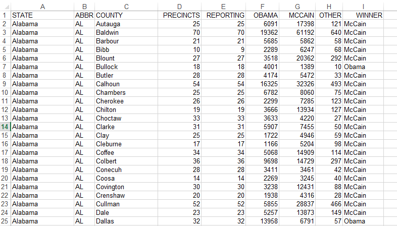
There are 3114 counties in the US; I know that because I requisitioned the county-vote-breakout spreadsheet holed up at: http://www-personal.umich.edu/~mejn/election/2008/. Unroll the data, and it looks something like this (note – for reasons of space and resolution, the screen shots here merely excerpt the data):

(You’ll note an infinitesimal shortfall in some counties reporting their results, but that’s a secondary matter here). The data read clearly enough, recording the respective totals of the contestants (including the existentially ominous Other), but that admirable lucidity won’t suffice to answer our question – namely, how many counties did each candidate actually win? Eyeballing the data clearly won’t do here, not when you have to fire your retinas at 3114 rows times eight columns’ worth of entries. What we need is an insurgent column, one that will simply proceed to name the victor by county, something like this:
Once that emendation is put into place we can swiftly route the data to a pivot table, whereupon we can tally county victories and break them out by state, and even by size of county turnout.
To achieve that end we need to turn to the redoubtable IF statement, and no fancy trimmings required in this case. First I’ve typed Winner in I1 to impart a header to the column. Then click in cell I2 and enter:
=IF(F2>G2,”Obama”,”McCain”).
(Your homework assignment: ask yourself which result would obtain were Obama and McCain to receive identical vote totals in a given county.)
Once composed, just copy the formula down the I column. A most handy means for making this happen, if you don’t already know it: click on I1, the cell bearing the new IF statement. Guide the Excel pointer to I1’s lower-right corner, where Excel’s default corpulent white cross reverts to a slender black one, called the fill handle. Double-click, and the formula copies itself down the I column, sidling every cell in H carrying data. This works whether the adjoining data inhabits the column to the left or the right of the copiedformulas. You can also accelerate the copy process by reconstituting the data as a table first, and then entering the prototypical formula in I2. The formula immediately copies itself down the column.
And if you want to streamline the data a bit you can now select the I column, click Copy, and execute the Paste > Paste Values option, thereby deposing each of the 3114 formulas with their numerical, hard-coded (that’s what they call it) result.
Once that deed is done the data can be redirected to a pivot table, where the answers for which you’re hankering begin to emerge. For example, you can construct a state-by-state breakout of county-victory totals – but first, you should delete the contents of row 3116, containing a cache of SUM formulas which don’t possess the same data character as the other rows.
Put programmatically, then do this:
To the Row Labels area, drag the State field
Drag Winner to the Column Labels area
Drag County to the Values area (note County is a text field, which we’re about to subject to a mathematical operation in virtue of directing it to the Values area. That operation is of necessity Count).
You’ll get:

Now scroll to the Grand Totals row at the foot of the columns. The results, as they say, may surprise you. Senator McCain – whom we agree lost the election, wins 72% of America’s counties. Incroyable mais vrai.
And scan those state breakouts. McCain wins Kansas’ counties 102 to 3, even as he pulls 56.82% of the popular vote. And he wins 100%of Oklahoma’s 77 counties, juxtaposed to his 65.64% of the actual vote.
Of course these are optical illusions, born of the compacting of popular votes into winner-take-all county units. Nevertheless the read is instructive. After all, the Electoral College is an optical illusion too.
I earlier alluded to an additional pivot table prospect – a breakout of county wins by county size, as operationalized by county turnout. That sort of permutation would correlate candidate wins roughly along urban-rural lines, assuming that smaller counties are the less citified.
In order to chase this we need to tack on another column, which I’m simply heading Turnout. In cell J2 inscribe this simple formula:
=SUM(F2:H2)
thus totalling the three vote-recording columns for each county. Copy the formula down the J column and inaugurate a new pivot table. Then
Drag Turnout to Row Labels. Then click PivotTables>Options>Group Selection in the Group button group. You’ll see
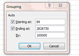
Note that Excel proposes to group the hugely varying county sizes by tranches of 100000. Let’s go with that default and click OK.
Then drag Winner to the Column labels area.
Drag County to the Values area. You’ll see:

Interesting. McCain overruns Obama in the smaller counties, which account for the great preponderance of all counties. And if you don’t like the skew of that distribution click anywhere the row labels area in the pivot table itself and return to the Group Selection button. If you downsize the default 100000 to 25000 in the resulting By field you’ll get

It’s the units thing again. Resize them, conceive them anew, and new, potentially iconoclastic story angles await. Bet you can’t wait until November.

Why not include the spreadsheet, or better yet, put it up as a google doc
Good idea – thanks. Hope to have something out there by the weekend at the latest.
this just shows that people in less densely populated counties are more likely to be stupid, racist, or both.
It at least shows they’re more likely to vote Republican.
where can I get a spread sheet containing the election results, by county for 2004, 2008 and 2012?