Crime is down in Seattle and the other cities surrounded by Washington state’s King County cordon – and if you don’t believe me look here:
(Click the Excel download link in the piece’s first paragraph.)
The workbook registers 27 years’ (or so) worth of data spreadeagling 1985 through 2011, timelining the flow and ebb of criminal behaviors (or at least the recorded ones) across localities in the County. And given the accompanying piece that details the felicitous downturn, an obvious follow-on question is begged thereby: what else can I bring to the story, then?
That question needs to be answered and acted upon in two coordinated steps. First, the data glimmering before you requires vetting – a smoothing and burnishing that primes them to serve the purposes you, as opposed to the preparer of the spreadsheet, want to bring to them. Then, and only then, when the tidying is done, can the search for arresting new content be pressed, pun intended.
And while you may be inclined to diss that tidying as just so much busywork, the job of retrofitting, or to fall back on that dreadful verb, repurposing, information, calls for a measure of creativity all its own, if only of a second-order type. Knowing how to redirect a stream of someone else’s data toward a new estuary of storylines qualifies as a talent too, and perhaps a more formidable one than you may think. In the interests of expository concision, then, this post will expound the tidying part; the entry following it hopes to plumb the data for the story prospects within.
Once the workbook makes its way into your LED, note first a presentational curiosity: the alphabetical discontinuity among the sheet’s column headings, which of course masks a raft of hidden columns. Those columns in evidence appear summatory – i.e., crime rates per 1,000 of population – but we need to restore the columns to view, and can do so en masse by clicking the Select All button – that blank rectangle jammed between the A column and 1 row heading – and right-clicking the A heading and selecting Unhide. Those now-revealed data are obviously central to the piece, and we need to keep them here, rather than there.
Next point, again more presentational perhaps than substantive. Note that some crime columns extend their data to two decimal points, even as others suppress the decimals entirely (e.g, Arson):
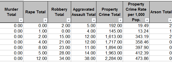
I can neither account for nor defend the inconsistency, given the plain limpid mathematical truth that crimes are recorded as integers. Legally or sociologically understood, there are no fractional crimes, and the excess of zeroes here suggests to Mr. and Ms. Reader that some fractional data potential is out there waiting to be plumbed. The zeroes should be pruned – that is, if you plan on tacking the spreadsheet online for wider consumption. But if, on the other hand, you guide the data onto a pivot table or chart, etc., you may not have to care about the zeroes. After all, 2.00 is 2; and either iteration will be regarded as such by table or chart objects. This one is your call, then. Who’ll be doing the viewing, and in what form?
Note also that Column B – County – contains precisely the same entry in all 841 rows worth of data – the county name King, sometimes spelled uppercase, in other places with merely a capital K. This lack of differentiation thus casts the column into irrelevance, and if you’re posting the worksheet as you see it here, I’d delete the column; there’s nothing to be learned from it. But again, if you’re pivot tabling or charting the data, you can simply ignore it all.
Another issue. There is no crime data for the Port of Seattle because no one lives there, at least not officially (see the Population column). A panoply of error messages – chiefly #DIV/0!, because the crimes rates reported divide the number of crimes by population – beset the Port rows (those additional #VALUE! errors for the “city” owe their to a few absolutely blank cells in the Population column). Because there is nothing then to be said about Port of Seattle data, and because retaining rows rife with error messages is a request for trouble, you need to click on any numeric value in say, the Total Crime Rate per 1,000 Pop. Field and sort by Smallest to Largest (that’s because dividing by zero is infinity, and you can’t get larger than that). Then again insert a blank row directly above the first Port of Seatlle record, banishing those data from the rest of the spreadsheet.
And here’s one more data-structural heads-up: Column E – Index Crime Total – appears to be nothing more than the record-specific sums of Columns G and M, the Violent and Property Crimes totals. It’s just doing a bit of the math for you, even though the totals are only hard-coded, i.e., non-formulaic.
From here on, though, the issues get a bit more subtle. Row 4 bears the innocuous “To filter on a specific category…” instruction, but that little commentary imposes a real stricture upon the data. Because the text rests immediately atop the data header row, it attaches itself – dragging along with rows 1-4, too – to the crime data, thus casting the worksheet title in Row 1 into the starring role of header row. Initiate a pivot table right here and you’ll see:

And that’s no good. You need to interpolate a blank row between 3 and 4, and free the actual data from the static text inhabiting the rows 1-4.
Now you need to make a critical analytical decision. A number of reporting cities exhibit either fewer than 27 years of data across the 1985-2011 swath, and/or fewer than 12 months for every year. Thus these suffer from a degree of incompleteness, and as a result you might want to partition them from the data-intact cities – because these comprise fewer than 324 reported months, i.e., 27 years times the 12 months per year. If, on the hand, you don’t care about stretches of blank cells and possible apples-and-oranges comparisons, then don’t touch that dial, or mouse. Either way, this strategy needs to be though through.
How do we identify these cities? Try this.
Draw up a pivot table and
Drag City to the Row Labels area.
Drag Number of Months Reported to Values area. Right-click here and select Sort>Sort Smallest to Largest.
Note that only 16 of the 36 cities meet the 324-month criterion:

And if – if – you want to triage the fractional cities, you can right-click anywhere in the City field, click Filter>Top 10, and enter 16 as shown:

Click OK and you should see:

(Because the default Grand Total is a non sequitur here, you can click PivotTable Tools>Design>Grand Totals>Off for Rows and Columns, as I did).
But again, you may want to err on the side of inclusiveness, incorporating those other, deficient cities into your data mix. That’s another one of your calls. But we hope to think about that in the next post.

Leave a comment