There’s no room for the obvious in the gender reportorial space. If you want to write comparatively about what’s happening in there – and talk about gender is by near-definition comparative – you need to insist upon the data with which to appoint the space; and the gender-parsed data about college enrollments makes for interesting furnishings.
True, the outsized relative female presence in American colleges might by now qualify as an obvious datum all its own, but I have one more comparison in mind – the remarkable, parallel likeness in the breakouts of the numbers for universities in the United Kingdom, filed by the Guardian and transposed to Excel form here:
The gender gap at universities
(N.B. I’ve supplemented the original workbook’s Higher Education Institutions sheet with a Country field; it is, after all the United Kingdom. And NI stands for Northern Ireland.)
Women comprise about 57% of college/university students in the States, an advantage that appears to have stabilized across the past decade, itself something to think about. The female proportion in the UK stands at about 55% (and last year one-third more women applied to university than men, striking a virtual identity to the 57-43 US split), an altogether striking bit of social homology. After all, who would have confidently imagined a concurrent lurch in the respective gender ratios, a shared velocity of change rambling across the two countries -even granting their real but limited cultural affinities? That the two gender tempos (all right, all right – I almost went with tempi) appear to have marched to the same metronome 3500 miles apart is no truism, but rather a provocative, newsworthy conjunction, worthy of a sociological grant or two. But I do go on.
In any case, on to the data, which stream across four worksheets and throw out some issues on which you’ll have to do your due diligence. Click through the numbers and it becomes clear first of all that they’ve been rounded off, for reasons to which I’m not privy; and while that discrepancy – and that is what it is – doesn’t subvert the larger enterprise, it’s a touch bothersome.
Now tap into the Higher education institutions tab, and onto the formula in cell F3:
=SUM((C3/E3))*100
The 100 serves to aggrandize the formula results beyond zero, e.g. 61.9 rather than .619 or 61.9%. But the SUM prefix and attendant parentheses bring nothing to the expression, which thus should have been rendered:
=(C3/E3)*100
The same critique can be levelled at the percent computations prowling the Qualifications by gender subjec [sic] sheet. (Note by the way the truncated “subject”, a casualty of Excel’s 31-character naming limit on worksheet tabs, a condition which does not beset the original, Google-docs platformed sheets. Note a similar forced abridgement of the Class of degree, by ge [sic] sheet title. You’ll thus probably want to rename these gnarled identities.) And note as well the intermittently hard-coded data fields across the workbook (as with the percentage data in the Students obtaining undergraduate [sic] sheet], fields which submit to formulaic treatment in other sheets. I can’t explain the inconsistency.
But you’ll have to save the heavy-duty emending for the Class of degree obtained sheet:

If you want these data duly prepped for pivot tabling, etc., you’ll need to
- Delete row 4, mischievously interpolated between the data and their titles
- Do something about the Female, Male, and All Genders identifiers (curious adjective here, “All”; how about Both?) posed as outline headings – namely, by lowering them into each record and paring any resulting blank rows:

And as you’re by now expert pivot tablers, you can let your spreadsheet imagination run riot with the data.
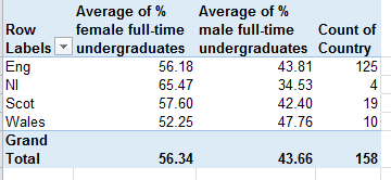
But let’s cut back to the Higher Education Institutions sheet. Suppose you want to call upon a pivot table to say, break out the gender enrollment data by Country (remembering that the data confine themselves to full-time students). First, insert a row between the last university record – University of Ulster – and the Total UK row, thus distancing the latter from any imminent table. If you don’t, Total UK will factor itself into the pivot data, inflicting a debilitating redundancy upon the table – because the totals aggregate all the data above them – in effect, summing the data twice.
Next, populate the pivot table:
Row Labels: Country
Values: % female full-time undergraduates
% male full-time undergraduates
Country
Summarize the quantitative value fields by average, and format decimal points to taste (I’ve stipulated two such points). You should see:
(I’ve also fiddled with column widths.) These findings average the averages; that is, they impart equal weight to each institution’s gender percentages irrespective of institution size, a salient measure for some purposes that nevertheless won’t figure women’s overall, actual enrollment proportion. In order to achieve that measure drag the current value fields off the table and slide in the Number of female and male f/t undergraduates:

(And you’ll want to bag those Grand Total decimals.) Now here’s the issue. Clicking PivotTable Tools > Options > Show Values As > % of Row Total will consider the female and male fields separately, and as such won’t deliver the comparative, cross-row percentages you’re seeking:

And that’s because the % of Row Total capability only threads across values of the same field. Had the data installed a Gender parameter instead comprising female and male values – that is, had it headed a column called Gender comprising successive enrollment number records for F and M, for example – the percentage of row totals could indeed obtain. In our case, however, you’d need to resort to the kind of Calculated Fields I detailed in my September 6 post, in which a new, pivot-table-specific formula would have to divide say, the female undergraduate field by the sum of female and male undergraduates fields. It’s doable to be sure, and sometimes necessary, but it’s messier.
Yeah – fields and values. You gotta nail that distinction down – even if the spreadsheets you have to deal with don’t.

Leave a comment