Hebdomadaire (aka weekly ticket) in hand, let us resume our beneath-the-surface survey of the Paris métro, and some of the data riches secreted therein.
Let’s go back here:
That is, to the RATP’s compendium of the traffic careering through its arrets, or stops (I’ve jiggered the sheet here in order to grease the analytical wheels), in which there’s more to learn.
For example – the Seine dices Paris into its storied, asymmetrical banks, the Left and Right, with six of the city’s arrondissements or districts mapping onto the Left, and it might be instructive to break out the distribution of metro stations and traffic along the Left-Right parameter.
Of course, you have to know which arrondissements go where, but you’ll have to trust me on this. Starting in cell Q1 I’ve entered the following data set:

I’ve named the range Bank. In cell N3 title an imminent field Bank, and follow up with this formula in N4:
=VLOOKUP(L4,Bank,2)
to of course be copied down the column.
Next, try this pivot table:
Row Labels: Bank
Values: Station (necessarily defaults to Count)
Trafic (stay with Sum)
Trafic (Average)

That’s noteworthy; 30% of Paris’ arrondissements wash up onto the Left Bank, and so if we click in the Station values field and plug into the PivotTable Tools > Options > Show Values As > % of Column Total sequence and do the same for the first Trafic field we see:

30% of the arrondissements, and 30.33% of the stations – a neat, or serendipitous, bit of urban planning, along with the roughly commensurate 26.62% of recorded rider entries into the system. On the other hand, the Left Bank contributes about 41% of Paris’ aggregate area, but about 33% of the city’s residential population –the latter figure sizing up well, though the advent of the métro obviously long predated latter-day demographic realities.
What about station distributions by arrondissements? That one’s pretty easy:
Row Labels: Arrondissement pour Paris
Values: Station (Count)
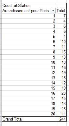
For a slightly subtler, but easily formulated, metric, we could also track (no pun intended) overall station total by arrondissement – that is, all stops cross-totalled by all lines:
Row Labels: Arrondissments pour Paris
Values: Count of Stations (Sum)

Thus while 15 physical stops dig deep beneath the 8th arrondissement – one of Paris’ poshest (think: Champs d’Elysses) – when all the transfer possibilities are reckoned, 27 line stops all told share those 15.
If you’re looking for more Paris data, drill into the ratp arret graphique workbook:
This sheet inventories and pinpoints 12,000 Paris’ transit stops, variously served by metro, RER, and most predominantly, the city’s buses. Because the data are all compacted into the A column, you’ll need to aim the Text to Columns feature at them (see my October 11 and 18 posts), retaining the Delimiter default and identifying the # as delimiter by entering it in the Other field. You’ll then have to name the fledgling fields.
There are a number of things to be done with these data, and here’s just one, a harkening to the faux spreadsheet maps I described in my World-as-Spreadsheet posts of October 25 and November 1.
Say we want to quickly map Paris’ métro arrets. Because the system’s records have already been felicitously pushed to the top of the data, insert a blank row between 308 and 309. Then name the H column Longitude (or something like it, so long as it differentiates itself from the label topping the longitude values in B), and call I Latitude (again, distinguishing it from the latitudes in C). Then in H2 enter
=ROUND(B2,2)
Thus broadening longitude precisions to 2 decimal points. Copy the formula to I2, and copy the results down the respective columns. Stoke a pivot table:
Row Labels: the new Longitude field (that is, the one exhibiting the rounded values)
Column Labels: the new Latitude field
Values: Location, defaulting to Count (in fact other fields can play the same role, something you may want to think about.)
Then for demo purposes click anywhere in the Values area and spray a conditional format at the data, taking pains to click the All Cells showing “Count of Location” values for “Longitude” and “Latitude”, and the 3-color scale option:
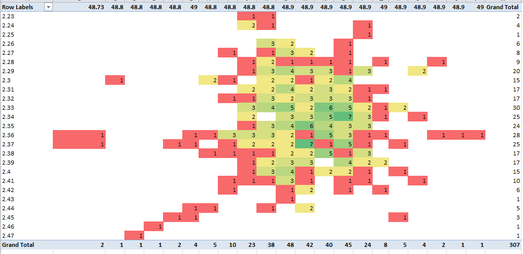
Note the near-bell curve clustering of stops in the numerical centers of both latitudes and longitudes.
And that, mes amis, is Paris – sort of.

Leave a comment