Please indulge your correspondent in a bit of analytical back-track, kinda sorta. Last week’s post on the New York Police’s stop-and-frisk data, circa 2011, called our collective attention to the data curiosities in their midst, e.g, 8-foot, 999-pound suspects plunging their size 52s into the city’s sidewalks; and apart from one unstoppable question, namely, how these superhumans could be made to fit into a squad car, I guessed that these outsized numbers denoted data entry errors or lacunae, and as such I moved to detach all the records estimating suspects’ weights at 400 pounds or more.
Now that maneuver makes perfect sense, provided that you’ve nominated suspect weight your variable of analytical choice. But at the same time, it’s most likely that the height/weight exaggerations pollute the entries of actual stops-and-frisks; and as such you’d probably do well to readmit these dodgy records into the data fold by deleting the interposing row I fitted in last week – unless again, you’re interested in sizing up suspect weights. But on the other hand, the lapses uncovered to date (along with any blank cells in there, and there are) may augur still others; in other words, remain vigilant.
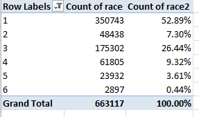
In any case and once you’ve seen to it that the time parameters I described in part 1 are duly columned, you can move on to consider your pivot table options, comprising nothing if not a dense buzz of possibilities. The most obvious, in view of the putative racial skewing of stops-and-frisks, is the tabling of race itself, simply executed:
Row Labels: Race
Values: Race (by Count)
Race again (by % of Row)
(again, it’s perfectly legal to impose the same field twice upon the same pivot table. The field is in effect breaking itself out).
Sieving the blanks via the Row Label filter button (and you know you’re dealing with a large set of data when 22,000 blank records amount to merely 3% of the whole), I get
Of course, you’ve already taken note of a problem here – the fact that race is numerically, not textually, coded. However, the New York Civil Liberty Union’s informative codebook deciphers the numbers:
1-Black
2-Black Hispanic
3-White Hispanic
4-White
5-Asian/Pacific Islander
6-American Indian/Native Alaskan
(While we’re at it, New York’s five boroughs receive these codes:
1-Manhattan
2-Brooklyn
3-Bronx
4-Queens
5-Staten Island )
The disparities are thus perfectly clear here, although these naturally await interpretation (see, for example this account. Note as well that the spotlight was trained on the stop-and-frisk issue during much of New York mayoral primary campaign, the votes for which were conducted two days ago).
But another potentially instructive breakout, namely stops-and-frisks by police precinct, suffers from some shortfall in quality control. Precinct numbers are keyed to their respective boroughs here:
http://www.nyc.gov/html/nypd/html/home/precincts.shtml
But run this pivot table:
Row Labels: Borough
Pct
Values: Pct (count)
And you’ll find a number of misassociations – though again, these contribute but an infinitesimal proportion of the whole – about 80 in toto. You’d have to wade through the data in order to correlate borough to precinct perfectly, though the fruits of that labor might not justify the exertions.
For another provocative read, try
Row Labels: arstmade (abbreviation for: was an arrest made? A code 0 represents no, a 1 yes)
Values: arstmade (count, % of column total):
We’re presented here with what are in effect nested proportions. African-Americans and Hispanics are a good deal more likely to be stopped and frisked, as we saw above, but once detained are less likely to be arrested than whites (code 4), – a metric that appears to comport with the racism thesis: that is, that police are relatively more likely to have less substantive cause to stop an African American or Hispanic citizen when they do.
If you then break the data out by age, say
Row Labels: Age (grouped in tranches of 5 years)
Values: Age (count)
You’ll find not shockingly that the 15-19, 20-24, and 25-29 cohorts account for about 63% of all stops and frisks, though taxpayers will want to know why the police also pulled over 13 320-to-324 year-olds. Data check, please.
And if it’s seasonality you want, try tabling the data by month, e.g.
Row Labels: Month (remember we introduced this field to the data)
Values: Month (count)
Month again (count, % of Column Total)
We see March was the busiest month, August the idlest, and I’m not sure why; the differential of over two absolute percentage points between the two is considerable and doubtless significant given the size of the data (with no blanks here, by the way; every record in the data set is dated). After all, a 28-day February (remember, this is 2011) projects a chance-driven 7.67% of all stops; but it checks in at 8.88%, the third-most confrontational month. And the first six months of 2011 total 52.82% of all stops and frisks, the latter six 47.18%. Let the criminologists pause and reflect.
But given the welter of available fields, many more findings await. Just stop and frisk the data first.


Leave a comment