Now that our data infrastructure has been firmed and its component fields, including the ones forged to our specifications, have been welded into place, we can begin to think about how this all might be put to good analytical use. As observed last week, each field is fetchingly substantive and groomed to contribute to the business of learning about New York-Paris naming practices. And had New York allowed its data to stretch across multiple years, over and above its monadic 2009, another field for our delectation would’ve sweetened the mix.
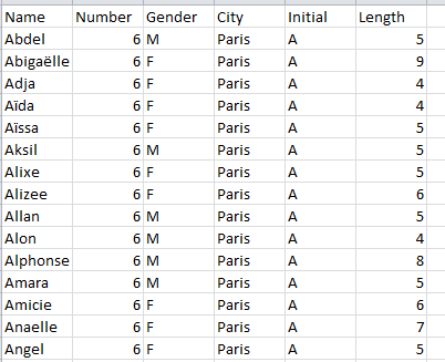
But let’s work with what we have. Your data right now should track somewhere along these (grid)lines:
And that refinished data set cues a return to the question with which I closed out last week’s post. While our intent of course is to frame a series of comparisons between New York and Parisian names, the numbers as they stand simply don’t directly support any like-for-like valuations, simply because the New York data comprises 2.7 more births (as opposed to actual names – a point over which we need to loll a bit later) that those in the French capital. One could, one supposes, multiply each Paris record by the 2.7 differential and as such normalize their numbers, after a fashion; but force-feeding the data with that kind of virtual numeric parity would mar the presentation prohibitively, I think. Reminding readers that the New York birth totals emblazon the actual numbers, and at the same time begging their imaginative indulgence over the Paris figures throws too many balls in the air – particularly when the 2.7 multiplier sprays decimal points all through the Paris totals. Do we really want a reader to know that 869.4 Louises were born to Paris mothers in 2009? Some rhetorical questions were meant to be answered – and the answer to this one is: No.
What we can do, of course, is proportion the data, by fractioning say, the ratio of A-initialed names to the respective New York-Paris wholes. This too, normalizes the data, but after a different fashion. For example, we could try out this pivot table:
Row Labels: Initial
Column Labels: City
Values: Initial (again, by Count, and % of Column total)
Report Filter: Gender
I get:
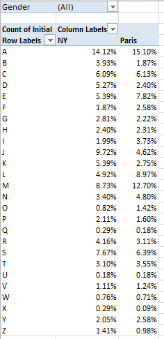
(N.B. One need only click the % of Column Total here option once. The NY and Paris values are exactly that – plural items or values in the selfsame City field; the two cities don’t stand alone as discrete fields.)
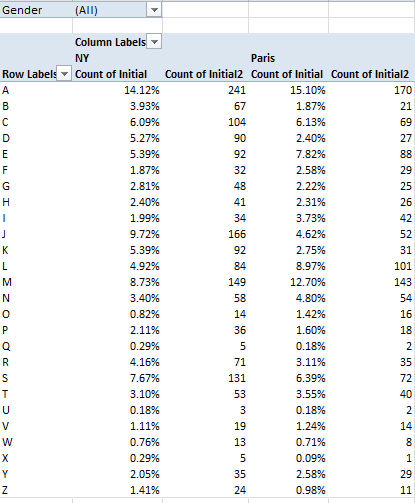
There are comparative differences in there (i.e., the J and M initials), but quite a few distributional resemblances, too. And if you’re wondering about the absolute numbers conducing toward these results, throw Initial into the Values area again and comply with the default Count operation:
And of course, all of the above could be filtered for gender, whose field is peopled by a data curiosity. Some of the Paris names have been spooked by the X factor – that letter having stolen into their Gender fields, presumably in virtue of some documentary/administrative complication. There are but five such names, however – Noha, Felicite, Keziah, Jessy, and Alexy, all of which are sufficiently indeterminate to beg the question of how gender is registered by the French.
Now we need to amplify an issue to which we earlier devoted a parenthetical aside. The name data before us can in fact be addressed in two modes: First, as a collocation of names, each considered a solitary, once-occurrent datum – the tack we’ve taken until now – or rather, as the sum of all the names borne by the babies born in 2009, a very different conceptual and numeric understanding. Thus by substituting the Number for the Initial field in the Values area for the above pivot table (and remaining here with the default Sum operation), you’ll realize this breakout:
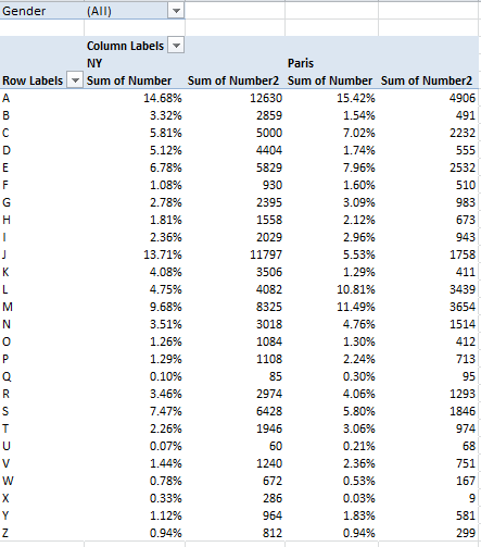
(Yes, feel free to rename the fields if you want to.)The numbers now are much larger, naturally, but by-and-large they jibe with the Initial Count data, and that’s probably none too surprising. And of course all of the above could be filtered by gender, once we look past the five Xs. Thus we see, for example, that a remarkable 19.26% of all New York males received a name beginning with J, even as that letter starts off but 5.16% of the girl names.
Now substitute Length for Number, summarize by average, and format to say, two decimal places (here you need only recruit Length once for the Values area):
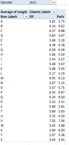
The variation is not stupendous, and overall New York names average 5.84 characters to Paris’ 5.78 – a virtual draw (note again, however, that these averages treat the names as one-time iterations, that is, as per the first method we described above. Resorting to the Plan B, in which the aggregate length for all names of all babies (i.e., name Number times Length, all totaled and broken out by each city, and divided by the Number total for each city) I wind up with a 5.89-5.69 New York Paris average name-length split. For the record, you can bring those results about via these expressions:
=SUMIF(D2:D2834,”NY”,G2:G2834)/SUMIF(D2:D2834,”NY”,B2:B2834)
=SUMIF(D2:G2834,”Paris”,G2:G2834)/SUMIF(D2:D2834,”Paris”,B2:B2834)
(Begging forgiveness, a detailing of the workings of the above with take us a digression too far here. But See, for example, this discussion: http://www.techonthenet.com/excel/formulas/sumif.php)
One additional finding that I, for one, attended with some surprise emerged from a simple question about the names shared by New York and Paris, i.e., how many names appear in both cities’ birth rosters? The answer can be pivot tabled thusly:
Row Labels: Name
Values: Name (Count)
And sorted descendingly by the Values column.
What interests us here, put simply, is the number of names evaluating to a count of 2 – meaning of course that these are the ones which find their way into the birth data of both cities. My pivot table counts 2360 individual names, of which only 446 – or about 18.9% – occurred to parents in both cities. I would have thought that the selection overlap, as it were, for these two Western countries would have canopied far more names. Anthropologists, I sense a post-doc opportunity in the making.
But these data also blow the whistle on two data quirks. A number of Paris names, e.g. Kevin, Sekou – appear twice in the original Open Data Paris download, and in association with the same gender (doubles dot the New Yorks data, too, but these are gender parsed). By the lights of pivot table protocols these redundant mentions are merely flesh wounds, because squeezing repeated instances of the same item into one, and only one, row or column label appearance is precisely what pivot tables are cut out to do. Still, the duplicated names – which were first brought to my attention by a student – are worth asking, or at least wondering about.
The other quirk is even quirkier. When I ran the above names-shared pivot table, its upper tier read as follows:
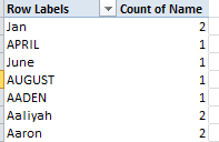
Now, pivot tables should immediately sort Row and Column Label entries; but the first four labels above clearly aren’t defaulting. I’ll admit to a thick, initial measure of puzzlement over these out-of-sorts entries, until the light bulb shined a few watts on me. Apart from qualifying as bona fide baby names, Jan, April, June, and April happen to populate Excel’s custom sort lists of the months and their three-lettered abbreviations (see File > Options > Advanced > the Edit Custom Lists button). As such, they’re indeed earmarked to rise to the top of any sort, at least by default (and note that the four month/names sort themselves in chronological order). But if you want the members of this quartet to assume their conventionally sorted place, initiate the pivot table via Insert > Pivot Table, and immediately thereafter click PivotTable Tools > PivotTable button group > Options > the Totals & Filters tab, and deselect Use Custom Lists when sorting.
But alright, mes amis; you’ve worked hard enough today – I’ll spring for the croissants.

Leave a comment