If health service provision is here, can the provision of data be far behind? That affirmatively-answered question comes to you from the UK’s National Health Service and corollary entities, and a great many of the holdings are columned and rowed, e.g.
http://www.england.nhs.uk/statistics/
http://www.hscic.gov.uk/searchcatalogue
http://www.ons.gov.uk/ons/taxonomy/index.html?nscl=Health+and+Social+Care
And among the many, you’ll find this workbook, compiling a series of counts of overnight bed occupancy numbers and rates across 226 hospitals nationwide:
Beds-Open-Overnight-Web_File-Final-Q1-2014-15-34655
Now in fact the book’s Area Team by Sector sheet appears to have done much of the analytical work for us, by aggregating the totals by what it calls Area Teams from the finer-grained NHS Trust by Sector sheet alongside of it, with “sector” presumably denoting the medical rubrics beneath which the bed figures gather: General & Acute, Learning Disabilities, Maternity, and Mental Illness. Aggregation there is, but the sheet’s geography suggests that attainment was spurred by some instrument other than a pivot table, and that’s fine, of course. Where does the Constitution of your or any other country mandate pivot tables upon its citizen data crunchers?
But there could be more. Apart from reconsidering the question advanced by last week’s post, the one asking what remains to be done with data that seem to have already been put through their paces, we’re yet left with the Occupied by Specialty sheet, breaking out the bed-occupancy numbers by 76 medical treatment categories. If you want to pivot-table that one, think about these emendatory matters:
- Blank row 17 must be deleted.
- As must the grand totals reaching across row16. Again, a totals data row masquerading as just another record will double any tabled results – and that’s just wrong; and affirming England in F16 as but another Org Name is likewise and self-evidently wrong, too.
- The data in Columns B and C – Year and Period – are identical throughout and hence superfluous, but as such inflict no actual impairment on the sheet and could simply be ignored. I’d delete them, though.
- Note the same-width speciality columns and their variably-spaced headings; the broken text wraps in the latter is a necessary consequence of the former. That’s a simple design complication, but if the concern is to promote parity among specialities through column equivalence the answers are none too forthcoming. A Scaled-down font would ultimately achieve a universatl heading fit, but will take its toll on legibility. Dilating columns to about 22 from their current 12 would smooth out the wrap-raised bumps, but users will have to do that much more scrolling across the sheet before they’ll be able to see it all.
- On a deeper level (and we’ve been here before, too): the specialities, each of which has been allotted a field all its own, should have been demoted to item status and made to stand beneath one all-subsuming field. Given the plurality of specialties it would be useful to be able to tick each one up and down a single Slicer – but you can’t, because Slicers slice through one field at a time:

76 specialities? You’ll need 76 Slicers.
And the transformative Alt-D, P recombination of fields into the desirable data set I detailed in my August 29, 2013 post won’t work here, because Alt-D, P will err on the side of a hyper-inclusiveness, investing only the left-most Year field with Row Label status and relegating all the other labelled fields into item status along with the specialties – and that won’t work. You don’t want Org Name to liken itself to Ophthalmology; one’s a bona fine Row/Column parameter, the other a proper Values-sited datum. Try it, if you don’t see what I mean.
- Click on any cell among the specialty data and it turns out the bulk of them drag a long train of decimals behind or before them. It is clear these numbers must have emerged from some spell of formulaic activity – they’re averages, after all, and they’ve simply been treated to a bit of presentational sprucing by rounding themselves off – kind of. Now click in any number-sporting cell and observe the format – Custom. Check into Number Format and you’ll see
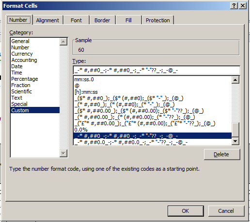
Now I have neither used nor understand that format yet, and I need to take it into the shop and probe its whys and wherefores, assuming it’s been used with all due number-managerial intent. But click in a number in the Area Team by Sector sheet and its number format reports Accounting instead I can’t account (no pun intended, but let’s go with it) for the disparity here, but it matters, and it matters in this way: Remember our numbers are really extended affairs, pulling across all those decimals, and if you Accounting-format them, throw them into a pivot table and group them, they’ll look something like this:

That is, the decimals overthrow their Accounting round-offs and burst into the pivot table as is, and it isn’t a pretty sight, and it can’t be reformatted, because Row Labels are labels and numeric-format resistant. But impose the Custom format above upon a set of values and they obediently group, as they do in Occupied by Specialty e.g.

But for other numbers in the workbook, Accounting-formatted grouping does happen, and for some other Custom-formatted values. it doesn’t. I’m duly puzzled, but has to be an explainable take on these several outcomes, but I don’t have it yet, and it requires a think-through; hope to get back to you on it shortly. But I’m on vacation now, and they tell me if I don’t take it now I can’t roll it over. Hope to see you in about two weeks.

Leave a comment