Archive | November, 2014

Eurostat Data: Some Footnotes and NUTs

30 Nov

Sorry to butt in in the middle of breakfast/lunch/dinner (tick one – I’m requesting your location just once, and my intentions are cookie-free), but allow me to ask: if a web site makes its data – the same data – available in both spreadsheet and PDF incarnations, what are we being told? It seems to me that the latter possibility speaks to the former; that is, the shipping of information into a read-only, do-not-touch mode suggests the other shipment is meant to be used.

One man’s opinion; and having so opined, I took my self-satisfied take on the matter to the data depot in the European Union’s Eurostat site, the statistical office for that far-flung association. There’s a lot of stuff in there; climb its tree structure and you’ll come away with all manner of facts and figures and nuts and bolts about member nations, a great deal of which (perhaps even all) clothe themselves in spreadsheet raiment. And again for seekers of alternatives, a good many of these parcels of stuff can come to you in PDF suit-ups too.

And so I shot an arrow into the air, and it came down upon this spreadsheet

Eurostat_Table_guest establishments

(It’s original name isn’t nearly as graceful)

and headed in row 1 “Number of establishments and bed-places by NUTS 2 regions”, that pun-evocative acronym abbreviating Nomenclature of territorial units for statistics (look here for more), a vocabulary for hierarchically tiering EU territories by are.

In fact the downloads offer themselves to us thusly:

 euro1

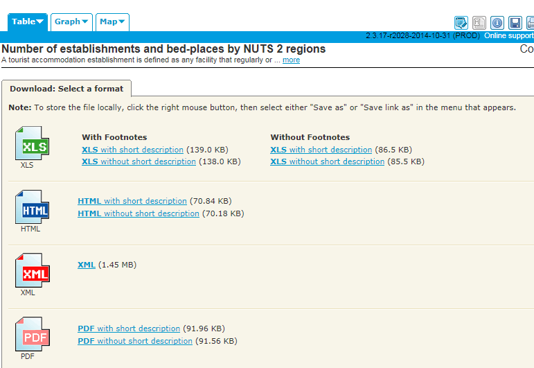
For starters, at least, I went for the XLS With Footnotes and short description, the workbook I’ve linked above.

Once you’ve auto-fit the columns (and as usual, the spreadsheet author hasn’t ) you’ll understand that rows 1 and 2 have to be pushed away from the data below with your true-blue blank row in between, as does 321, directly beneath the cell that among others names the Batman region (face it – you can’t help but admire my comedic restraint here). Next lower yourself into the data and think about the colons (e.g. row 139), that plant data-not-available markers all over the sheet. True, a replacement zero wouldn’t work here, representing as it would an authentic, quantified data point; but still, the labels are data weeds in a field otherwise marked out for values (and hold on to that thought).

But then there’s column C, and E, and G, and all those other empty corridors elbowing their way between the yearly numbers. Were these vacuities nothing but nothing, that is, airy space-makers between the data, we could simply delete them. But in fact the columns aren’t quite all empty, and have after all received a marching order. Remember my download asked for a workbook with footnotes somewhere in the workbook, even as I couldn’t quite fathom what that ask was going to deliver. It turns out that C, E, and G (I know; sounds like a major chord) and their compatriots have reserved their spaces for those very footnotes. Look for example at S130:S133 and their (u) entries; and if you look in turn back to what should now be row 322, its (u) explication, flagging a datum of low reliability, reads loud and clear.

And those largely but not wholly unattended footnote columns really mean well, because had the (u)s been made to cling to the values they footnote in their several cells, the value would  have regressed to a text standing as a result, and would have repelled their data-purporting charge. Thus the sheet designer has rightly put the footnote-labels in their place – a place at a decisive remove from the numbers to which they’re keyed, in a column all their own. And yet the colons, themselves footnoted in row 322 as well, punctuate the columns of the values, albeit in otherwise unoccupied cells.

But cavils aside, what is the analyst to do with those footnote-spattered columns? How, for example, can a pivot table look past those extraneous, heartily non-contributory soft spots in the data set, and succeed in doing something manageable with the whole potpourri?

I think it can, by doing something exceedingly simple. How about naming the footnote columns? Once named, the columns advertise themselves as bona fide fields, however sparse, which can be then be properly ignored by the pivot tabler who wants to study only the annual numbers in the year fields.

Simple indeed, but putting new fields into play won’t complete the assignment. You’ll still need to do something about the colons, and because they’re sprinkled among the data-toting year columns, that something won’t be our standard sort-them-to-the-bottom-and-jab-in-an-empty-row patch, a nice but futile try here that would continue to leave colons above the bottom of the data by which you sorted in many of the other columns, by which you hadn’t sorted. Better here, then, might be a find and replace, in which the colons could be overwritten by zeros. Those numeric replenishers would at least restore some numeric standing to the cells, and so qualifying the data to run through their quantitative paces, including some grouping activity. Again, however, the zeros won’t be entirely truth-telling, as the NUT in question will be understood to have no guesting places, when in fact we don’t really know if they do or not.

The larger question, then, is what we do with data of the NA kind, however labelled. Another alternative here, then: find the colons and replace with say, the number 1,000,000, sort the numbers ascendingly, and hammer in the blank row right there. That is, a prudent surrender. There isn’t much else you can do with records that don’t know what’s in their fields.

I also feel obliged here to return the discussion to the field-item disquisition I’ve conducted on these pages, and the analytically advisable demotion of the year fields to item status, all rounded up beneath one, grand field.

And the plea to fairness again obliges me to begin to close the circle and track back to Eurostat’s square-one download options. Had I downloaded the data Without footnotes, I would have spread this sheet before me instead (in excerpt):

euro2

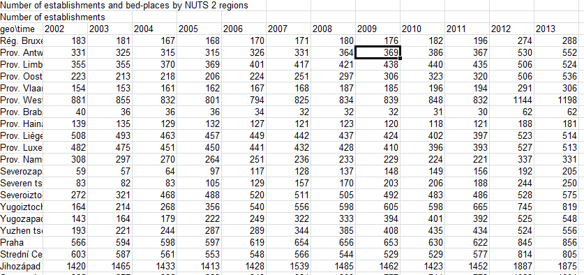
And that looks more like it, doesn’t it? But we still have those colons, don’t we?

But please – go back to breakfast/lunch/dinner. And sorry about the coffee spill  – dry cleaning should get it out. Don’t forget to bill me.

Territorial Imperative: The Data Behind the Map

21 Nov

Who was it that said a picture is worth a 1000 cells? I don’t know either, but while you word-search your Bartlett’s I’ll slip out the back door and tip toe to the DataShine site.

That’s where the exceedingly cool and protean map plotted by the University College London’s Oliver O’Brien and his associates shakes its booty of riches at you, the one that fixes in space the data points for all sorts of demographia about the United Kingdom population (sourced by the country’s 2011 census) – ethnicity, religion, modes of transport to work, educational, second homes outside the UK, the whole polymorphous, multi-regressed, information-rife, full whack of sociological goodies.

Just click through the options in the floating Data Chooser

 shine1

And observe the color coded (we might call it conditionally formatted) distributions splash across any one of ten UK cities; let your mouse roll atop the maps’ microscopic OAs, or Output Areas (“…the lowest geographical area at which census estimates are provided”, according to the page linked in this sentence) and watch the Key’s scaled percentages hip hop up and down its rungs (and view the fine-printed OA codes as you roll). All told, it’s one glorious depiction. Or many.

But grab the map, squeeze, and watch it crumple into a million rows and columns.  Shake it hard, and a torrent of spreadsheets showers out of that wad, each one keyed to parameter’s worth of data, each one as prosaic as the chart is brilliant.

For example, if I tune into Data Chooser > Housing > Number of Bedrooms > 3 Bedrooms, and proceed to click Data in the dialog box at the base of the map:

shine2


(and it’s here too where you get to identify the city to be mapped, say London for example’s sake)


This workbook (in excerpt) unpacks before you:

shine3

Leaving aside the perennial column-auto-fit  issue, the sheet names the pertinent OAs, their superordinate Local Authority and region, and in this case, two coded references, QS411EW0005 and QS411EW0005 (base). These count the number of three-bedroom households and all homes (I’m assuming the base denotes homes here, and not residents) respectively, culminating in the OA Percentage  – in a manner of speaking.  The numbers in OA Percentage don’t attest a simple division of the coded data by their base, because they’re integers, an order of magnitude 100 times larger than authentic percentages; and that would at least matter were an analyst to format the values in Percentage terms.

And so on. Any click upon any parameter and its specified value (i.e., 3-bedroom), and a follow-on click Data does much the same. We see then that the Datashine map(s), if you will excuse this bit of reductive sophistry, “really” comprise the additive magic of a legion of homely spreadsheets. Put otherwise, the tables give rise to the tableaus (I’m sorry – I like that).

Of course I’ve stretched the point, and probably until the rubber band has snapped. Of course the maps are hardly “nothing but” their foundational workbooks, but the arrow of dependency between workbook and map is nothing if not striking. The spectacular, emergent cartography of the Datashine maps flowers atop the grittiest topsoil, and indispensably so.

But of course the comparative dimensionalties of map and sheet suggest different functionalities. You can’t simultaneously map, say, all of London’s ethnicities by AO, at least not without resorting to a round of implausible histrionics I can’t even imagine performing. To frame the challenge more universally, I don’t think you can map multiple items of the same parameter at the same time. You could, however, map the numbers of Sikhs who own three-bedroom houses and bicycle to work – i.e. one item each of several parameters – once you generate a sheet that lifts those items, and just those items, from the Ethnicity, home ownership, and mode-of-transportation data sets.

But a spreadsheet could crosstab all ethnicities by any and all AOs, apart from the technical trammels laid upon the data by the 1,000,000+ record limit. Indeed, were it operationally possible to columnize the data for every variable for every census respondent – and given London’s population it isn’t – you could break out any variable by any other one, by pivot tabling them and returning breakouts by every item in any field you choose. But that at-least-conceivable swoop across the data simply can’t be imagined by a map, unless I’m missing something.

Certainly a single mapped data point could capture the variable magnitudes of two fields in tandem. For example, the stirring MIT Senselab viz Trains of Data/Trains in Time viz of French train activity across a day’s worth of traffic batches both punctuality and passenger capacity numbers in each point, by color-coding timeliness and registering capacity by point size:

 shine4

But the Data Shine maps can’t get with that program, because their data points are coterminous with fixed territories – the Output Areas. Resizing the points isn’t an option, not if the map wants to hold its shape beneath each and every parameter hueing atop it.

So what’s the punchline, then? Simple (alright – maybe even too simple): Sometimes you need a great map, and sometimes you need a great spreadsheet. It’s just that you can’t have the former without the latter.

Paris’ Budget Participatif: Voici le Data, Part 2

16 Nov

6,200 discrepancies can get to a guy, particularly the 6,200 uncommonly literate zero-year-olds who seem to have crept past the examiners for the Budget Paticipatif vote and had their pudgy-fingered clicks duly recorded.

OK – that diapered constituency couldn’t have done what we’ve been told they did, but how the misidentifications could be understood makes for one very good question.

Remember first of all that the peculiarly plural character of the Budget vote, in which citizens were perfectly free to vote on up to five projects – militates against a straightforward demographic summary of the actual individuals who took part in the referendum. We’ve seen this problem before, but because the same individuals with the same ids could have, and did, call upon the data one to five times variably weights their presence. And that means, for example, that any intention to learn how many discrete, voting Parisians live in the 18th Arrondissement (district) suffers from an undue complication, because Pierre from the 18th may have voted for 5 projects, even as his neighbor Amelie may have elected to ratify but three. (For a graphically-driven look at individual votes look here.)

That’s one issue, along with those zeros. First, if you peel away the now-blank row 97750 and reunite the zero records with the pack and strike up a pivot table comprising exactly one field:

Row Labels: id

You will have done what Row Labels were designed to do – enumerate unique instances of each id/voter, of which I get 24001. Now roll age into Row Labels, too, sign off on the Tabular form, and stanch its subtotals (these decisions are motivated by Tabular’s collinear effect, which levell super and subordinate labels along the same row. You also don’t really need any Grand Totals here either). The new count: 24028 rows – and that means that 27 voters have something more than dual citizenship – they have dual ages, and I’ve lost the number of my local relativity theorist.

But seriously, folks, that means 27 voters incurred a second age assignment somewhere among their one to five votes. Considered in their numeric relation to all voters, the error-bearers amount to barely, and merely, one-tenth of a percent of the electorate, and statistically speaking that’s not bad. And what that also apparently means is that all the other zero-aged voters – about 1,400, according to my stress- testing of the numbers – received only zeros across all their votes.

And so while the error-trapping yield above is scant, we might as well do something to restore those 27 multi-aged participants to the unitary value they deserve. Start by lifting Age over the great divide and settling it into the Values area, and moving to summarize the numbers therein by Max. That decision puts every voter ID in touch with his/her “largest” age, i.e. it defines the 27 by their non-zero, actual age. Then select the entire pivot table (PivotTable Tools > Options > Actions > Select > Entire PivotTable) and name the whole thing Ages.

Then click back to the source data and in F2, or the free cell hard by the first record and enter

=VLOOKUP(A2, Ages,2,FALSE)

Then copy down F (note: if your computer’s like mine, all that processing take some time). That expression matches each id in the data source with its twin in the pivot table (now operating under that Ages range name); and hence the 27 ids with zeros somewhere among their several records should experience a replacement of  those ciphers with the maximum value associated with those ids – that is, their apparently real age. Then Copy > Paste Special > Values the F results onto the corresponding entries in E (the age field), and delete the VLOOKUPs, their work having been completed. Then sort the data by age, again Largest to Smallest, and the zero-aged cells now debut at row 97792 – a felicitous demotion, as it were. In other words, we’ve refit some of the ages.

Now in fact the row numbers mean we’ve added authentic ages to 42 records, then, even as we earlier counted 27 ids suffering from that zero imputation. The answer – on assumes – is that some of those 27 had more than one zero among their multiple votes. Now you can reinstitute that blank row to send the recalcitrant zero records packing – but the row goes above 97792.

But of course we’re still left with the 455 voters falling, or crawling, somewhere between the ages of one and ten. Are they any more genuine than the zeros? I don’t know, but if you throw a pivot table at the question:

Row Labels: age (grouped in bins of ten years, for example)

Column labels: projets

Values: project (Count)

You’ll see that these petite partisans allotted greatest support to the Rendre la rue aux enfants project (approved, by the way), an idea for cordoning off play streets for the younger set, and the Cultiver dans les Ecoles educational initiative for school-based gardens. A savvy – and self-interested group. The implication, then: perhaps those ages are for real. Just implying, you understand. And as for you, Francois Hollande: keep an eye on them. Don’t say you haven’t been warned.

Paris’ Budget Participatif Vote: Voici le Data, Part 1

6 Nov

Vote early and often, the wags advise, their hard-bitten bromide borne of the storied, dodgy business conducted in certain American electoral districts. But it seems as if some jurisdictions actually promote the one-person-multiple-vote equation, and for the common good besides; witness the recent Paris’ Budget Participatif (for some unaccountable reason the web site is in French), a referendum on budget allocations to a range of projects conducted both online and in hard-copy mode (they used to call those ballots), in the week endpointed by September 24 to October 1 (ok, that’s eight days, but who’s counting?). And among other niceties, each Parisian was duly enfranchised to vote for up to five projects, the numbers from the online segment recorded on the Paris Open Data site and brought to you here:

 Budget participatif

Democracy is a messy business, and by fitting corollary perhaps, the workbook’s 104,000 votes (out of a grand total of 174,090) aren’t completely tidy either (remember that the workbook reports the online votes only). Sort the age field Smallest to Largest and a spray of negative numbers douses the top of the column, and the existential impossibility they portend needs to set aright. But those minus signs are simply errors attaching to the voters’ actual age (as confirmed to me by Paris Open Data); and because they are I’d jump into the unattended cell in F2 and pencil in the ABS function:

=ABS(E2)

Excel tells us that ABS “Returns the absolute value of a number, a number without its sign”, which sounds good enough to me, restoring as it does the putative negative ages to their intended, usable positive state. Copy the ABS down F, follow with a Copy> Paste Value > Values into and down E, and then delete all those ABSes, if that isn’t too ungrateful.

But one repair doesn’t fit all. Sort the ages again, this time by largest to smallest, and take note of the 6,200 or so voters aged zero, all too happy to add their squeaky sonorities to the vox populi. These clear and present mistakes give us literally nothing to go on, and because they do I’d bail out, by scampering to row 97750 and preparing to inlay the trusty blank row that’ll hold those these pretenders at arm’s length from the ranks of the usable. But redirect your glance just a mite upward and view the 19 votes cast by one-year olds, and the 352 more registered by a precocious electorate ranging from two to nine. Remember that Budget Participatif imposed no age limit on its potential constituents, and so apparently nothing could have detained these jejune activists from the process, unless it was past their bedtime. Absent verification of these junior politicos from the powers that be – and I’ve sought it – I’d provisionally aim that blank row right instead above 97374, where the nine-year-olds give way to the tens (again we’re assuming the ages have been sorted highest to lowest). Is that drawling line arbitrary? A bit, but I’m separating those records, not deleting them; if events warrant I’ll be happy to bring them back into the fold.

Have completed those prefatory chores we can buckle up take the data out for a spin. Start with something simple, say a pivot table that breaks turnout figures by the referendum’s eight dates:

Row Labels: date_de_vote

Values: date_de_vote

date_de_vote (again, this time via Show Values As > % of Column Total)

I get:

vote1


(Note: Your machine’s regional time format may trend the row-label chronology differently. My US format pushed 1/10/2014 to the top of the labels for starters, presumably treating October 1 as January 10.By right-clicking the date and selecting Move > Move “1/10/2014” to end, I succeeded in reassigning it to its rightful place.)

What’s noteworthy here is the voter shortfall for September 26 and 27, a Friday and Saturday respectively. Remember these are internet votes, an electoral medium whose greased access route to its virtual polling place should have flattened any and all daily variation in turnout. Not so, apparently; perhaps it was the Parisian fondness for le Weekend that succeeded in distracting the collective attention away from all things political for those couple of days (on the other hand, the participatory peak in the referendum’s final two days may attest a procrastinators’ late dash to their screens).

We can next take an age-graded look at the results by lining up average voter age by project preference, something like

Row Labels: projets

Values: age (by Average, formatted to two decimals, and sorted Largest to Smallest)

age (again, by Count)

 vote2

Don’t, first of all, be flummoxed by the Count of Age heading, which in fact delivers the vote count for each project, and merely grabs onto the age data as a device for aligning the votes with their project (In fact any field could have served the same end and posted identical totals; think about what is, after all, a standard pivot table tack). But I was authentically surprised by what appear to be the meaningful associations between the projects and the average age of their sectaries.

Les Evenements Sur Grand Ecrans (Google-translated as Events on the Big Screen), a (losing) proposal to boom important events to the multitudes on a giant screen in a public space, captivated the youngest average cohort, even as Musees parisiens 3.0, i.e. an digital hoard of the holdings of fourteen city museums and another idea whose time hadn’t come, piqued a demographic more than 6.5 years older. As both failed ideas seem to have belonged to the more-or-less hi-tech species, the dissonance in age between them becomes all the more curious.

But vive la differences, or something like that.