Who was it that said a picture is worth a 1000 cells? I don’t know either, but while you word-search your Bartlett’s I’ll slip out the back door and tip toe to the DataShine site.
That’s where the exceedingly cool and protean map plotted by the University College London’s Oliver O’Brien and his associates shakes its booty of riches at you, the one that fixes in space the data points for all sorts of demographia about the United Kingdom population (sourced by the country’s 2011 census) – ethnicity, religion, modes of transport to work, educational, second homes outside the UK, the whole polymorphous, multi-regressed, information-rife, full whack of sociological goodies.
Just click through the options in the floating Data Chooser
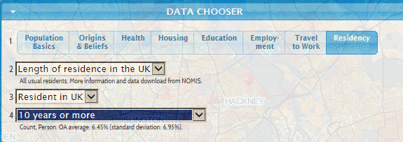
And observe the color coded (we might call it conditionally formatted) distributions splash across any one of ten UK cities; let your mouse roll atop the maps’ microscopic OAs, or Output Areas (“…the lowest geographical area at which census estimates are provided”, according to the page linked in this sentence) and watch the Key’s scaled percentages hip hop up and down its rungs (and view the fine-printed OA codes as you roll). All told, it’s one glorious depiction. Or many.
But grab the map, squeeze, and watch it crumple into a million rows and columns. Shake it hard, and a torrent of spreadsheets showers out of that wad, each one keyed to parameter’s worth of data, each one as prosaic as the chart is brilliant.
For example, if I tune into Data Chooser > Housing > Number of Bedrooms > 3 Bedrooms, and proceed to click Data in the dialog box at the base of the map:
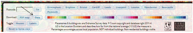
(and it’s here too where you get to identify the city to be mapped, say London for example’s sake)
This workbook (in excerpt) unpacks before you:
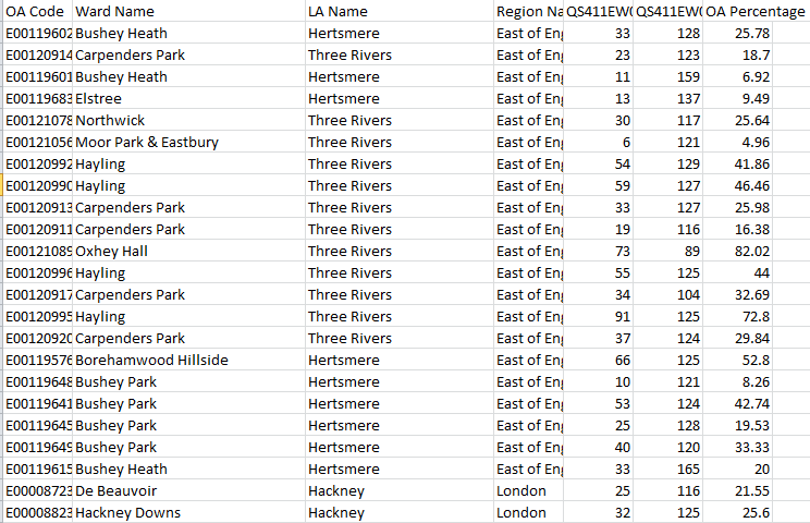
Leaving aside the perennial column-auto-fit issue, the sheet names the pertinent OAs, their superordinate Local Authority and region, and in this case, two coded references, QS411EW0005 and QS411EW0005 (base). These count the number of three-bedroom households and all homes (I’m assuming the base denotes homes here, and not residents) respectively, culminating in the OA Percentage – in a manner of speaking. The numbers in OA Percentage don’t attest a simple division of the coded data by their base, because they’re integers, an order of magnitude 100 times larger than authentic percentages; and that would at least matter were an analyst to format the values in Percentage terms.
And so on. Any click upon any parameter and its specified value (i.e., 3-bedroom), and a follow-on click Data does much the same. We see then that the Datashine map(s), if you will excuse this bit of reductive sophistry, “really” comprise the additive magic of a legion of homely spreadsheets. Put otherwise, the tables give rise to the tableaus (I’m sorry – I like that).
Of course I’ve stretched the point, and probably until the rubber band has snapped. Of course the maps are hardly “nothing but” their foundational workbooks, but the arrow of dependency between workbook and map is nothing if not striking. The spectacular, emergent cartography of the Datashine maps flowers atop the grittiest topsoil, and indispensably so.
But of course the comparative dimensionalties of map and sheet suggest different functionalities. You can’t simultaneously map, say, all of London’s ethnicities by AO, at least not without resorting to a round of implausible histrionics I can’t even imagine performing. To frame the challenge more universally, I don’t think you can map multiple items of the same parameter at the same time. You could, however, map the numbers of Sikhs who own three-bedroom houses and bicycle to work – i.e. one item each of several parameters – once you generate a sheet that lifts those items, and just those items, from the Ethnicity, home ownership, and mode-of-transportation data sets.
But a spreadsheet could crosstab all ethnicities by any and all AOs, apart from the technical trammels laid upon the data by the 1,000,000+ record limit. Indeed, were it operationally possible to columnize the data for every variable for every census respondent – and given London’s population it isn’t – you could break out any variable by any other one, by pivot tabling them and returning breakouts by every item in any field you choose. But that at-least-conceivable swoop across the data simply can’t be imagined by a map, unless I’m missing something.
Certainly a single mapped data point could capture the variable magnitudes of two fields in tandem. For example, the stirring MIT Senselab viz Trains of Data/Trains in Time viz of French train activity across a day’s worth of traffic batches both punctuality and passenger capacity numbers in each point, by color-coding timeliness and registering capacity by point size:

But the Data Shine maps can’t get with that program, because their data points are coterminous with fixed territories – the Output Areas. Resizing the points isn’t an option, not if the map wants to hold its shape beneath each and every parameter hueing atop it.
So what’s the punchline, then? Simple (alright – maybe even too simple): Sometimes you need a great map, and sometimes you need a great spreadsheet. It’s just that you can’t have the former without the latter.

Leave a comment