Shopping for spreadsheets? If you’re in the neighborhood, poke through the inventory at the Organization for Economic Co-ordination and Development, acronymized OECD, you’ll be happy to know. We’ve been here before, on July 25 to be exact; but I told you it’s a large inventory.
In fact there appear to be several points of ingress to the holdings, but here’s one
a self-described Public Beta page that enables you to “Find core datasets in the data warehouse and make your own tables and charts in OECD Stat Extracts”, a triflingly ambiguous inducement, appearing as it does to conflate the term “datasets” and the “Database” informing the title atop the quoted passage, but again, that’s a trifle. More to the point is the availability of the data in either unmediated spreadsheet form, or downloadable as such via an Export button.
In any case one such set, a brief of statistics on asylum seekers to OECD circa 2013, seized the attention of the Guardian’s datablog (note that site’s redesign, and the disappearance of its erstwhile Data link from its home page), and is the one I think I’ve managed to capture here -even as the OECD heads its source page Stacks and flows of immigrants, 2002-2012 and so seems to have made off with a year (I’ve also retitled the workbook, overwriting its long, number-beset native name):
Inflows of Asylum seekers in OECD members and the Russian Federation
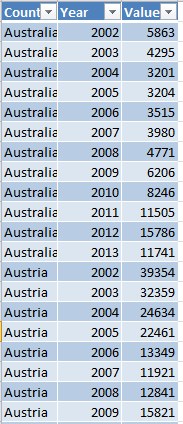
A first view of the sheet exposes it in Page Break Preview, a perspective on the data that won’t particularly advantage the analyst, and so you’ll want to make your way back to the standard Normal View. Moreover, the recourse toward the Freeze Panes selection at the columnar intersection of A and B seems puzzlingly needless, as the sheet bares all its numbers and country names immediately. I’d unfreeze the panes right away, even as I continue to wonder about the dictionary form which Microsoft mines its verbs. What would your teacher say about unfreeze? In addition, the missing field header in column A needs to be supplied.
Note, on the other hand, the proper distancing of both the sheet’s title and its yearly grand totals from the body of the data with the expedient of choice, the blank rows. But at the same time recall the OECD’s invitation to its visitors to “Find core datasets…and make your own charts and tables…”. Again, our sheet assigns its yearly data to one field per year, when in fact all the years and their associated numbers would more profitably be reined into greater, subsuming fields. Not this, then:

Butt again, this:
(For a straightforward review of the means toward the above transformation over and above what I’ve said about it, look here.)
The companion question, then, is what plans the OECD have for the data once they hand them over to us. True, the workbook’s as-it-stands configuration does happily supports a round of charting, but less certain are the data’s congeniality to making “your own tables”. Once, however, the information fills the pared-parameter shape assumed by the second of the above screen shots, the prospects for this kind of pivot table loom a lot larger:
Row Labels: Country
Column Labels: Year
Values: Values
Now this facile breakout of the asylum numbers by year is ready to happen, because all the years share the same Year field as an item. Try the above pivot table that when the each and every year occupies a field to itself.
But hold on. When the pontificating is done, my self-assured amelioration cooks up nothing but precisely the worksheet that already presents itself at the point of download:
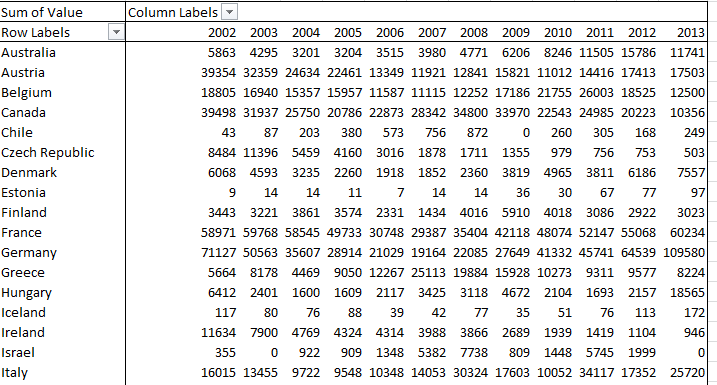
Same numbers, same juxtaposition of fields. So what was my point?
That’s a sweat-inducingly good question. But once all those years and their concomitant data recuse themselves from fields into items you can also treat the values to the % of Row Total styling, and learn, for example, that 30.88% of Turkey’s asylum seekers during the 2002-13 interval made their way to that country in 2013 alone, a clear attestation of the Syrian conflict’s scattering effect upon its populace. Less obvious is Hungary’s 2013 percentage of 37.22 of all the seekers it received across the 12 years, a skew I can’t yet explain.
Now consider this OECD book, counting member populations by their residents’ country of origin:
Compare that far larger dataset’s field structure with that of the one above, e.g.

That’s really more like it, even if the data themselves could stand some clarification (I’d bang out a lookup table that would return country names in full, and the data are available on the OECD site in a PDF for doing so. Is AUS, after all, Austria or Australia?).
And these variously-structured workbooks drag one ore question into the fray: why should some OEDC workbooks be stitched along this, or that, pattern of design – fields as items, or items as fields? I don’t know, that answer; nor do I know if the OEDC has endeavored to think about it.
But I’ll be happy to think about it, folks. Here’ – I’ve attached my business card.

Leave a comment