Archive | July, 2015

ATP Tennis Rankings, Part 2: Some Baseline Data

27 Jul

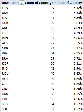
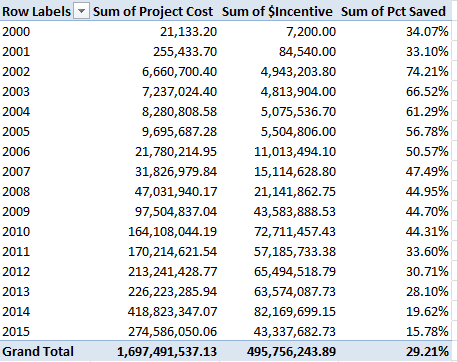
Now that we’ve established the fact of the relative French hegemony over the men’s rankings a breakout of said parameter would appear to be in order, that is, something like this:

Row Labels: Rank (Grouped in bins of 100; needless to say you can demarcate these as you wish)

Values: Rank (Count)

Slicer (or Report Filter): Country

Slicing for France I get:

atp1

It must be the wine. With 40 players in the top 400 – and the US has 30, by way of comparison – France is doing something right, and by turning the values over into Show Values As > Running Total mode (Rank serves as the Base Field) you’ll see

atp2

That is, the top-ranked half reaching through 1100 counts 96 Frenchmen, or 69% of their total, a favorably top-heavy distribution. The equivalent US proportion stands at 53%.

Now of course there’s another variable we’ve neglected till now – Age, which should have some notable things to say about who’s ranked where. First, I’d calculate age by posting the TODAY() function in some unoccupied cell, say L1, and range-name it, with all due sparseness, t. Then name E1 Age and enter, in E2, =(t-d2)/365.25.

That expression, which we’ve seen before, subtracts the player’s birthdate – a number, after all, when all the formatting is said and done – from today’s date, whenever that day may fall, and divides the difference by 365.25, or the near-average length of a year.

But note that 17 players report no birthdate, and so by sorting the ages Oldest to Newest we’ll drop those empty readings to the bottom of the dataset, wherein we can ask our perennial blank row to shove the vacancies from the date-bearing records.

Rounding the results to two decimals, we can begin by pivot-tabling a breakout of average age by grouped rankings, here with the presently usable range (through row 2150) e.g.:

Row Labels: Rank (again, Grouped by 100)

Values: Age (Average). I get

atp3

And that, I would contend, is interesting. Top 100 rankers are the oldest, their 28.79 years exceeding by 1.6 years the penultimate average of 27.19, which happens figure in the very next tranche of 101-200. Indeed, that 28.79 betters the overall men’s average by 4.74 years, not a trifling disparity, and doubtless a meaningful one.

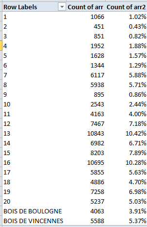
Next, a simple frequency distribution of ages across the rankings would be correlatively valuable, but it isn’t that simple. Start here:

Row Labels: Age

Values: Age (Count)

It’s when we try to group the ages – and I want to organize them in units of one year – that the problems fly off our racket:

atp4

Now we ran into the extended-decimal problem some time ago, having alleviated that unsightly tableau courtesy of a consultation with Debra Dalgleish (sorry for misspelling your name last week, Debra). All we need do is delete the number’s decimal portion

atp5

and proceed, or so we’d like to think. But when we click OK we see

atp6

That is, the “By 1” entry in the above dialog box is all-too literal, squeezing the ages into tufts of two years, describing an interval of one year. But I want each year stand-alone, and decoupled from any companion age. And that is a perfectly standard stratagem, one in fact that could be engineered quite swimmingly without any grouping at all under “normal” circumstances – that is, were the data-set ages decimal-free at the outset. But because our field’s ages are now precise to a fault, we need to rewrite E2 thusly:

=ROUND((t-D2)/365.25,0))

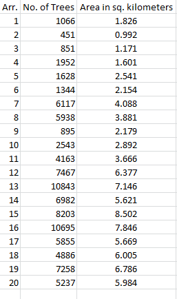
thereby flattening Novak Djokovic’s 28.18 years into an uncomplicated, but real 28.00 (i.e., that is a meaningful 28, not a format-tinctured 28.18). Copy down the column, and refresh the table. Now I get (ages sorted youngest to oldest):

Flip the numbers over into % of Column Total and throw in Rank (Average, two decimals) in Values and

atp7

21 is the modal age, but with an average ranking of 1265.73 that cohort has yet to hit its stride. Note 28’s 719.32, but check out the even lower rankings for 30 and 31, numbering 68 and 40 players respectively. And the 34 34s score even better.

You may also be intrigued by the one 48-year-old urging himself upon the rankings, instated at 1716. That demographic belongs to the Israeli/American Oren Montevassel, who as of this writing sits at 1727 (remember our data take us back to December of last year). His Twitter account states its owner is “…considered best player in the world for 40+”, and that judgment may be wholly justified.

In fact, 125 players shared the 1716 ranking, presumably because it amounts to just a few tournament rating points. And to that stratum also belongs the rankings’ youngest entrant, the Italian Nicolas Merzetti, who with a birth certificate (it’s been translated for me) dated October 29, 1999 is less than a third of Montevassel’s age.

Hey ATP – where’s your publicity department? Why aren’t these two guys paired in a doubles team?

ATP Tennis Rankings, Part 1: Some Baseline Data

20 Jul

DalYou may not need or want to know that you’re the world’s 1572nd best plyer of your favorite trade, but tennis plyers, er, players, can’t help but be reminded of precisely where they stand among their peers, and all the time at that. It’s the rankings, those invidious markers of professional worth that want you to know just how many of your fellow practitioners out there do your job better than you do; and the Tennis Abstracts site ranks 2100+ male players on the Association of Tennis Professionals (ATP) tour for your interest, consideration, and analysis (I don’t see an equivalent compendium for the woman’s tour, by the way, though other sorts of listings for them are on the site). You can check it out in standard spreadsheet form courtesy of yours truly here:

 ATP Men’s Tennis Rankings

The data set comprises exactly four fields, one of which – the player names – doesn’t really have that much to add to the inquiry, though I wouldn’t I delete it. But those three other fields nevertheless suffice to speak instructively about the rankings.

First, a necessary qualification: we need to recognize that, with its December, 2014 timestamp, the rankings – which naturally oscillate with every tournament – aren’t absolutely to-the-minute, an imperfection that is real and should be rued. You’ll happen upon a timelier arraying here at the ATP web site, but its currency is frittered away by the site’s poorer data organization: the players come to screen in blocks of only 100 at a time, and their country codes have been supplanted by text-less national flag icons, which don’t copy-and-paste very well at all, if at all. And that means you have to know your flags.

Shortcomings duly recorded, we can return to our data and attempt a breakout of ranked players by country, an obvious but need-to-know kind of metric. And here too another problem of sorts sprays molasses into the gears: those aren’t flags in there, but I can’t always tell which country is referenced by which three-letter code. It took me a round of Googling, for example, before I persuaded myself that MNE means Montenegro, BIH stands for Bosnia-Herzegovina, and MAR is, naturally, Morocco (ok – it’s Maroc in French; look here for some global clarifications). And CHI is Chile, not China; that latter country is signified by CHN.

But once you get past that international complication this straightforward pivot table beckons:

Row Labels: Country

Values: Country (Count)

Country (again, here % of Column Total). Sort by either Count of Country values, largest to smallest. I get in excerpt:

 rank1

Quelle surprise. I would not have anticipated France’s superior representation, or Italy’s third-place showing but I’m a duffer; followers in the know may find their expectations wholly fulfilled.

But what about the countries’ numbers and their players’ average rankings (whereby lower is better)? Let’s slide Country into Values, summarizing by Average and formatting to two decimals, e.g.:

rank2

Leaving existing sort order in place, we again find the French among the higher achievers. Remember that with 2166 players populating the ratings, the average across that total comes to 1033.5; and so an evaluation of 844.46 – 189 places above the average – spread across 139 Frenchmen, is no small attainment (note that some players with equivalent, overall tournament point totals will share a ranking. Thus if two players are ranked 83, the next player down the pecking order receives an 85).

The problem of course is that the average reported above won’t directly reconcile absolute country totals with the calculation. We see, for example, that Czechoslovokia ‘s average 799.78 rank outpaces France’s appreciably, but it’s gotten there with but 40 players – and that disparity seems to shortchange the latter country. Thus it seems to me that dividing a country’s number of ranked players by its average rating – again, in which lower is better – would realize a truer measure of the national standings. Not perfectly true, perhaps, but truer.

That alternative would appear to call for a calculated pivot table field, something like this:

rank3

But that won’t work at all, in part because, to quote Excel boffin Debra Dalgliesh:

“A calculated field always uses the SUM of other values, even if those values are displayed with another function, such as COUNT.”

You may want to think about that caution – I know I need to –but either way, you can’t build a calculated field atop a set of counted values – and country names can only be counted. The way in to a solution then, would return us to the data set itself, to which we need to strap in another field, which I’ll call Country Count, presumably in column E. I’d then select all the country data in C2:C2167, name that range country, and in E2 enter:

=COUNTIF(country,C2)

and copy down E, even as you blunt the values’ two decimals if you see them. As advertised, the COUNTIF totals respective incidences of each country name, and don’t be bothered by the fact that the total won’t vary among countrymen down the column. For example, the appropriate E cell for each French player will return 139, but that redundancy will be attended to by the ensuing pivot table, which should assume this shape:

Row Labels: Country

And it’s here where we devise the calculated field, which I’m calling AdjustedRank, e.g.:

rank4

Click OK and sort by AdjustedRank, Largest to Smallest (here I’ve formatted the results to six decimals):

rank5

That’s a bit more like it, I think. Compare France’s adjusted rank with Czechoslovakia’s; now, in spite of the latter’s more impressive average rank, France’s greater player numbers overwhelm that advantage commensurately, at least more or less.

I’m hedging because, taken to its limiting case, my new field begins to cause itself problems. 21 countries contributed exactly one player to the rankings; if one of those players, for illustration’s sake, were rated number one, my little equation:

=Country count/Average ranking

Would yield 1, and so would embarrass France’s real-world, table-topping .164602. That scenario isn’t unimaginable, either, and so the above fraction might have to be returned to the shop for a rethink, the better to properly mathematize all contingencies.

OK, so my calculated field isn’t irreproachable. But I ask you: can 139 Frenchmen be wrong?

Watt’s Up With New York State’s Solar Power Program

13 Jul

Don’t confuse New York State with New York City; the former subsumes the latter, though imperious residents of the latter will probably tell you the subsuming goes the other way. But either way, don’t confuse the New York City’s open data site – to which we’ve travelled any number of times – with the State’s site, a novel stop-over for us, in which I scrolled my way into the euphonious

Statewide_200W_or_less_Residential_Non-Residential_Solar_Photovoltaic_Incentive_Program_Map_Beginning_2000 workbook, whose title balloons my word count by exactly one (blame the underscores).

All of which you can get here.

(You’ll note by the way that the site brings the data to our attention in the first instance in map form; nevertheless, a click of the blue Export button will repackage these into what the site call a static spreadsheet.)

The workbook tracks installations for solar energy-saving equipment, or photovoltaic (PV) systems, (detailed here, I think), but learning more about the data and the activity they detail will require some extra-worksheet due diligence. Click the unassumingly small right-pointing arrow beneath the data’s title on the open data site and you’ll bring out;

watt1

That legend is a mite clearer on the site itself, but only a mite.  If you’re looking for more, and click the right-of-the-screen’s About link, this legend emerges:

watt2

That is, it’s the same content we saw in the first screen shot (trust me). I also had to look elsewhere to learn something about PV inverters, modules, and nameplates, elements that figure in data set fields, and which aren’t denoted in the workbook.

In any case, the data themselves look pretty good, a reliable virtue of US-based open data sets. Once you perform the customary column auto-fits you’ll probably want to rid the workbook of the undifferentiating State field in the D column, whose 32,670 rows contain 32,670 entries for NY. (I’d also loosen the wrapped text in the Location 1 field). Once you’ve gotten that far the data should be in line for some – ahem – illuminating, if not electrifying, finds.

Start simply enough, for example, with a pivot-table breakout of installations by sector types:

Row Labels: Sector

Values: Sector (Count, befitting Sector’s text data)

Sector (again, by % of Column Total).

I get

watt3

The numbers are clear, though I don’t know what ultimately distinguishes a Commercial from an Industrial site. In any case residential installations dominate the mix, not terribly surprisingly.

Next, an enumeration of installations by year could inform us as well:

Row Labels: Date Install (grouped by Year)

Values: Date Install (Count)

Date Install (again by % of Column Total; and you won’t need Grand Totals here)

watt4

Remember that the 2015 data extend only through May 31 (effectively the 29th, the date of the last recorded installation) and thus augur a record year, one much in keeping with the definitive upward installation arc drawn across the data. On the other hand, one needs to key those 32,000 installations to a statewide population of nearly 20 million; some inter-state comparisons might be in point here.

We could also ask about the average waiting time separating an application for a system and its date  of installation. Here we could easily enough poke our mouse into the next available column, head it Application Wait or something like it, format it in Number mode (sans decimals) and enter, in what should be T2,

=J2-I2+1

(If you’ve in fact deleted the D column and its endless NYs the above would read =I2-H2+1.)That 1 plays its part in quantifying an installation rolled out on the very day of its request, and there are (apparently) a few such models of promptitude in there. Absent the 1, these swiftly-appointed rounds would return a zero.

This pivot table then awaits:

Row Labels:  Date Install (again grouped by Year)

Values: Application Wait (Average, two decimals)

Application Wait (Count).

I get:

watt5

It seems clear that the one-day averages declared for all the installations effected in the program’s first five years serve a placeholder role, perhaps paving over absent or defective wait data. But note as well the ragged course of wait-time averages, strung below across a rudimentary pivot chart:

watt6

The spike in average waits in 2011 also dovetails with that year’s singular, backtracking installation totals. A story line, in there, perhaps? But note on the other hand the impressively speedy average for 2015 thus far, that for a year that foretells record installation demand.

And there’s at least one other interesting relationship to explore – the interaction between what the workbook calls Project Cost and $Incentive. I suspect – but cannot yet prove – that the installation savings signified by $Incentive sits atop the Project Cost denominator, so that an incentive of $1,190.00 on a Cost of $2,496.00 yields an effective installation charge of $1,306.00, or a 48% economy. The alternative understanding – whereby the $2,496.00 stands as the resultant of a savings of $1,190.00 applied to a $3,686.00 project – could be entertained, but I suspect the data mean to communicate the former.

Assuming for the next five minutes I’m correct, we could move to break out average incentive savings by year, once we do some thinking about the Cost numbers. If you sort Project Cost by Smallest to Largest the numbers bottom out in row 32,497, after which the next 174 rows set down no cost as all. And the cost figure in 32,497 – $9,532,080,102.00, for an installation in the town of Calverton in Suffolk county in Long Island – can’t be right, can it?  Its speck-like $4,144.90 incentive doesn’t remotely cohere with that monumental outlay, and because it doesn’t I’m imposing a blank row atop 32,497, thus beating back that big number along with all the missing project cost records.

Now we can pivot table the remaindered 32,495 data-bearing rows:

Row Labels: Date Install (again, grouped by Year)

Values: Project Cost (Sum)

$Incentive (Sum)

And in the interests of dividing summed Incentives by summed Project Costs to realize percentages, I’d piece together a simple calculated field:

 watt7

I get, once all our numbers get the formats they deserve:

 watt8

(Remember that you can retitle any and all the field headers.)

Now that, I would submit, is interesting. From 2002, when the numbers start getting big, incentive percentages slip every single year, and the slippage is big, too. Have these yearly contractions been itemized in some New York State agenda for the PV program, or is some other, less planful market vector tightening the screw?

I don’t know, but hey, story-seekers: are – ahem – any light bulbs going off?

A Tree Grows in Paris: Les Arbes d’Alignement, Part 2

6 Jul

Our nature walk through Paris’ 100,000 trees is about to get us somewhere, now that we seem to have completed the formulaic fix that should let us distill the arrondissement numbers from the locales in the Adresse field and free us to break out the tree totals by arrondissement:

=VALUE(MID(C2,FIND(” “,C2)+1,FIND(“E”,C2)-FIND(” “,C2)-1))

That expression is still good as far as it goes, but it has occurred to me since I last went to press that we might want to invite back the 10,000 bits of flora sown in the Bois de Boulogne and Bois de Vincennes, the ones we had separated from the greater pack of tree data because they had no arrondissements to report. Upon reflection, I’d allow we still could and probably should count them, and so by deleting the interposing row separating the forests from the tree we could amend the above formula thusly:

=IF(LEFT(C2,1)=”B”,LEFT(C2,FIND(“-“,C2)-2),VALUE(MID(C2,FIND(” “,C2)+1,FIND(“E”,C2)-FIND(” “,C2)-1)))

This extension to the existing formula poses a condition that asks: If an Adresse starts with the letter B -confirming a Bois adresse – then find the sequential position of its dash somewhere in its cell and subtract 2 from it, thus ordering the LEFT function to retrieve all the text segment exhibiting that length. For example – the “-” appears in the 18th position of cells featuring the Bois de Boulogne; thus we know that a 16-character LEFT extraction will return that name.

Once this new edition is copied down the now-enlarged Arr field we improvised last week our pivot table is duly posed for action:

Row Labels: Arr

Values: Arr (Count)

Arr (again, this time % of Column Total; dispense with Grand Totals)

I get:

Paristrees21

Again, I don’t know what pretensions to completeness the census entertains, but we see the Left Bank’s 13th and the posh 16th have set aside the largest spaces for their trees. The smallish totals for the two Bois entries may be wholly complete, but they furnish cause for us to wonder just the same. The figures also need to be calibrated to arrondissement size, or course; the inconsiderable totals for the 1st and 2nd do in fact scale to their pinched areas, for example. And a correlation is available, thanks to Wikipedia’s square-kilometer enumerations of the arrondissements:

paristrees22

Throwing Excel’s CORREL function at all the numbers, I get .927, a massive association suggesting that Paris’ urban designers strove ardently to smooth their tree distributions across the districts as per their size. (Note, however, that the Wikipedia listings pair two area figures for the 12th and 16th, the larger incorporating the Bois de Boulognes and Bois de Vincennes respectively. The above table displays the former, smaller area totals.)

And some causes for wonder abound in the Date Plantation field, too. We’ve already taken stock of the two-thirds of all putative date stamps in there that are in fact inactive text, nullities that I assume mean to tell the analyst that these are trees for which no planting dates are available, though they may also want to let us know that some of these in fact took root prior to 1900, the year before which Excel just can’t compute. The great bulk of these dormancies show the 1700-01-01 pseudo-date, but some others insist on some curious variations, e.g., 1700-03-06. Either way, these are text. There are in addition exactly 100 trees submitting a 1/1/1900 planting date, a real date this time but one that, given the understanding that January 1 1900 is the earliest date with which Excel can work, one needs to ask what these are trying to tell us. We also are told about a tree with a circumference of 165 centimeters ostensibly planted on May 27, 2015, about a month-and-a-half ago. Some potent fertilizer’s in that turf.

But if, in spite of all, you do want to learn something about the planting dates, you first need to do something about all the text entries before you dare to group the dates by year, for example. I’d take over the column to the right of Date Plantation, call it Date or whatever, and enter in what should be I2 (remember our Arr field is in there):

=IF(ISTEXT(H2),1,H2)

And what is this formula doing? It’s telling its cell: if the entry in H2 is indeed text, replace it with a numeric 1. Otherwise, if the H2 is a truly dated, return that number). And why 1?  Because 1 is really January 1, 1900, the first date in Excel’s chronology, the one naturally receiving the very first number in the date/number sequence. Thus every 1700-01-01 will be treated as January 1, 1900, a date we’ll then decide to filter away from any grouping.

Once you’ve copied the formula down. A pivot table along these lines can take shape:

Row Labels: Date

Values: Date (Count, and group by Years alone; filter out the year 1900 and the residual-category <1/1/1900).

You’ll see a bounce in plantings starting with 1987; but given my caveat above I ‘m not sure what that means. The dates require a second – and perhaps even a third – look.

And what about tree heights and their averages, say crosstabbed (remember that term?) by arrondissement?  Here the data are all quantitative (remember that last week I split off all the  ,0 decimals that can’t be read by those insular US regional settings), but about half of them record a tree height of 0 meters – and that can’t be, particularly since many of these possess measurable circumference data. Moreover, one particularly strapping stripling in the Bois de Vincennes stands 881,818 meters tall, which puts the tree’s upper branches somewhere in the Van Allen belt. Ten others register heights in the four-figured meter range, turning the Eiffel Tower into a Lego knock-off by comparison. Verdict, then: these data don’t seem terribly usable.

And the circumference (Circonference) data aren’t much better. I’m thinking of the Platanus orientalis in the 18th arrondissement, and its 120,170 centimeter girth; at more than 12,000 meters around it could fence off the whole district, and tempt the 18th’s residents into declaring their independence from Paris. And about 16,000 trees state no circumference at all. (By the way, if you rest your mouse atop any Geo point in the source data on the Paris Open Data site, the tree associated with that point is promptly reckoned on a pop-up map.)

All of which may compel me to rewrite the brief I filed on behalf of trees in my previous post.  They’re not quite as cooperative as I might have thought. After all, even the most  vain of humans wouldn’t have the nerve to declare a waistline of 0 inches.