Homelessness, alas, always seems to make the news, though perhaps not enough for the coverage to mitigate its newsworthiness. A recent cluster of New York Times stories on the matter – one, for example, on homelessness in San Francisco, in which the problem is particularly profuse, another on the youthful homeless in New York City, and yet another on the older American homeless, speaks to its breadth and depth. A dataset on New York City’s homeless from the city’s open data site helps quantify the phenomenon:
The set tabulates a most current daily census of New Yorkers housed in city shelters, beginning in August, 2013 and broken out by an assortment of demographic identifiers. Once you fulfill the need to autofit its columns you’ll want to consider a design curiosity that had me, for one, momentarily fooled, or perhaps misled. Pursuant to my interest in simply learning something about the volume of records populating the data set, I clicked somewhere in row 1 and trotted out the textbook Ctrl-Down Arrow navigational go-to and streaked into the last of a series of contiguous populated rows. I was dropped off at row 393, corresponding to the shelter data for September 28, 2014 – an odd, but not unimaginable place at which to wind down the data set, perhaps, but I suppose I’ve seen odder things. But to my surprise, some random downwards scrolling actually exposed additional data, e.g.

With my index finger working overtime I scrolled through data taking me all the way to June 13, 2016, in row 1010. What then, accounts for the interstitial blanks? It appears that, in the interests of full disclosure or perhaps an anticipation that these empties would later be filled, the rows stand for precisely those dates that aren’t there. Rows 394-97, for example, clearly mean to make room for data that count the shelter numbers from September 29-October 2, 2013. But New York’s well-intended pro-activity clangs against rule No. 1 of data entry: no blank rows – please. But because they’re there they need to be deleted, a paring that slims the range from rows 1 to exactly 1000.
The follow-on question needs to ask how the analyst could reconcile the missing dates, the most productive answer to which, of course, would consist of a discovery of the data. Thus the evident, if prosaic, first tack here would be to put the question to New York’s Department of Homeless Services. But should the dates remain incommunicado, you could pivot-table a daily shelter population average by month, for example, taking pains at the same time to count the number of data-bearing days available per month, the better to inform the viewer/reader, e.g.
Row Labels: Years (Grouped by Years and Months)
Values: Date of Census (Count)
Total Individuals in Shelter (Average, formatted appropriately).
I get, in excerpt:
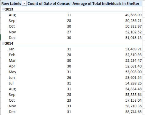
The average could – should – feasibly offset the small shortfall in available days.
And the averages describe a peaking of the homeless shelter population in late 2014-early 2015 (the August 2013/December 2014 accretion is 18.2%), presaging a small but discernible downturn thereafter (see various DHS dashboard data here, along with daily census data here).
And the proofreaders among you may have rubbed your eyes at this line in the pivot table:

And 2015 wasn’t even a leap year; and I thought the rhyme insists: “All the rest have thirty-one, no exceptions, but save one: twenty-eight hath February…”
Double-click the entry above and Excel turns the clicks into a new sheet, in which all the January 2015 records present themselves – and that’s where you’ll find two January 29ths, their data wholly equivalent. And that means one of them has to be escorted away from the data source. (But note that because the deletion has been exercised upon a record somewhere in the middle of the data source the pivot table will automatically redraw draw its effective source range, from $A$1:$O$1000 to $A$1:$O$999.)
And there’s something else. In the course of a none-too-systematic scan of the data I observed a few of the daily Total Individuals in Shelter values (column D) seemed unexplainably higher than the norm, e.g., the figures for July 2, 2014, November 19, 2013, and February 21, 2014. Slightly intrigued, I appropriated the free column P to the immediate right of the data, and entered, in P3:
=IF(D3-D2>=3000,1,0)
The formula simply asks if the difference between the value in the respective D cell and that of the cell atop it exceeds 3,000 (a fair discrepancy about which to ask, it seems to me), return a 1 in P. If not, report a zero (there’s no reason to emplace the formula in P2, though; no value takes its place in P1). I then simply added the 1s, yielding 8. That is, the aggregate shelter count for eight of the days topped their prior days’ figures by at least 3,000, an incongruity that suggests something’s indeed amiss. Look closer at these outliers and you find that the anomaly in every case contorts the Total Adult figure in the B column, and never the Total Children field, the two contributory fields to Total Individuals in Shelters. I’d forthrightly submit that the problem is thus of the data-entry stripe, but, my forthrightness aside, that hunch calls for some manner of proof.
Ok, I can take a hint – I think I need to the ask the DHS myself.

Leave a comment