Archive | August, 2018

Tracking the Fields in Track and Field: Olympic Athlete Data, Part 1

26 Aug

In the interests of enhancing my medal prospects, I’m lobbying hard to have freestyle array formula writing approved as an Olympic sport. Preposterous and self-serving, you say? Well you’re surely correct on the second count, but a scan across the events that have, at one time or another, qualified for Olympic standing – all remembered for you on the Olympic athlete data set shelved on the Kaggle web site (sign up for free) – will reestablish my credibility. The set unfurls 270,000 entry records throughout its 21 MB of athletes who’ve mined for the gold and other precious metals and the events in which they hoped to find them, and those events make for a motely collection indeed.

Who’s in training nowadays for the Art Competitions Mixed Literature event, for example? Well, no one, in actuality, as the competitions for the best sport-themed literary submissions were last conducted in 1948, the year when all four of art events categories – art, architecture, music, and literature –  were finally edited out of the Olympics. But the Kaggle data set also records all the events of which you’ve heard, too, and its medley of columns provide for a host of interesting findings.

Start with a primordial consideration: the relation of Olympic events to their competitors’ average age and gender. Here a methodological caution need be sounded. Because athletes very often compete in different events and different Olympics, a coarsened look at average ages will of course come to admit the same athletes many times. While it would be possible, on the one hand, to account for athletes uniquely via a Remove Duplicates routine, that recourse would leave the data set with one record per athlete – and only one of his/her ages, a reduction a sight too far. It seems to me, rather, that a plural counting of the athletes – each instance of which nevertheless uniquely permutes each entry per age and event – would work here.

That’s my take anyway, but you’re welcome to download the data and subject them to your own assumptions. In any case, I’d start the analysis with this pivot table:

Rows: Sport

Columns: Sex

Values: Age (average, formatted to two decimals)

(Note that Sport is the superordinate rubric beneath which particular events are then subsumed. Thus the sport Swimming spreads its umbrella above 55 different events, for example.)

I get, in excerpt:

oly1

Yes, Aeronautics was an Olympic sport – once, in 1936, including a gliding event, though apparently only men took part (I don’t know, however, if the sport was gender-specific). There’s lots of sporting exotica in there (Basque Pelot – an assortment of raquet sports –  was featured as a demonstration sport in 1924, 1968, and 1992 but had bona fide standing in the 1900 Games), but a close look evinces a very general age parity across genders, if not sports. We do see, and for what it’s worth, that men competitors in sailing and shooting are significantly the older (and the numbers are pretty sizable here, if you retool the averages into counts); and it’s probably noteworthy that the men are nearly two years older than women in the very global Swimming sport, in which the men-women participant numbers stand at 13,345 and 9,850 respectively.

And what about average age by gender by Olympic year, and gender distributions (keep in mind that until 1992 the Winter and Summer games were conducted in the same year)? Substitute Year for Sport and I get in excerpt:

oly2

The strikingly higher averages for the 1932 games need to be explored; Wikipedia points out the economic privations wrought by the Depression pared the 1928 athlete complement by a half four years later. It nevertheless remains to be understood why those who did make their way to Los Angeles, where the games were contested, were the older ones. Perhaps they had to pay their own way, and could better afford the trip.

An additional curiosity is the age trough bottoming for women in the 1972 games (again, the numbers above reflect both Games that year). The screen shot clips these data, but in fact their average age of 25.57 for the 2016 (Summer) games pushes nearly five years higher than that for the Games 44 years earlier. Explanations, anyone? And you’ll note the far flatter arc for mens’ ages across the same span.

In connection with the above, you can also drill down the numbers by Season, the heading beneath which the Summer and Winter games are distinguished. Slide Season under Year and you’ll see, in part:

oly3

Again, a close look is called for here. The pronounced Summer/Winter women’s disparity in the selfsame 1932 competitions may be reconcilable in part by the grand total of 22 female participants in the latter Games, a figure not likely to gladden a statistician’s heart. Yet the impressive men’s Summer margin for that year of more than eight years is founded upon a more workable base of 2,622 and 330 athletes, the latter count compiled for the Winter Games. As for the watershed 1972, the women’s Summer-Winter averages come to 20.53 and 21.79. And if you’re interested in the overall, undifferentiated aggregate gender-age averages, they look like this: Women-23.73, Men-25.56. Of course, those computations have controlled for nothing (e.g. event category), so to speak, but probably mean something just the same. And the total number of entries by gender (remembering that these gather many instances of the same athlete): Women -74,522, Men-196,594.

Nevertheless, those numbers should and could be associated with the years of the competition. The obvious intimation here is that womens’ rates of Olympic involvement could have been expected to rise. Thus, we could proceed:

Row: Year (grouped in tranches of five years)

Columns: Sex

Values: Sex (% of Row Total; turn off Grand Totals, which must invariably yield 100%).

I get:

oly4

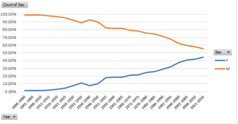
Not particularly shocking, but a detailed confirmation of the “obvious” can’t hurt just the same. The proportion of female Olympic athletes has about doubled in the past 40 years, a development heavily abetted by the expansion of events open to women; committed to primitive chart mode, the gender curves look like this:


oly5

And now I need to get back to that letter I’m sending to Nike, the one requesting sponsorship for my array-formula training. Look – it’s either that or crowdfunding.

Data Stories: NY City Property Sales

14 Aug

You’re wondering what to do with that discretionary $2,000,000 you have laying around – you know, that sheaf of bills that’s been angling your pillow up to untenable heights. In the interests of a good night’s sleep, then, how about dropping those two big ones on some New York real estate?

It sounds like a prudent bet; even the president of the United States has been known to commit some rocks to the idea, after all, and if that example doesn’t inspire you you may find yourself on the wrong end of an all-caps tweet from you-know-who. So now that you’re properly inspired and keen to know what you can get for your seven digits, you’ll want to consult the data set of the New York’s property sales for the year Feb 1, 2017 through January 31, 2018 – 60295 of them, or 165 a day – brought to you by the folks at Enigma public data, who’ve joined the sales records from a pair of City agencies. You can download the set over there, once you’ve signed into their site (for free).

Shift the default Save As format from CSV over to standard Excel and you’ll wind up with a 13 MB workbook – not a prohibitively weighty file, but with 62 fields that pull all the way into column BJ you may find yourself grabbing onto the scroll bar with prohibitive pique. You may thus want to abolish fields not likely to serve your analysis, starting with borough_code in Column A; you’d doubtless prefer to work instead with the five actual borough names filed in the curiously named borough_code_definition field in B. Other candidates for excision, at least in my view and at least for starters: community_district_definition in column Z, school_district_defintion, and city_council_district_definition. All three in effect reiterate the New York neighborhood names promulgated in the neighborhood field in what was, at least at the outset, housed in column B. Those curtailments kick back a megabyte to my hard drive, and every million counts, after all.

We can next move on to some standard, obvious need-to-knows, e.g, the number of properties sold in each of the city’s boroughs, understanding at the same time that obvious questions don’t always yield obvious answers. We could try this:

Rows: borough_code_definition

Values: borough_code_definition

I get:

nyprop1

You may be surprised by the smallish sales total for Manhattan, as I was. But the boroughs feature different kinds of properties in different proportions. Drag borough_code_definition into Columns and substitute building_class_category_code_definition in Rows, and you’ll get the picture, which looks something like this in excerpt:

nyprop2

Observe the One Family Dwellings entries, and their deeply understated Manhattan representation. While these standard residential homes contribute few jags to the island’s storied skyline they loom rather larger among the byways of New York’s more suburban boroughs.

But what about property values? We could plausibly guess that Manhattan sales will lift themselves atop the listings, even as a thorough appraisal would control for building class, but for a preliminary assay:

Rows:  borough_code_definition

Values: sale_price (average, formatted to two decimals with the comma)

That yields:

nyprop3

Our guess is ratified, and unsurprisingly. Now augment the Values area with these two fields, both formatted as above: gross_square_feet and floors_number_of:

nyprop4

Manhattan properties are clearly larger – and higher (note, however, the blanks in the floor field).  A 19-floor apartment can have a penthouse; the top one in a three-floored one is called the third floor.

But it next occurred to me that those averages may have absorbed multiple apartment purchases in the same properties, a possibility that could skew the numbers – provided one is concerned to isolate unique parcels.

With that thought in mind I ran a Remove Duplicates at the data, identifying address and zip code as sources of potential redundancy (zip code, in the event properties in two different boroughs had the same address, a possibility). 12251 records were thus uprooted, after which I reran the above pivot table. This time I got:

nyprop5

I was startled by the Manhattan decrement, so much so that I initiated the table twice for verification. Sort the floor numbers largest to smallest in the original data set, however, and you’ll indeed discover repeated sales in the same, very tall properties. Note as well the heightened average sale price for the borough, a figure that needs to be considered carefully; after all, if a single property enjoyed multiple sales at conceivably various price points, only one of them remains here.

And since the data span precisely twelve months, a look at sales by month might prove instructive (I’m back in the original, full dataset here). But here, again, we’ve run across – or afoul – of an Engima protocol, the decision to portray dates, the ones stored in the sale_date field, in textual terms, e.g.

2017-02-01T00:00:00

In fact, because all the dates possess equal character length, a formula such as =VALUE(LEFT(W2,10)) could be put to the task, refashioning the entries into authentic values that could then be formatted in date terms. But a slightly swifter if less elegant workaround might be the thing to do here: since each entry in sale_date bears the suffix T00:00:00 (for whatever reason), selecting the sale_date column and targeting the data with a Replace All Find and Replace routine, e.g.

nyprop6

And that restores quantitative standing to the field’s labels. Subtract T00:00:00 from 2017-02-01T00:00:00, and you’re left with 2017-02-01, a usable date.  And it seems to work all 60,295 times.

And once that deed is done, try this:

Rows: sale_date (grouped by Month)

Values: sale_date (count).

sale_date (again, count > % of Column Total)

(Note that January data emanate from 2018.)

I get:

     nyprop7

Note the conspicuous shortfall of sales in January, which again, is the most recent of the months. Apart from that discrepancy I’m not sure if a pattern could be properly declared, though the tycoons among you may have something to say on that count.

Now to take the analysis slightly off-piste, what about the average antiquity of the properties sold, that is, years of construction? The information is there, courtesy of the year_built field. Here’s one look at the question:

Rows:  borough_code_definition

Values: year_built (average, to two decimals, sans comma)

I get:

nyprop8

Note the relative recency of the Manhattan structures, befitting the borough’s protean impulses. Yet the collective provenance of Staten Island builds are far newer, a likely signifier of its relatively late-in-coming appeal as a residential habitat. By extension, the notably older properties of the Bronx appear to reflect that area’s comparative loss of appeal – but being New York, watch that space.

But bear in mind that the year_built data calls for a measure of review. Sort the field Lowest to Highest, and the commercial garages on 7th Avenue in Manhattan’s Chelsea district rise to the top. If in fact the facilities were completed in the reported year 1111 – about 800 years before the advent of the car – we need to commend the owners for their foresight.

Also clearly wrong is the attribution for the property in sort position 2 – the two-story home hammered together at 509 Seguine Avenue in Staten Island. Its 1680 time stamp should qualify it for landmark status, but a couple of web sites let us know that the building in fact became available in 1920.

In addition, some pause should be given to the 28 sales of properties dated 1800, most of these ascribed to a batch of condos on offer at 365 Bridge Street in Brooklyn Heights – an elevator building. In fact, it seems it was built in 1929.

And I thought the elevators were autographed by Mr. Otis himself.