You’ll recall my last post (and if you don’t, just scroll down; I’ll wait) broached the not-awesomely-exciting but integral matter of spreadsheet data, their contents and their discontents – that is, challenges of working with information that just won’t cooperate with your plans to refurbish and ready it for a round of analysis pegged to your story-seeking needs. And there’s is more to consider on this count, including a recurring, foundational, spreadsheet design question you do need to think about. So prepare to be unexcited again.
The problem is pointedly typified by a worksheet I’ve carted off from
http://data.nationalpriorities.org/searchtool/
a government site that breaks out and maps various federal expenditures along a number of budgetary variables. The one I’ve brought to your attention, a state-by-state (and US-territorial) gender census for the years 1990-2010, comes to you right here:
(You’ll note first of all that no data avails for any of the territories, but that’s the way it goes.)
The communicative intent of the spreadsheet is clear – to tally state populations by year and gender, and as far as they go the data are nothing if not intelligible; so if you’re bringing a casual viewer’s eye to the sheet, the tableau unfolding before you may suffice as is. But if you’re expecting more from the data, a harder look may be in order.
For one thing, the worksheet has more columns than the Parthenon, appointing female, female percent, year male, male percent, and year total fields to each of the 21 years compiled and culminating in a distended, awkward read:
Moreover, the alternation and reprising of fields, i.e., female, female percent, male, male percent, year total for any year, and then again for the next year, inflicts a crimp in the formula-writing process – not a prohibitive one to be sure, but an irritant at the least. It would be easy enough to sum each column – say, all females for 2010 – but calculating the average female percentage by state across the 21 years, for example, would involve an expression starting (say for Alabama)
=SUM(B2,G2,L2….) and so on, to be divided by =SUM(F2,K2,P2…) and so on.
And you’d have to do something similar for male percentages. Again, these conjurations aren’t forbiddingly complex, but you’d have to plant them in column DC at best (that is, the first free column), and additional formulas grounded in the data streaming horizontally would have to lurch farther out still (one need not be troubled by all those N/As, however; those are text entries and not formula-resultant error statements, and so standard formulas will ignore them without hazard. You could, on the other hand, simply delete the N/A-beset rows, because they contain no data at all.).
Once thought through, the sheet’s presentational inelegance and impediments to productive data breakouts are problem enough; but once you decide to commit the data to pivot table scrutiny, the problem burgeons – for a very – er, pivotal – reason.
The problem – a classic one haunting this kind of work – is this: the worksheet under your steely investigative gaze has awarded individual field status to what should be more properly accredited as items.
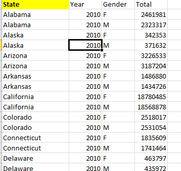
And exactly what does that mean? It means that the year fields – all 21 of them (these in fact hybrid fields twinned with a gender property) – could have, and in my humble estimation should have, been compliantly huddled beneath the umbrella of a single field – something called Year, or something like it. And it means that Female and Male – the attributes bolted to those 21 years – should have been spirited away and sequestered beneath a new, liberated field called Gender. In my view, the data should have been arrayed more or less like this, using four years’ worth of data in this truncated example:
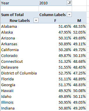
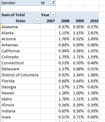
And so on, down the respective columns for all the states and all the years. Now while these records appear at first and perhaps even second blush to suffer from a kind of data profligacy – after all, we’d need to enter each state name 42 times (21 years times 2), even as each was keyed in exactly once in our downloaded worksheet – yet major analytical and presentational efficiencies follow as a result, because when these redrawn data are visited upon a set of pivot tables, you can get this:
And this:
And this:
This rather abstruse formulation delivers the percent increase in men by state, relative to the preceding year – and there are notable divergences by state.
Granted, these data don’t conduce toward Eureka-level findings, but the larger point is there to be made, namely this: that data of what could be called the same order of phenomenon belong together, enrolled as items in the same field. Thus here, year data should be accounted as discrete instances, or items, of the overarching field called Year. The two genders should likewise be made to share the space plotted beneath the field Gender, or some such suitable name. And the states should not in turn be allotted separate field statuses – i.e., a field called Alabama, a field called Alaska, etc. – as indeed they are not here.
The advantages of this strategy may or may not be wholly transparent to you, but they are real, and include these:
- Extending the above example: if every year were to possess its own field status, each one would have to be dragged separately into a pivot table – and that, is after all, a drag. But gathering all the years under the Year field aegis would require only one field drag.
- If each year were to arrogate separate field status, for example, each one would have to be formatted separately once having been roped into a pivot table. A unitary Year field requires only one formatting operation, and allows its data to be immediately grouped:
Try carrying out this elementary pivot task on the downloaded worksheet. I’m not sure you can, because when two fields co-reside in the Row Labels area, one necessarily subordinates itself to the other, e.g.
Thus put two independent year fields in play and one needs to appear “first” in Row Labels, in the superordinate position; the other won’t and can’t occupy the same space, appearing only subordinately in the next Row Label column as above.
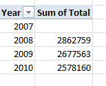
- The pivot table’s native mathematical complement – that is, the Summarize by Sum, Average, etc., and Show Values As capabilities – work directly on same-field data, bypassing any need for those calculated formulas discussed in an earlier post (September 6). For example, this little pivot table elicited from my demo data:
simply enumerates the aggregate increase in US population across adjacent years (that’s why 2007 is blank – it serves as the base year). Again, the labors required to enable this sequence if 2007, 2008, 2009, and 2010 were to hold down individual field statuses is a pause-giver.
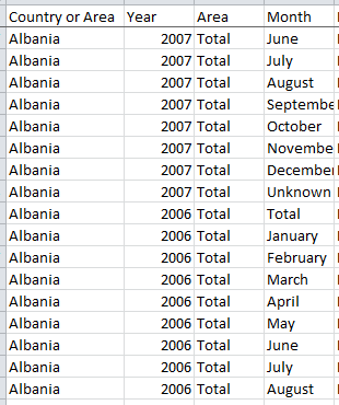
And if you’re looking for corroboration of all this, return to that UN birth data spreadsheet I referenced in my post on Olympic birth months. On second thought, don’t bother – just check out this shot:
You see the point – the ostinato of Albanias and year entries, both items complying with the Country or Area and Year field rubrics respectively. That’s the way it should be done.
But what then of our census data as they stand – are these workable, or grounds for another write-off? I’d suggest that some room for rapprochement could be set aside here. For one thing, and unlike the adjunct data worksheet we reviewed last post, the data themselves – the actual cell-specific entries that inform the sheet – are ok in and of themselves. One could leave the data in their as-is state and throw in some of the formulas I had suggested about 1,000 words ago. But it also seems to me that with a measure of due diligence – and perhaps not as much as you might initially fear – you could, with some sage copying and pasting, restructure the sheet commensurate with the counsel I’ve proffered above (though you’d probably want to do the copying to a completely new sheet). I managed to assemble the four-year census demo above in about 15 minutes, so if you have reason to believe that, given the proper exertions, the data may have something to say, the project might be worth a go.
So go.
@abbottkatz




Leave a comment