The cost of living is in the news in the UK but it always is, in one or other of its ubiquitous, chameleon guises; and no less chameleon are the means for measuring that essential but quicksilver property of the commonweal, sometimes called by a less fetching name: inflation.
UK officialdom frames two principal indicators that strive to realize the cost-of-living snapshot – the Retail Price Index (RPI) and the Consumer Price Index (CPI). That plurality of course points to two different stats, measuring two different batches of variables that conduce towards two different numbers (for some definitional distinctions see the Wikipedia discussions here; and look here for a UK-government elucidation of the differences. Note as well the Guardian’s extended discussion of the definitional movement within the RPI and CPI. Thanks to the Guardian’s Charles Arthur for the heads-up. Correlations of the two measures need to take these understandings into account.)
In that connection the Guardian has released its own set of the numbers in spreadsheet mode, these tracking monthly RPIs and CPIs since their respective inceptions, along with a third metric, the Change in weekly pay over 12 months, which considers the relative movement in workforce wages. It’s available here in Excel guise:
(Again, there’s a need to own up to the obvious: namely, that spreadsheets merely acquiesce in the values they receive, without presuming to adjudicate their meaning and validity. That central matter is properly left to a more searching look at the cost-of-living idea.)
In any case the data read more-or-less straightforwardly, and we can proceed with something simple, say a set of correlations of the RPI/CPI/Change in weekly pay fields. RPIs tend to point notably higher than CPIs (again, a close analysis of that discrepancy appears in the government document referenced above), but a high correlation, between the two if obtaining would at least suggest some comparative constancy. Because correlations match pairs of values and because the CPI doesn’t appear on the statistical landscape until 1956, our correlation needs to start at row 489, at which the CPI debuts. In a blank cell enter
=CORREL(B489:B777,C489:C777)
I get .758, a high association by social-scientific expectations, but one clearly ridden by a measure of slack between the two fields. But again, RPI and CPI aren’t measuring precisely the same thing.
We can next move to correlate RPI and then CPI with Change in weekly pay, the latter parameter settling into the sheet at row 633 and descending to row 774, or the October 2012 index. To correlate RPI/Change, enter
=CORREL(C633:C774,E633:E774)
Both ranges (or arrays, to use the technical term) pull up here at row 774, as they must submit the same number of records. Result: .235, a moderate positive association between Retail Prices as operationalized here and Weekly pay.
For the CPI/Change correlation write
=CORREL(D633:D774,E633:E774)
Result here: a notable, but deceptive, -.338.
Deceptive, because a negative correlation typically denotes a degree of reverse trending – when one array’s values move up the other presses upward. But chart the CPI/Change data and we see a fairly orderly covariance:
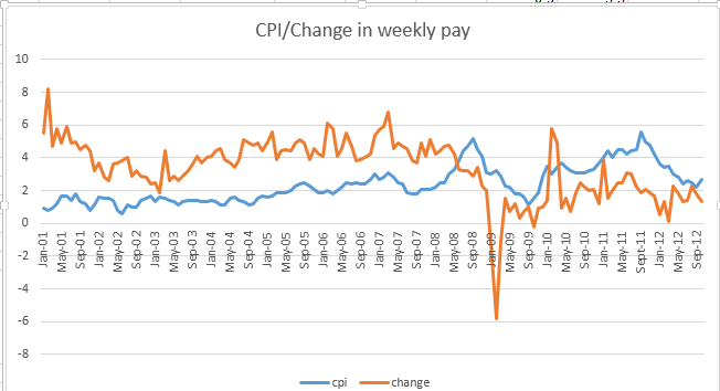
The “problem” is that the arrays change places around May 2008. From there on, weekly pay falters behind the CPI, at least by and large; and it’s that reversal that spurs the negative correlation. In other words, the CPI and wage figures tend to move in rough concert throughout, but the switch in the higher-lower relation drives the negative correlation. If you don’t quite appreciate that nuance – and I sure didn’t at first – correlate these values:
Result: -.515.
There are some additional simple vantages to gain on the data, namely the monthly ratios and absolute differences between the RPI and CPI. Move over to a blank area in the sheet – let’s say the G column, and title it Dates on row 488 (because the CPI data commence at 489), and name H488 Ratio. Simply copy the dates starting at B489 beneath the Dates heading, and write in H489
=C489/D489
and copy down the column. That’s simple enough, but instructive just the same. RPIs generally exceed CPIs, a matter of not inconsiderable political import, but we see the ratios careen all over the place, as exemplified by this Cro-Magnon but serviceable chart:

There was, as we see here, a stretch of months in 2009 when the RPI actually fell beneath the CPI.
If we title I488 Difference and compose the even simpler
C489-D489
in I489 and copy all the way down and chart the results, you’ll get something like this:

No shortage of variation here, and worth marking in light of government observation that
“Between 1989 and 2011 Retail Prices Index (RPI) inflation tended to be around 0.7 percentage points higher than Consumer Prices Index (CPI) inflation on average.” (Extracted from the document hyperlinked above). Maybe so, but the constituents of that average run riot across the years.
OK – But I’ve remained eyebrow-raisingly silent about the Date column and those green-notches commanding many – but not all of its cells. Some formatting issues in there? For sure. Not to worry, though; I’ve got you in mind – in Part 2. Be there – aloha.

Leave a comment