Turn to page 39 of the Centre for Investigative Journalism’s Data Journalism Handbook for this word to the hard-bitten iconoclasts of the fourth estate:
It is astonishing how many government agencies still refuse to publish information in a structured form that can be checked and analyzed. One official noted that his office had ‘previous experience of mischievous manipulation and misrepresentation of Excel and Word documents,’ and used this as an excuse to provide data only as a scanned pdf.
To which I hereby submit my standard, friendly amendment: backroom connivance aside – and connivance there may be – it seems to me that even official, ingenuous access-friendly data sets, from which all agenda and guile has been sieved, often make the work of analysis a good deal more trying than it has to be. I’ve forwarded this complaint many times, and I’ve just forwarded it again. By way of additional case in point, I’ll run the 2011 UK Census breakout of religion, the breakout drawn along perpendicular lines – that is, affiliation by coded area:
(The area code field here is bound to British usage, by the way, and not the American telephonic reference.)
One-and-a-half questions beg themselves, and I’ve asked these before: 1. Again, given the lay of the data, for whom are the data intended – a readership of unreconstructed information seekers, or a research-minded cadre that might want to take the data a few more steps? And 1.5 – if the latter, where do they go from here?
That sounds like more than one-and-a-half questions, but who’s counting, and that last one could be written off as rhetorical, because the data…need work. Let’s count off some of the ways:
- The welter of blank rows interlacing the data needs to be carted away.
- That redundancy problem is back in spades. The Area Name field is recessed into three levels: global area names (e.g., NORTH WEST), a second tier (e.g., Cheshire East UA), and when warranted a third (e.g., Cumbria/Allerdale). The result, again: the same totals being figured twice.
- Titular dispersion. That is, a heading such as Sikh Persons Number is spread across three separate cells, and failure to consolidate these will unleash major pivot table problems across the analysis. You can’t, after all, work with ten fields called Number.
And while the above irregularities aren’t irretrievably discouraging, you’ll need to make sure your sleeves are rolled up before you have a go at the sheet. And one organization that was prepared to do at least some of the heavy lifting is the UK Jewish Board of Deputies (BOD) a communal organization that brought out a report on Jewish demographics across the UK Census years 2001 and 2011. Here’s its spreadsheet:
Of course the BOD chose not to recast the entire UK census sheet, devoting itself only to the Jewish data and their numerical relation to the areas’ general populations. Rather, it apparently resorted to a judicious copy and paste routine, mindful of the blank row and double-counting snares signaled above. Note as well that the sheet references both its 2001 and 2011 sources (though I can’t find any geographic breakouts in the S103 sheet compiled in 2001).
The results are pretty straightforward. You’ll note the conditional formats tinting the H and I columns, with red signaling a net Jewish decline in the respective areas, and green beaming an increase (and no contingent format alighting upon areas in which the population remained precisely unchanged). Note, however, that a first attempt at pivot tabling the data will incite an error message implicating faulty field names; that’s because the some header row(s) cells have been merged. You thus need to select A8:I9 and click through the Home tab > Unmerge Cells (unmerge: one more fetching Microsoft verb) option in the Alignment button group. (And yes, you’ll need to push away the totals row at 358 from the body of the data, lest you perpetrate your own double counting.)
But that won’t finish the job. Because the data’s uppermost, now–independent, row – 8 – exhibits vacancies in E8, G8, and I8, a second pivot table attempt will prod the same error message back onscreen.
There’s a bit more. Cells D10:G10’s paired titles are identical, and we mustn’t have that. I’d edit these to receive the relevant year, e.g. Total population 2011, etc. There’s also a mild-mannered formatting touch in the H column that took me a while to notice: its positive numbers are fronted by a + sign – most surely not consonant with the default setting for those values. Right-click any cell in H and you’ll open a window on Excel’s custom formatting gallery:
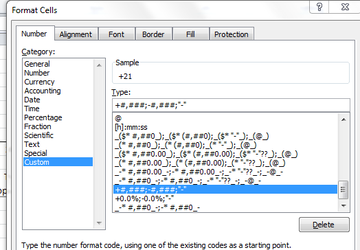
Custom formats can get rather fearsome, but in this case we’re told that, among other things, positive values are to be chaperoned by the +. As for the “-“? That notation describes how the value zero will appear per the format – that is, a dash in lieu of 0.
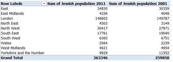
Here’s a final point. You could box out a pert pivot table aggregating the population stats by region:
Row labels: region
Values: Jewish population 2011, Jewish population 2001
But if you want to detail the collective percent changes by region, you can’t really deploy the Percent change since 2001 data even though they’re there, because the table would treat each area percent change as equally contributory to the bottom line – even as the Jewish population sizes by area are exceedingly variable. You’d need instead to wire together a calculated field, whose ingredients read something like this (I’ve called mine Percent Change):
=(‘Jewish population 2011’ -‘Jewish population 2001′ )/’Jewish population 2001’
(Again, check out the September 6 post for the how-tos if you need them.)
Follow through and garnish with the standard percentage format and you wind up with:

(And don’t ask me what a Humber is, though the name Northumbria apparently derivers therefrom – so says Wikipedia. Lots of odd place names in the UK.)
That pivot table is duly edifying, and adds materially to the BOD rendition – but again, the data here comprise but a fractional retake of the larger, original whole. If you want to try your hand at the native UK Census sheet’s panoptic, pan-religious scan of its data, peel back those sleeves.

Leave a comment