It’s vacation time – don’t try to stop me. Hope to be back around April 4. A bientot.
Archive | March, 2013
LA Story: The Date Thing, Again, and My Low-Grade Eureka Moment
21 MarHere’s what I was looking for:
http://spreadsheets.latimes.com/
Fire away at the target above and you’ll drop yourself onto the spreadsheet page of the Los Angeles Times’ Data Desk, a rough left-coast equivalent of the Guardian’s Data Blog. I’d been getting myself lost en route to the page, vainly shambling across the Desk’s missing links and the smudged latitudes of the Times’ site map, until I decided to take the back door via surreptitious Google ingress.
Once you’ve at last arrived, a link-bearing catalogue of the Desk’s spreadsheets unrolls down the page. Click any one and its “spreadsheet” offers itself onscreen in tabular form (that Search field filters the records by search item):
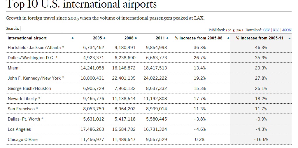
If you want to realize the data in genuine spreadsheet, save-worthy mode, click the upper-right-cornered XLS link or right-click atop the data and select Export to Microsoft Excel, a hoary option which actually works on these sheets.
The sheets are nothing if not variably forthcoming. You’re viewing the airport sheet above in its entirety, and another one, Smartphone Stats, comprises exactly three records – one each for the iPhone 5, iPhone 4s, and the Galaxy S III. Others, however, such as Kern County Pensions – an enumeration of 1900-plus county workers and their retirement settlement/final year salary data, give the investigator a good deal more to work with.
In any case, and recusing myself from any facile searches for cross-cultural truths, I’d allow that the Guardian exhibits the greater amity to the spreadsheet medium than the Data Desk, the former’s data-quality issues notwithstanding. Far more of the Data Blog holdings assume a spreadsheet identity, though I’m not terribly sure why.
But let’s put the anthropology on hold and turn to a Data Desk sheet, Unlimited outside money, brought to you in proper spreadsheet mode here:
The data break out contributions to various Los Angeles electoral contests by what the Times calls “outside groups”, entities not beholden to spending thresholds. The 449 records tell their story in straightforward parameters including a date field, and so grouping the money by say, month of disbursement, might tell a tale worth reading about. There’s just one problem, and we’ve encountered it before: the dates aren’t dates. Right now they’re nothing but text, and they need to be overhauled into numeric fighting shape if you want them to play a group, or any other quantitative role.
I’ve discussed the text-date problem before, both in my September 13 post here and a companions piece of sorts on the datadrivenjournalism.net site; but like Tolstoy’s unhappy families, every date hobbled by its formatting trammels is different, and calls for a slightly different resolution – and this time I had a hunch. The dates, in their three-lettered month abbreviations, look pretty close to authentic, value-laden data – save that intrusive period (full stop if you’re reading this in the UK). Acting on that self-confided tip, I hit on this idea: why not try a Find and Replace, searching for the “.” and replacing it with…nothing?
Give it a go. Select the D column and click Ctrl-H (or Home tab > Find and Select in the Editing button
group > Replace) and enter:
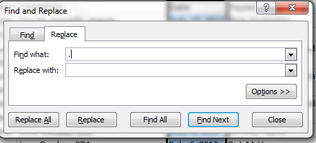
There’s that dot in the Find what field, and nothing more. Click Replace All and…
Voila and check it out:
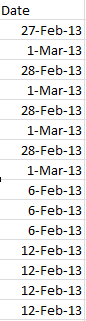
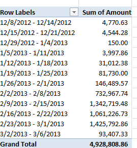
Real dates, real grouping.
And while we’re at it, an additional word about this grouping business. You may have already wondered about the absence of a Weeks handle in the grouping window:
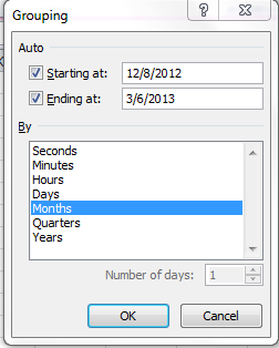
There’s a reason why that option goes missing – because if one elects to group data by say years and their concomitant months an additional weeks breakout is no longer possible, because any given week may pull its days across two months, eg. January 28-February 3, and Excel won’t know where to position that seven-day stretch. Instead, the Days option – which, when selected, excludes the other units from the imminent grouping – can by plied, into seven days or any other span:
And that’s a wrap (bit of LA talk, you understand).
Spring Cleaning the Data: The Global Voices Spreadsheet
14 MarThose in search of a handle – albeit a slightly slipperly one, perhaps – on the current representation of women in the journalistic arts can turn to a Guardian-authored spreadsheet on the matter drawing upon data afforded by the Open Data Tracker, an open source service underwritten by the Knight Foundation.
The spreadsheet, available in Excel adaptation here:
GenderTracker_ Global Voices Gender Balance Case Study – Data
breaks down numbers on story authorship by gender, the intents of its respective worksheets abstracted in the Introduction sheet. The data source? The archives of the Global Voices blog, which builds “an international community of bloggers who report on blogs and citizen media from around the world.” (And thanks to Open Gender Tracker principal Irene Ros for clarifying this. Open Gender teamed with the Guardian to gather and structure the data.)
But before we place the data under our sheet-by-sheet consideration, a bit of necessary prolegomenon begs our attention. It should go without saying that, because the blog posts are presumably volunteered, and hence by definition self-selected, the data cannot broach the incipient, larger question: whether women have been, or continue to be, treated with invidious regard across the journalistic marketplace. Our take here is on the spreadsheet qua spreadsheet; hearing the larger socio-political messages would require a different set of ears, and probably a research grant.
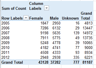
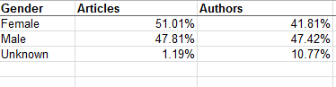
Gender Counts by Year – The sheet simply parses authored article aggregates by gender and year. The Total column imposes a set of curious redundancies upon the data, though, citing each year’s aggregate three times – once each for Female, Male and gender Unknown. A pivot table would have communicated the point a good deal more presentably:
And once in place, the data could be rephrased in percentage terms:
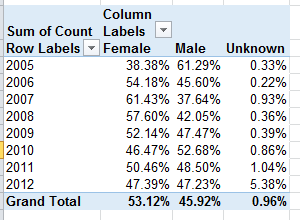
We see the gender proportions charting a wavy course across the eight-year term, with female contributions nevertheless enjoying a clear authorial margin. To be explained, however, is the bump in gender-indeterminate bylines for 2012. And remember that the above tables tabulate article volume, not the totals of actual, discrete women and men who contributed pieces. Calculating that latter metric would entail a round of hoop-jumping that might better be reserved for another post, but those data appear to have been registered in summary form in the Articles_Author Split sheet.
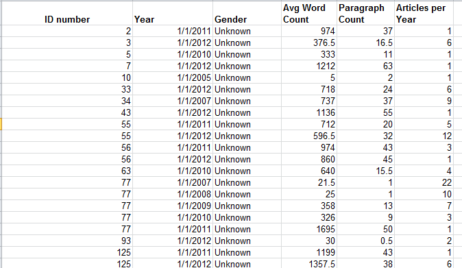
Author Data – Some additional curiosities here, its byline-gender attributions masked behind a 32-character code, which I am taking be randomized. I am privy neither to the mechanics nor the strategy justifying the code, but it seems to me that a simple numeric assignment to each author would have done the same work, unless the report generators feared that a simple, relatively memorable integer would come to be associated with a particular author and hence his/her gender. If that be the case, a lookup table in which each byline code could have been associated with a conventional number, to be assigned to the author identities solely as we see them here in the spreadsheet, would have neatened the data. Thus the sheet before us could have been reconditioned into this kind of tableau:
even as Open Gender Tracker would have retained the original IDs.
Moreover, we should ask why the Year field submits month and date specifics (always the first of the month) into the expressions, when all we really need here is the year reference.
I’m also not terribly sure what the Paragraph Count field brings to the exposition.
Articles_Author Split –Again, I’m not entirely certain what “high level” (which perhaps could have been hyphenated) means, though I’m assuming that the workbook wants us to know that the numbers summarize overall totals, foreswearing any data drill-down. Be that as it may, the numbers would have profited from a percentage reformat:
Number of Articles Per Author – I’m drinking too much coffee, because I had to think at least twice about this one. What it’s trying to do, simply enough, is break out authors by gender and their output, in decidedly uneven tranches. (I’m prepared to be corrected, but so far as I know this kind of breakout is not pivot table-capable,by the way, because its Group Selection feature insists upon equally-sized groups. The FREQUENCY function, something we haven’t discussed in this blog, will accommodate such lopsided distributions.) Again, note the redundant Total column (see Gender Counts by Year above). It’s hard to take this sheet any farther, in part because we aren’t told how many articles populate each of the tranches but rather only the number of authors, graded here by output and gender.
Number of Articles per Author, Full Posts – That’s the tab’s entire, original, Google-doc-dubbed name, clipped on our sheet by Excel’s 31-character tab-name limit. I’m not sure what’s normalized about the data in that eponymous column, comprising as it does a straight calculation of gender proportion by tranche. Again, the percentage format here would be welcome, and that redundant total column makes a reappearance. The second collation of data embarking from the H column reports the same data but attired in a more reader-friendly layout, one that emulates the pivot table, cross-tabular, conceit. Note by the way the right-aligned 3 in the Group data; that’s because that digit is an actual number, even as the dash-splayed other groups assume Text format. (23-1189 is text; =23-1189 is a bit of subtraction).
Category Summary – Again, the Percentage format would streamline the Percentage data. But note that the reiterated Categories don’t inflict the same sort of superfluity upon the data we witnessed in the other sheets, because the repeated entries here are text, and such are needed to identify the associated percentages. The other, quantitative excesses identified in earlier sheets are redundant because they could have been derived mathematically and made to appear once each.
So there you have it, the data all tidied up in most fetching array. Who says men don’t do housework?
Check, Please: Rating the UK’s Eateries
7 MarThey may not be chewing this one over in your time zone, but Europe’s horsemeat scandal has frozen mouths in mid-mastication Continent-wide; and apart from the fusillade of equine-charged wisecracks riddling the Twittersphere, the scandal has tossed a bone of contention to consumers and politicians, two constituencies quick to register a beef with food purveyors.
Ok – now that I’ve gotten my jokes out of the way, let us redirect our pun-addled sensibilities to a most instructive and timely site, http://ratings.food.gov.uk/open-data/en-GB, a UK-based directory of findings that applies the national Food Hygiene Rating Scheme to thousands of food establishments (including pubs, hospitals, take outs, etc., in addition to restaurants) in England, Wales, and Northern Ireland organized by local governmental authority (Scotland works with its own scheme).
Scaling the establishments in ascending order of salubrity from 0 to 5, the Scheme site posts XML-rendered, oft-updated files which swing smoothly into Excel format. To download a file for a selected authority, right-click the English language link beneath the Download umbrella column and select Save Target As…Rename the file as you wish, but preserve the XML format. For illustration purposes, download the file for London’s Kensington and Chelsea authority, an area described in a local newspaper as Europe’s wealthiest (I can’t link it to you here, because WordPress can’t digest the XML format).
Once in Excel, you can open the file via the by-the-book route: Data tab > From Other Sources in the Get External Data button group > From XML Data Import. Go with the defaults greeting you in the ensuing dialog box, and your data are spreadsheet primed, in row-banded table form (an access alternative: simply initiate the standard Open command and approve the defaults begging your consideration in the radio-buttoned dialog box).
But before the data begin to comply with your analytical intentions you need to do some important preparatory work. First, the data in the linchpin L column in which the actual establishment ratings appear present themselves in the Number Stored as Text format, a most curious motif (see my January 17 post) that stands as the spreadsheet approximation to the wave-particle duality: sometimes the data behave like values, sometimes like text. But because pivot tables regard these quicksilver items as text, we need to redefine them decisively as numeric values, and we’ve done this or something like it before (note: in some Authority sheets I’ve seen the ratings are set down in columns other than L, and one sheet I’ve viewed defines its ratings in straightaway numeric terms – no manipulation required).
Select the L column and drag the vertical scroll button up to row 1, at which point you should be reunited with that cautionary exclamation mark we’ve seen elsewhere. Click it and select Convert to Number, thus quantifying the entries in the column.
Next we need to sort the column (Smallest to Largest), because a good many of the establishments either have yet to be rated or for whatever reason are exempt from any assessment, and as a result are characterized in actual text terms, e.g. Exempt. The sort should relegate the first textual item to row 1441, the position at which I usually thread a blank row, in order to detach the text data from the numerical values above. But we’re in the middle of a table, which for all its virtues sometimes outsmarts itself, to wit: insert a blank row at the 1441 position and it simply joins itself to the rest of the table, and brings along all those rows beneath it, the ones you thought you’d just unloaded. All the data in the worksheet remains in the table – with one blank row besides.
The way out of this near-Sisyphean regress is to first click the Table Tools tab > Convert to Range button in the Tools button group, and reply Yes to the prompt. Now you can interpose that blank row without repercussion.
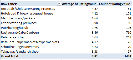
Once you’ve burnished the data, you can do the pivot table and chart thing, e.g.
Row Labels: Business Type
Values: RatingValue (set to Average)
Rating Value a second time (set to Count)
And because it takes time to vet all those establishments, how about this breakout by last year of inspection:
Row Labels: RatingDate (grouped by years)
Values: Rating Value (set to Average)
Rating Value again (set to Count)
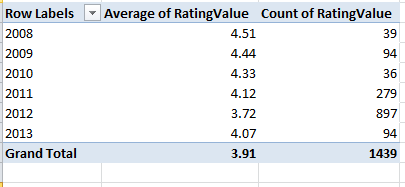
These data point to a putative slump in collective hygiene (remember, though, that we’re examining but one local authority here, albeit a posh one), a conjecture that nevertheless must be treated with some investigative care. Have official standards been stiffened, thus forcing the averages down “artificially”, or have the more suspect establishments been subject to the more recent scrutiny? It’s hard to say, though the 897 places inspected in 2012 – a rather large number, amounting to about 62% of the total – insinuates that the inspection sequence was merely randomized. But these conjectures need to be researched. I should also add that a scan of about half-dozen authority worksheets corroborates the lower score/recency-of-inspection correlation.
To view the distributions of ratings 0 through 5 by Business Type:
Row Labels: Business Type
Column Labels: RatingValue
Values: Sum of RatingValues (PivotTable Tools tab > Options > Show Values As > % of Row Total
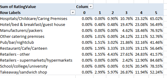
And additional perusals of the data can serve up piquant, near-sociological findings. Four percent of Kensington/Chelsea’s inspected establishments fell under the Takeaway/sandwich shop rubric; the comparable figure for the Tower Hamlets authority in London’s storied East End, one of the city’s poorer districts, is 12.88%, perhaps comporting with the area’s more proletarian cast – perhaps. Yet the take away/sandwich figure for London’s City – the financial center of the country, if not the world – is 21.60%, presumably reflective here of the lunch hour, eat-and-run workday. And how about the Pub/bar/nightclub percentages of all inspected establishments?
Kensington/Chelsea – 7.18%
Tower Hamlets – 9.39%
City of London – 16.20%
The ruling class likes to party.
So lots of interesting stuff out there, no? Bon appetit.
