It actually snowed here today in the UK’s 104th least desirable area – and that’s out of only 110. In virtue of the city’s lopsided topology, we’re known as Northwest London (check a map to see what I mean), and the local chamber of commerce – assuming we have a chamber of commerce – isn’t press-releasing any puffery about our invidious relegation, but you’re getting it here.
“It”, is a compendium of 12 self-reported indices of perceived well-being drawn from more than 38,000 UK respondents by the Rightmove property site, in turn cobbled into spreadsheet mode by the Guardian. Here it is:
Right Move_ Happy at Home Data
In combination, the results have been made to resolve into what Rightmove calls its Happy at Home Index (HAHI). To quote Rightmove’s larger report on the findings:
Rightmove’s index uses 12 distinct factors to measure how the British public feels about where they live, covering feelings towards our ‘property’ (the physical attributes of where we live), our ‘home’ (emotional attachment to where live) and our community (social attachment to the town or city).
All of these seem to have connived to consign my ‘hood to the 104 seeding, but I’m prepared to rise above the ignominy and vouchsafe this analysis to the greater journalistic calling.
But enough about me. (Before we turn to the spreadsheet, by the way, it should be cautioned that Rightmove doesn’t detail its sample-gathering process, and so that technical but essential constituent of the deep background has to be taken up elsewhere.)
Now on to the sheet. First, it isn’t an easy read. Each of the dozen survey indicators slots in two columns, one citing each locality’s national rank on that parameter, the other divulging a normalized HAHI score wrapped around an average score of 100. The effect approximates a copy and paste routine gone amok, aggravated by a broken record of identical HAHI score/National ranking headers, that latter fillip a significant spreadsheet impairment. We’ve seen this before; you don’t want to sound the changes on data with redundant field names. We’d thus need to submit the headers to a fitting field-name rewrite, something like Investment HAHI Score, Investment National Ranking, and so on across the columns (note that if you don’t bother, Excel will improvise field name qualifiers, e.g., HAHI score, HAHI score2, HAHI score3, etc. But you don’t want that).
Next, note the enumeration of the national rankings themselves, each encumbered by the appropriate st, nd,rd, or th suffix. We can’t abide these qualifiers, at least not if we want to direct any quantifying look at the data. We’ve seen this before, too; the data bear a textual veneer that needs be scraped away. But the job is easily done; click anywhere in the data and follow that selection up with Ctrl-A (which first only selects a contiguously populated cell region, by the way; it’s a second Ctrl-A that’ll select the entire sheet). Then touch off a Ctrl-H, and in the resulting Find and Replace window enter st, nd, rd, and th successively in the Find field, in each case omitting any Replace suggestion. Click Replace All for each of the four entries, and all the rankings recover their primeval numeric character.
On the other hand, by confining one’s analysis to the numeric stores already in force, one can establish the town/city pecking order without having to bother with the above transformation. Note that Rightmove associates an average town/city with that baseline aggregate score of 100. That three-digit midpoint has been subject to a rounding off, however. Sort the data by the Overall HAHI field in the E column and then add all the HAHI score fields for each town/city, and you’ll see, for example, that the towns/cities receiving 100 in fact evaluate to somewhat different HAHI aggregates. (Note: if you carry out these sums before you perform the prior, text-to-value find and replace described above you can enter a simple, =SUM(E3:AC3) etc., formula in the AD column (which I’m simply calling Totals), because that expression ignores any text data visiting the range. Execute the formula after you’ve rejuvenated the text data, however, and you’ll need to write something like =SUM(F3,H3,J3,…), thus marshalling the HAHI scores only.)
Once you’ve developed these numbers you could conscript them into this pivot table:
Row Labels: Town/City
Values: Totals
Click in the Values area and click PivotTable Tools > Options > Show Values As (in the Calculations button group) > Rank Largest to Smallest. You could then introduce Totals into the Values area a second time as it stands (in default Sum mode), and you’ll get (in excerpted form):
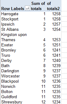
These are rankings all our own, which interestingly enough don’t correlate perfectly with Rightmove’s; look at our data, and look at theirs (and if you’re hankering for a homework assignment, pivot-table the intraregional rankings without making resort to the Regional HAHI data in column D).
Indeed – those towns/cities scoring precisely 100 distribute their aggregate HAHIs totals across a gamut extending from 1192 to 1205; and Watford, checking in with a beneath-the-curve 99, also scores an aggregate 1192.
With the totals in place you can lower them into a pivot table, broken out by the region names in column A, and then sorted:
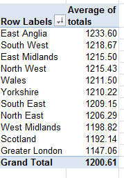
Hold on while I check the map to see where East Anglia is.
Note, by the way, Greater London’s worst-in-show score – a metric compiled, remember, by Londoners’ responses (two exceptions: the tony London borough of Kingston upon Thames along with Bromley, aggregating to the 6th and 9th overall places, respectively according to Rightmove). Note as well the next-to-last position thrust upon Scotland, an odd statistical dig at the general high repute it owns for social services provision and the like (yep, Scotland is a country all its own in the United Kingdom, as is England).
In the meantime, I’m continuing to exhibit admirable equanimity over my home turf’s 104. And my wife is positively exultant; before coming to NorthWest London she lived in Ilford, way over in the city’s east side – and that neighborhood came in at 107.

Leave a comment