Do you believe the words of the prophets are written on the subway walls? That’s what the song said; but the Talmud says nowadays prophecy is given to fools and children, so the authorial judgement is yours.
In any case, we’re talking graffiti, the in-your-face, on-your-property genre that urban incumbents either adore or abhor. For devotees, it’s nothing less than a beauteous cultural template, Lascaux in spray paint; for antagonists, nothing more than vandalism under cover of night, daubed in attitude-laden hues of faux hipness.
And it’s the partisans from the latter camp who vent their pique at all that unwanted art to New York’s designated pique-collector, its Department of Sanitation, who’ve passed the grumbling over in turn to the New York Open Data site, via this spreadsheet:
The sheet bundles graffiti complaints for the year period bounded by September 2010 and August 2011, 13,000-plus strong, and touch off one obvious question for the research-minded, for starters: do the data describe any significant variation, when broken out by the city’s boroughs (or counties)?
For example: after completing the usual sheet housework (i.e., auto-fitting the columns) we could pivot table the boroughs’ ratios of closed to open complaints:
Row Labels: Borough
Column Labels: Status
Values: Status (Count), shown as % of Row Total (and you’d probably want to display grand totals for columns only; each borough’s status breakout must come to 100%).
I get:
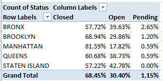
Interesting, I think. The data disclose considerable headroom between Manhattan’s close rate and those of the other boroughs. Surprising? Maybe not; I would allow that a belief in a Manhattan service-delivery bias has circulated among other New Yorkers for some time, perhaps most memorably during the throes of the 1969 snowfalls, when Queens residents excoriated then-Mayor John Lindsay for his slowness to clear that borough’s streets. The obvious remit here is to explain the disparity – or attempt to learn if the Manhattan margin is perhaps better laid to some artifactual, measurement-driven issue instead. (By the way, I don’t have a handle on the few Pending complaints, particularly their closing dates. If they’re pending, how were they closed?)
What does that mean? It could mean, for example, that Manhattan’s superior open/close times might have more to do with a relative dearth of graffiti reports there than any favoured-treatment status the borough might enjoy. No; that doesn’t sound right, but the data should stand in nicely for our guesswork. Just yank Status from its Column Label setting, then click in the Values area and return to the Show Values As button and select No Calculation (that is, we’re here simply breaking out, or counting, the number of complaints by borough, irrespective of complaint status):
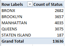
So much for that conjecture. Given its massive daytime population, Manhattan unsurprisingly leads the complaint parade (though fewer than 20% of all New York residents actually live there).
Ok – so if Manhattan is indeed New York’s pet, would it stand to reason that its complaints are closed more swiftly than the ones logged in the other boroughs? It might, and in order to make that determination we need a new field and a formula, one that simply subtracts Created Dates from Closed Dates (after we’ve satisfied ourselves that the data lining those columns are in fact all dates, and not the text-formatted imposters we’ve encountered in previous posts; running a couple of COUNT functions beneath the entries should validate the data types, bearing in mind in turn that a good many of the Closed Dates cells are vacant. Sorting by that column at one point will enable you to perform a COUNT that gathers all its occupied cells into the expression. And remember that dates are really sequenced numbers, baselined to January 1, 1900).
Let’s see…where was I? Call column L something like Day Span and enter, in L2:
=I2-F2
(You’ll note the large, unsightly spate of negative numbers streaming down the column, flowing necessarily from the absence of close dates for the open complaints. These don’t matter for our current purposes, but under other analytical circumstances they might, and might have to be dealt with differently.) Then haul those data into a pivot table (and if you’re working with an existing table remember to bring the L column into the operative range via PivotTable Tools > Options > Change Data Source):
Row Labels: Borough
Values: Day Span (Average) Format decimals as you wish.
Report Filter: Status (select Closed)
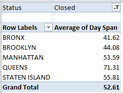
That’s interesting too. The Manhattan average closing day span falls very much in the middle of the pack – again, even as its overall close rate pulls away from the other boroughs. And that qualifies as a bit of a puzzlement. If, after all, Manhattan complaints were somehow easier to resolve, it should reasonably follow that these would be brought to closure more swiftly. But in fact Bronx and Brooklyn complaints take less time to close out, and only the Queens numbers careen into outlier status.
The answer – or at least what I take as the answer – lies in the points across the September 2010-August 2011 year at which the complaints were registered, and from which borough. If it could be demonstrated that Manhattan complaints tended toward a calendrical front-loading – that is, if more of them were issued earlier in the year rather than later – it might be sensibly inferred that, all other things being equal, more of these would be closed as a result.
Remember that our data extend only so far as August, 2011, and tell us nothing about the disposition of calls remaining open at that cut-off. Presumably by now the great preponderance of these will have been closed – but we can’t know that from the information in our hands. Thus many of the later complaints among our data appear as open – even as, for all we know, they were eventually closed with comparable timeliness. The bottom line, then, is that the earlier the complaint the more likely for it is to be closed, and if Manhattan complaints could be shown to predominate in the early going (for whatever reason), they’d evince the higher close rate.
To check this all out, try this pivot table:
Row Labels: Borough
Column Labels: Created Date (which I’ve then grouped via 180 Days, thus splitting the chronology here more or less in two)
Values: Status (Count)
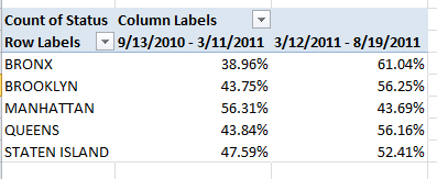
That looks confirmatory. Again, and for reasons that call for a round of deeper looks, Manhattan complaints were lodged disproportionately in the first half of the reporting period – and that seems to be one of those measurement artifacts about which I spoke earlier. If I’m right, then no Manhattan bias – rather, a superior close rate born of a set of disparately-timed borough complaints.
Hope you’ve been writing all this down. If not, there’s a nice big wall over there…

Leave a comment