Big Apple, big data. That sentence fragment comes to you straight from New York’s Open Data site at
https://nycopendata.socrata.com/
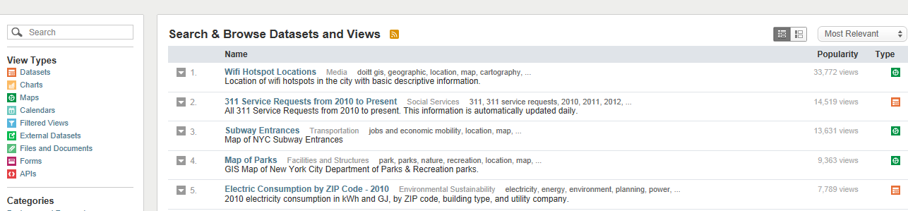
an eccentrically, wondrously miscellaneous trove of information whose contents have little else in common apart from their source city. A good many of Open Data’s (continually updated) holdings make themselves available in de facto spreadsheet form; click any of the dataset icons dotting your search results (the search field beckons in the column stationed at the left of the screen shot), proceed to click the resulting Export button, and finally fire away at the XLSX format option in the Download area (though you can get away with CSV, too).
There’s a lot to look at here, but in the interests of starting somewhere I’ve dusted off the SAT (College Board) 2010 School Level Results dataset and stamped it into the spreadsheet here:
SAT__College_Board__2010_School_Level_Results
SATs, for the worldwide readership, are optional preparatory exams plied by the college-bound American high schoolers, the results directed to applicants’ university choices. Tripartite in construction, each section ranges in score from 200 to 800, and presently comprises Mathematics, Critical Reading, and Writing units. The SAT has been impugned by critics who charge cultural biases lace the exams, and some institutions have struck it from their student-acceptance formulae.
Still, the SAT is out there and continues to impact hundreds of thousands of life chances; as a result right or wrong the 2010 results have something reportable to say.
Once you’ll called up the worksheet you’ll want to put the wrench to a few of the nuts and bolts in there that need tightening, e.g., auto-fitting the B column the better to bare its school names, and sorting the data by say, the C column (by Smallest to Largest) in order to consign score-less schools to the lowest reaches of the data, and then expatriating them from the usable numbers by aiming a blank row between 387 and 388 (and I can’t yet explain why 74, or 16% of the schools, report no scores). You’ll next likely want to introduce a Totals column in G, simply summing the three school SAT scores populating columns D through F (and ignore any “Formula Omits Adjacent Cells” advisory if you see it).
And once those deeds are done you’ll then need to understand the selection bias of sorts that prefigures these data. Our spreadsheet considers New York’s public schools only (that term to be understood in the American sense), spread within the domain of the New York City Board of Education; the data look not at all at the substantial fraction of the city’s children enrolled across its broad panoply of private schools. It is fair to assume that students in that latter cohort come home at night to higher-income families (at least overall), with the attendant educational advantages (see for example, http://admissionsusa.com/messageboard/2011/02/23/do-private-schools-guarantee-higher-sat-scores/ ).
Put all those ducks in their rows and the obvious next step suggests itself – a descending sort of the test data in our TOTALS field. Go ahead and the list tops out with these schools:

And here’s where it pays to be a New Yorker. Natives will recognize familiar, storied names among the high fliers, including Stuyvesant, the Bronx High School of Science, Brooklyn Tech, and Townsend Harris, special-entry schools that proffer what Wikipedia calls accelerated academics to talented young city dwellers. The 735 average Mathematics score boasted by Stuyvesant’s crew is no mean feat, after all.
But now what? Get past that sort, and the data don’t seem particularly inspiring. But – and again, a New York provenance helps here – that six-character DBN field secretes a hidden nugget of data, in position three, to be exact. That alpha codes the borough, or county, in which the schools find themselves, to wit:
K Kings
M Manhattan
Q Queens
R Richmond
X The Bronx
(Kings is the official name of Brooklyn; Richmond is the by-the-book listing for Staten Island.)
And once we associate each school with its borough we should be able to aggregate SAT scores by their geographical identifier.
To start, enter the above data in a range of your choosing (I’ve gone with N1:O5) and name it say, Borough, enter the field name Borough in H1, and slip down to H2 and write:
=VLOOKUP(MID(A2,3,1),Borough,2)
(I’ve described MID in my September 13 post; a first cousin of LEFT or RIGHT, it plucks characters from the interior of a text expression.)
Then copy that result down the H column.
Now you can light up a pivot table, for starters:
Row Labels: Borough
Values: Totals (Summarized by Values and formatted to say, two decimal points)
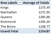
County honors go to Richmond or Staten Island, with a population of around 470,000, by far New York’s smallest, but the borough piling the city’s highest median (but not mean) income. The hierarchy of results stacked above correlate pretty strongly with borough income averages, but Manhattan jabs a sore thumb at the data; with a surpassing mean household income of about $120,000, common-sense points us to the expectation that Manhattan schools’ SATs would rule – and perhaps they do. Remember – we’re confining ourselves to public school scores, and as such haven’t factored in all those rich kids haunting Manhattan’s Upper East and West sides, the ones whose parents pay the big bucks to those posh, well-resourced schools. That issue is a matter for an additional, different set of data.
One more data morsel: as the SAT is optional, one might – might – project a thumpingly positive correlation between the number of test-taking students in a school and its average SAT score. That is, greater student interest in higher education, bigger SAT scores. The correlation between number of SAT-takers and scores:
=CORREL(C2:C387,G2:387)
evaluates to .495 – palpable by social-scientific standards, but one still leaving much of the variance to be explained. A truer measure would begin by first learning the proportion of all school enrolees opting for the SATs, and only then dropping the numbers into the correlation.
In any case, that’s just a taste from the Open Data menu. Hope to serve up something else next time.
@abbottkatz

Leave a comment