Back down into that storied hole in the ground. Now that we’ve counted the lines intersecting each stop each we need only to drum up a title for the curiously truant header in what is now the K column (call it say, Pct Change); then we can hand the data over to some simple but instructive pivot tables, along with a few other preliminary jottings. (By the way – the data from which our analysis proceeds originates here.)
First among the latter might be an elementary lines-per-stop fraction, or the total of all lines per stop – 731 – divided by the number of recorded subway stops, or 421. That comes to 1.73 lines per stop, a reading that, by way of comparative example, powers it past Paris’ 1.34. Does that make the New York system the nimbler of the two, opening a sluice of option-richer travel flows from point to point? I don’t know about that, and I’d refer the matter instead to a statistician and/or urban planner. Remember that New York is by far the physically larger city, and you’d have to leave the service-optimization algorithm to the regression analysts.
You might also want to sort the data by 2012 rank (or the 2012 ridership field), serving up an unsurprising but substantive demonstration of Manhattan’s hegemony. Ranks 1 through 11 are arrogated by the island’s stops, preeminent among these Times Square, the nexus of 11 – count ’em, 11 – different lines. It isn’t until you lower yourself to rank 12 that you come face-to-face with a non-Manhattan venue – Main Street, the teeming Queens terminus of the Number 7 line, a stop to which I’ve wended my way many times (New York subway lines are either numbered or lettered, by the way, a legacy of the scheme’s multi-system prehistory).
But note that Main Street is also the busiest stop through which only one line runs, triggering an obvious pivot-table poser: how does station ridership covary with the number of lines tracking through its platforms? It stands to reason of course that, all things being equal, stations housing more lines will absorb the great rider population; but an average riders-per-number-of –lines station index might tell a different story.
And in order to tell it we need to crack open a pivot table and sow a calculated field (see my September 6 post for the mechanics) therein, one which divides aggregate rider totals (and remember we’re navigating rider-per-weekday data) by each lines-per-station total. For example: in order to figure the average for stations harboring three lines, we need establish this fraction:
All riders for stations with three lines/(Number of three-line stations*3)
That’s a relatively simple but not-entirely-intuitive bit of division, but with a few seconds’ rumination you’ll be able to see what it’s doing. We can call the calculated field say, Riders Per Number of Lines, and write it thusly (assuming we’re working with the 2012 rider numbers):

And in sum, the pivot table comprises:
Row Labels: Lines per Stop
Values: Riders Per Number of Lines; and for good measure why not throw in
Lines per Stop (Count)
You should end up with something like this (once the standard formatting’s been implemented):

Among other things, we see that 237, or 56% of New York’s stations, feature but one line. But note that these carry strikingly more riders-per-line than those stations entrusted with two lines.
Now this finding is quite something apart from the average number of all riders per line, broken out by number of lines-per-station, though if you haven’t had your coffee yet the two sound equivalent:
Row Labels: Lines per Stop
Values: 2012 (Average)

But what about individual stations and their 2012 per-line ridership? Just cut back to the source data and title the next available column Riders per Line and enter, in row 2:
=I2/C2
That is, divide the 2012 station ridership by its number of lines. The top 10 (I’ve hidden a few columns for screen shot purposes):
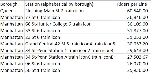
Main Street again – by a rout, and note that positions one through five record stations equipped with but one line. Times Square? By this reckoning, it recedes to a diffident 22nd place.
And what about rider and station activity by borough? Shaped by the appropriate formatting, how about
Row Labels: Borough
Values: Station (Count)
Lines per Stop (Average)
2012 (Sum)
2012 (Sum) (Show Values as % of Column Total):
![]()
(Remember, by the way that the field headings above can be renamed by clicking the pertinent field cell and entering something new. The source data headings hold to their original names, though.)
Note, for example, that Brooklyn, the city’s most populous borough, likewise enjoys the highest station count; but Queens, the penultimate borough whose residential cohort exceeds Manhattan’s by 600,000, appears to have been shortchanged – although again, station construction could not have expectably geared itself to latter-day demographic ebbs and flows. And Manhattan – the cynosure of so much of the city’s activity – checks in with the system’s highest line-per-station average.
Note as well that 55% of the subway’s daily ridership passes through a Manhattan-sited turnstile, a proportion that makes a good deal of sense. Since it’s reasonable to suppose that the great bulk of Bronx, Brooklyn, and Queens weekday users head to work in Manhattan, their return trip of necessity starts in the latter borough. Thus the Manhattan/other-borough totals could be expected to offset each other, and they do within reason, once they’re qualified by the obvious supplementary fact that many Manhattan dwellers work in their home borough, too. And all those Manhattan-based tourists could be expected to skew the ratios too.
OK – one last table, formatted to two decimals with the Grand Total turned off:
Row Labels: Borough
Values: 2012 Rank (Average)
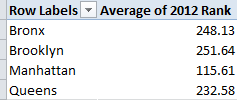
Those are borough-wide, station rider-total ranking averages. And they’re just what you expected to see, no?

Leave a comment