For all the wrong reasons, news about London bicycling has lately and repeatedly boldfaced the city’s headlines. A spate of fatalities on the city’s roads – six in the past two weeks – has compelled a re-ask of questions about rider safety and a gathered to it a clutch of variously satisfactory answers, including London’s Mayor Boris Johnson’s own question: if cyclist carelessness might in some way be contributory.
In fact the tragic toll urges a need for perspective upon the investigator. London’s 14 cycle deaths matches the 2013 total, but interpretations hinge on both an appreciation of the statistics of small numbers, however dreadful, and rider volume, one review of which is posted here.
Those background understandings need be imported into the equation and kept there before any analysis of the UK-wide incident data for 2012, compiled by the country’s Department of Transportation and delivered by and interactively mapped in the Guardian, can move ahead. Its Excel equivalent is here:
The data are hearteningly fit for manipulation (all the dates are dates, for example), if imperfectly so. Some here-and-there sprucing would appear to be in order, including
- A turning off of the global Wrap Text effect that seems to have fanned through each and every cell in the workbook
- A columnar autofit on behalf of field-header visibility
- An recommended delete of the Casualty Type field, each cell of which billets the word Cyclist, and hence affords no differentiation
- Another discretionary dismissal of the redundant Long lat field, whose values have been practicably broken out in the two columns to its left
- As the Casualty No. field codes the Casualty Severity data to its immediate left (1 for Slight, 2 for Serious, and 3 for Fatal), it too could be deemed redundant, and likewise dispensable. Averaging the codes into a severity index of sorts would deputize the numbers with an authority of the most arguable kind. What would a severity average of 2.5 mean?
- The field reference to Northing, “The difference in latitude between two positions as a result of movement to the north” (to quote thefreedictionary.com), could probably could be ignored, if not exiled from the sheet, along with its perpendicular companion Easting. Latitudes and longitudes would better serve any data mapping enterprise.
Once these bumps have been smoothed, you should be able to undam an outpouring of pivot tables, again provided these submit themselves to the necessary qualifications, i.e., information about the numbers of riders of any and all vehicles on the road at the pertinent times and places. And as such, these tables can only travel the first leg of the investigative journey.
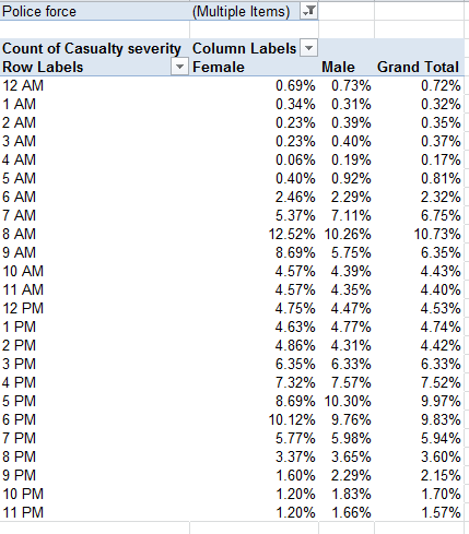
Let’s start in any case with a gender breakout across the UK:
Row Labels: Sex of Casuality
Column Labels: Casuality Severity
Values: Casuality Severity (by Count, of necessity; these are textual data). With a bit of formatting, I get

Then shift to PivotTable Tools > Options > Show Values As > % of Column Total (and add PivotTables Tools > Design > Grand Totals (Layout button group) > On for Rows Only here. We don’t need horizontal 100%s here):

The hugely dilated gender incident divide – plainly redolent of a far greater male bicycle ridership – yet widens with accident severity. Even granting a congenital disparity, women comprise a notably smaller proportion of fatal incidents, cueing a deeper look as a consequence. Do women ride fewer aggregate miles per trip, or navigate safer roads, or ride with greater care?
What about gender crosstabbed with time of day? Because the gender categories are binary and readability is sharpened by running times down a column and not across, where the fields could bleed off the screen, drag Sex of Casualty to Column Labels and drag off Casualty Severity. Slip Time into Row Labels, and group its data by Hours (and only Hours). Maintain % of Column Total as well. I get

Note the disproportion of women populating both the 8AM and 9AM tranches (keep in mind the percentages above are reading downwards; the 11.68% stands as the percent of all female incidents), the likely rush-hour peak. Again, the table fires questions it can’t answer by itself. Are women riders relatively more likely to take to the roads for work destinations than at other times? Are they somehow more vulnerable to High Goods Vehicles (HGVs), implicated in numerous incidents?
But that last interrogative is a something of a London question. To see how the data present themselves for that city alone, drag Police Force into Report Filter, click its filter down arrow, tick Select Multiple Items, and check both City of London (that financial center/city-within-the-city indeed maintains its own law enforcers) and Metropolitan Police, the London constabulary:
Both genders exhibit higher incident proportions at the 8AM mark than the UK as a whole, but again the female percentages skew the 8 and 9AM slots.
How about day of the week? Start over again, and start simply:
Row Labels: Day of the Week
Values: Casualty Severity (again, Count):

Remember these are UK-wide data. Not surprisingly, weekend days record far fewer incidents, an expectable consequence of a presumed tail-off of car/truck (or lorry) traffic during that phase of the daily round. On the other hand, we can’t tell from the above how many recreational riders predominate on Saturdays and Sundays, and how their numbers impact the cycle-car/truck ratio. And in any case the numbers are very similar for London only.
And what of prevailing speed limits at the point of incident, a hotly controverted issue (see www.20splentyforus.org.uk )? Considered nation-wide:
Row Labels: Speed limit
Values: Casualty Severity (Count)

Again, of course, the data need to be reconciled to the numbers of streets upholding the respective limits, and the extent to which these are pedaled through. In fact, recalculate the above by % of Row Total and:
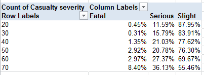
The percent of fatal incidents of all 30-mph events actually falls beneath the figure for accidents at 20mph (though of course the numbers are fortunately small).
Lots to think about. We need more deep background, to be sure – but if you’re looking for Square 1, here’s a good place to start.

Leave a comment