I seem to have gotten on a vehicular jag of late – first bicycles, then cars, and now jets, more particularly ones that deliver functionaries at the UK Home office on their appointed, and perhaps sometimes, disappointed, rounds, rowed and columned here (for 2011):
Home_Office_Air_Travel_Data_2011
The spreadsheet is perhaps admirably straightforward. I was preparing to dismiss the Departure field in column C for its at-first-blush redundant character, appearing to roll nothing but “UK” entries across its cells, but in fact 79 entries in the field offer up something other than UK, e.g., EEA (the European Economic Area, an organizational composite enrolling European Union and European Trade Association members), and Non EEA embarkation points.
And therein is promoted a measure of mystery. The data’s departure and arrival points are drawn in the most general terms, and one could properly wonder if that manner of indefiniteness means to divert the reader from exactly where the Home Office has been taking itself. That could be, but an enterprising journo could perform a bit of triangulation by correlating departure date, airline, and flight fares in order to educate a guess about the airports associated with those departures and/or destinations, and all with information unambiguously and publically there on the workbook. Nothing treasonous there – I think. But if I’m wrong about that, I need to finalize that reservation at the Ecuadorian embassy.
Be that as it may, taxpayers may want to know how fares fare, and those totals are most easily pivot tabled, broken out first by say, month:
Row Labels: Departure_2011
Values: Paid Fare (format as you wish)
Paid Fare (again, this time Count). You should see:
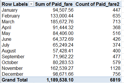
Considerable inter-month variation obtains; how that squares with the rhythms and syncopations of policy-making remains to be considered. Note that March hands in the dearest expense report, but trip count honors go to November, at 1128, or 37.6 a day. Those disparities put Marchs’s per-trip average at £260.41, and that for the eleventh month at £144.10 (I couldn’t output the averages via a calculated field, but I’m still thinking about why not and how the why the might be articulated), begging more than a few questions in turn. For one – rather than having traveled farther distances on average, is it possible that March’s passengers were more likely to have taken off from a seat in one of the upper classes?
That question is easily answered:
Row Labels: Departure_2011
Column Labels: Ticket_Class_Description
Values: Ticket_Class_Description (PivotTable Tools > Options > Show Values As > % of Row Total)
Click On for Columns Only among the Grand Totals option in the Design> Layout button group.
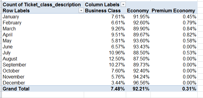
March Business Class flights blurt well above the 7.48% per-month average (that average, by the way, proportions all business class to all flights), but cannot explain the better part of that month’s elevated fare-per-trip. But try swapping Paid _Fare for Ticket_class_description in the Values area (by Average):
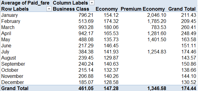
That adds a jot of definitiveness to the query. March’s Business Class-ruling £993.28, far higher up the axis than any other month save Aprii, appears to account for its dilated overall fare average. Note in addition the very substantial January-May Business Class averages and the commensurate fall-offs, timed with June.
If we next substitute Destination for Ticket_class_description (and all those underscore-connected field names suggest a data inception pointing back to an application other than Excel), work with the Count operation in the Values field and show the values as % of Row Total (turning off Grand Totals for rows if necessary):
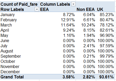
It’s easy to be struck by the Home Office’s near-absolute moratorium on non-UK-destined flights after May. Indeed, no such sorties toward EEA nations streaked down any runway after that month. Of course I can’t explain the EEA front-loading in 2011; It would prohibitively difficult to point to an Office strategic deliberation to fly to only certain venues, and only then; one would think the commanding political exigencies would goad the flight patterns instead, if there is a “pattern”. We’ll need to pass this one over to you, Mr. and Ms. Journo.
We can begin to prepare for landing here by breaking out flights by airline, one of the parameters that again might hint at actual flight destinations:
Row Labels: Supplier_Name
Values: Paid_Fare (Count)
Paid_Fare (Sum)
(In excerpt:)
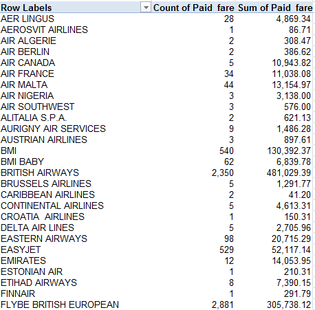
55 airlines figure in the manifest, and these data require a bit of study as well. Note the unsurprising hegemony of the British-based British Airways and Flybe (along with BMI and BMI Baby, neither currently trading, as they say here). Again, exactly how these plot against destinations might take a bit of reflection, or more than a bit.
So fasten your seat belt.

Leave a comment