And now for a study in contrasts. If last week’s UK Home Office flight records submitted their data to a partial lockdown, i.e., by apparently boarding up their flight destination data, the data before us now – combed from the US Research and Innovative Technology Administration Bureau of Transportation Statistics (RITA) – suffers from no such recalcitrance.
IF anything, the RITA holdings, linked here, fires a barrage of too much information at the searcher, if that kind of excess is even possible or undesirable. The RITA interface presents itself in copious checklist form, enfranchising the searcher to pick and choose data fields of interest, as per this excerpt:
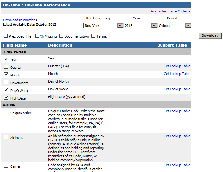
Again, be advised that the capture above is rather fractional; there’s far more there in there, although you’re likely decide against many of the downloadable fields, e.g. the long block of Diverted Airport Information parameters. On the other hand, as they used to say about the New York Times, it’s nice to know it’s all there.
For illustration’s sake I drafted what I took to serve as a useful assortment of fields describing domestic arrivals and departures to and from New York state airports for the October, 2013, the last month for which data are available (note: it appears as if international flight data should likewise avail here, as per the myriad checkbox possibilities above, e.g. OriginWac or Origin Airport, World Area Code, but I haven’t been able to actually call them up. I’ve emailed RITA about this). You can find it here, in its 3.87 MB glory:
My field selection comprises:
DAY_OF_WEEK (expressed in numerical terms; 1= Monday)
FLIGHT_DATE (that is, Flight)
ORIGIN (originating airport)
ORIGIN_CITY_NAME
ORIGIN_STATE_ABR
DEST (destination airport, that is)
DEST_CITY_NAME
DEST_STATE_ABR
DEP_TIME (Departure)
DEP_DELAY (expressed in minutes; a negative value denotes an early departure)
ARR_TIME
ARR_DELAY (again, a numeric rendering; negative values attest early arrivals)
ACTUAL_ELAPSED_TIME (in minutes)
DISTANCE (between airports, in miles)
(Note that because I’ve initially filtered the data for October, 2013, there’s no need to actually interject those fields into the download).
Of course, with all those other boxes you can customize and re-customize your investigations to your heart’s content, and handy lookup tables explicate the content of many fields whose data are guised in coded terms.
Once the fields are readied (and you’ll also need to perform a column autofit here), plenty of questions beg to be asked and answered. Consider, for example, a simple, initial pivot-table query of flight frequency by day of week:
Row Labels: DAY_Of_WEEK
Values: DAY_OF_WEEK (Count)
DAY_OF_WEEK (Count again, this time as PivotTable Tools > Options > Show Values as % of Column Total via the Calculations button group)
I get
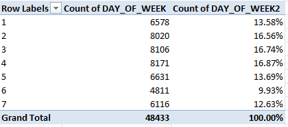
Noteworthy day-of-week variation obtains, as we see, with Tuesdays and Wednesdays more or less equivalently busy, and with Mondays at their heels. I would have expected far denser, weekend-presaging Friday flight activity, on the other hand, but that just goes to show you what I know.
And how about some Arrival/Departure State distributions, e.g.,
Row Labels: ORIGIN_STATE_ABR
Values: ORIGIN_STATE_ABR (Count, of necessity)
I get (in excerpt):
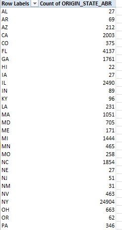
Of the 48,433 flights tracked in our data set 24,904, or 51.4%, emanated from New York, a wholly predictable fraction – I think. If you next run these fields through a table:
Row Labels: DEST_STATE_ABR
Values: DEST_STATE_ABR (again, Count)
Here New York state reports itself as a destination 24,905 times, or 51.5% of all arrivals. Remember of course that all the flights among the data either took off or touched down in New York – but because some flights embarked from and landed in New York, the state’s departure/arrival numbers aren’t quite reciprocal. Indeed, if you throw DEST_STATE_ABR in the Report Filter area and filter for NY and leave the ORIGIN_STATE_ABR data in place as per the above shot, you’ll learn that 1,416 of all flights both began and ended in the Empire State (that’s New York). Call me the ingénue, but I’m (perhaps bewilderingly) struck by the near-identical New York arrival-departure numbers for each state as well. Does it follow, after all, that all these comings and goings would necessarily equilibrate? Well, perhaps it does – assuming, for example, every New York-Cincinnati flight need be followed by a return in the opposite direction. It may be that scheduling and maintenance imperatives require all those paired backs and forths. After all, if the plane has to get back to New York, it might as well carry some passengers on the way.
Here’s but one more table to think about:
Row Labels: DISTANCE (grouped by an interval of say, 250 miles)
Values: ARR_DELAY (Average)
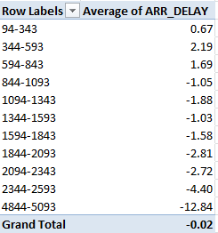
Recall that negative values bespeak earliness; witness, then, the broad correlation between lengths of flights and their timeliness (though 419 of the 48,433 flights report no Arrival Delay data at all). The longer the trip, as a most general rule, the earlier the arrival. No, that wasn’t my default surmise, although training a finer lens on the 48,015 ARR_DELAY-divulging flights via the CORREL function:
=CORREL(M2:M48015,O2:O48015)
(where ARR_DELAY is posted to the M column and DISTANCE holds down O)
delivers a mere .054 relationship (note, for example, that only 43 flights lock into the 4844-5093 tranche, and over 80% of all flights comprise 1,600 or fewer miles; the table results thus above don’t proportion the respective inputs of the groupings.)
In any case, know that even if you confine any additional downloads to just the fields installed above, many more findings nevertheless should slake your curiosity –and even if you’re pleased to study New York data alone. You can, after all, drill back to many years and individual months for New York or any other state. And you don’t even have to latch your seat belt.

Leave a comment