Archive | February, 2014

Lights, Camera, Data: Paris Movie Locations, Part 2

27 Feb

It’s called a teaser in the business, though my nail-biter of an allusion in last week’s post to a conceptual problem with the pivot table sourced by the Paris movie-shot data isn’t the stuff of big-time buzz and box office frenzy.  But the show must go on, to wit:

We wrapped up last week’s post by counting and grouping Paris film scene shots by their arrondissements, after which I dropped some dark hint about a conceptual problem spooking the data crunched in the pivot table that was doing the counting and grouping.  Now the problem can be told: My interest in these data – an interest in which you may or may not want a share – is to build a census of film locations at which any given movie unpacked its cameras, counting each such intersection of film and location once each.  And what that means is this: if 20 films prevailed upon the Eiffel Tower to sit still for a shot or two, I want that activity to total 20 – and nothing more. The problem with our data is that if film A shot the Tower (or Tour, to the natives) on June 16, for example, and then returned for another take on June 28, our worksheet will have recorded each visit, thus inflating the overall sum to 21. Speaking merely for myself again, I’m looking in effect for the number of movies that trained their lenses on a particular site – and not the number of individual times a given movie adopted that site. I’d then want to gather all these data under their respective arrondissements; and again, the pivot table with which we capped last week’s post counts a site each and every time it was filmed, thus including multiple shoots by the same film.

In order to get what I what, then, I – or we- need to nit-pick the data for their redundant film/site entries, and that’s a job for the Remove Duplicates feature, which premiered here in the July 4, 2013, post (also Paris-themed, as it turns out. Check it out for the necessary Remove Duplicate steps). But the first thing you want to do, before obliterating all those excess records, is make a copy of the original data and paste it somewhere – because by the very nature of the deed we’re looking to disabuse the data of its duplicates (as we want to define them), leaving us with a leaner set of records – even as we reserve the right to work with the primordial data set, redundancies and all.

In any case, once you’ve reacquainted yourself with Remove Duplicates, click Unselect All and tick back on Titre (movie title) and addresse_complete, thus priming the search-and-destroy mission for all those records notating the same film and the same site more than once, but conserving one representative of each, of course.

And once you’ve rid the data of those 1300 or so unwanted doubles you can retry that pivot table, complete with a sort:

Row Labels: Arrondissment

Values: Count of Arrondissment

This time I get, in excerpt:

locat1


(N.B.: If you’re clicking along with me your results may vary, as they say. That’s because I took some pains to edit the data in the addresse_complete field, which suffer from more than a little inconsistency. Many addresses appear by turns with and without dashes, for example, e.g.

locat2

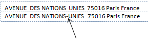
And that’s just one; again be advised that, absent a stiff dose of quality control Excel will regard the above as separate addresses, all because of that silly little dash.)

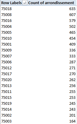
Note the regime change in our results. Where location honors belonged last week to the 8th Arrondissment, the revised, trimmer data with which we’re working now have resituated Paris’ movie-location epicentre to the 18th, by the city’s northern edge. It depends, then, on what you’re looking for, and how.

Now for another look and a different read of sorts on arrondissement popularity, how about toting up shooting days, and breaking these out by arrondissement? That is, why not add all the durations in days of all shoots (i.e. all date_fin_evenements minus all the data’s date_debut_evenement, where “evenement” means event), and align these to the arrondissements in which these were filmed?

Once we’re happy with that question we need to recall the original, duplicate-ridden data set (I told you to make a copy), because now we want to factor in all the shoots at all the locations, including revisits to once-filmed sites (understand as well that some films may have set their tripods down at a plurality of locations on the same day, with each and all of those days to be counted).

Step one toward that end seems simple enough – make room for a new column and call it Days, within which we want to conduct a record-by-record subtraction of shoot start (debut) dates from their finish (fin), e.g.

=D2-C2+1

 The +1 above will admit the day of shooting inception itself into the total; otherwise, if you subject a shoot that begins and ends on the same day to this formulation, for example:

=D2-C2

you’ll get zero; hence the necessary + 1.

But step one is in need of a step one-and-a-half, as it were, because a wayward promenade through the data took me past about 60 records in which the fin happened later than the debut, and in the standard order of things ends usually precede beginnings. There’s a programmatic way out of that this chronological snare, though (I’m assuming by the way that the fins and debuts were simply transposed); enter in the first row of your Days field

=ABS(D2-C2)+1


And copy all the way down. ABS is an agile means for shaving any plus and minus signs sprouting from a number and returning its absolute value only – in effect, the plus equivalent. Thus, for example,    =ABS(3-7) and =ABS(7-3) will both settle on the value  4.

And once all the days have been absolutized, this pivot table beckons:

Row Labels: Arrondissement

Column Labels: Cadre (just for good measure)

Values: Days (Sum)


I get, in excerpt:

locat3

Interesting, n’est-ce pas? It’s the 16th Arrondissement on which the auteurs seem to have actually spent the most time filming (in days), although I can’t tell you why. Note too that the relatively banal 11th grabs the silver medal here, even as it slouches into 15th place in the first table table pictured earlier (Domaine Publics, by the way, seem to comprise venues of the park/forest/square ilk, and note their strikingly variable ratio, by arrondissement, to Exterieurs.) And on a summatory note, consider that the grand total of all film days comes to 29,030 – or nearly 80 years’ worth of day-time spent shooting Paris scenes. Formidable.

Time for one more data-quality issue, if I may. Take a look at this data excerpt:

locat4

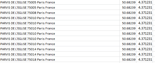
Parvis denotes a square fronting a church; but observe the assortment of postal codes above, all appearing to convene at precisely the same latitude and longitude. Moreover, those coordinates don’t even seem to be Paris-based; Google place that city here:

48.8567(latitude)

2.3508 (longitude)

And given that each degree of longitude takes in about 60 miles at this global pinpoint, it seems that at 4.371231 the data have traveled some way out of Paris – and again, according to Google, they have; the lats/longs in the above screen shot put all those churches in the Gare (station) de Braine-l’Alleud – in Belgium.

I knew there was something wrong with that sat-nav.


Lights, Camera, Data: Paris Movie Locations, Part 1

20 Feb

You won’t be learning anything you didn’t already know when you’re told Paris is a first rank cinematic – or Seine-ematic – go-to site for hundreds of filmmakers.

But hundreds is but a number, and so once the discussion turns quantitative a turn to our favorite application might help us texturize the clichés with a sprinkling of data-based somethings we didn’t already know about the Paris big-screened experience. The Lieux de Tournage de films (long métrage) – (very freely translated, Locations for Feature Films, these dating back to 2002) –a spreadsheet on the bill at the  Paris Open Data Site that names and counts the Paris streets and allées backdropping all those movies – is playing here:

http://parisdata.opendatasoft.com/explore/dataset/tournagesdefilmsparis2011/?tab=table

Download the sheet by clicking the Export button and deciding next between the Télécharger en CSV or Excel links, stationed immediately beneath those respective headings.  Experience would point me to the CSV alternative, because I’ve met with occasional file-truncation issues in the Excel mode and portlier file sizes besides. Start by whisking both into your system – but make sure to save both varieties to XLSX format (after you’d swerved past roadblocks like the one pictured below), and you’ll be advised that the dedicated Excel offering checks in at 612 KB, about 30% weightier than the CSV 477 KB – but either way, your hard drive will find itself swallowing an eminently digestible byte count.

                       loca1

 Now, while I’ll ultimately want to migrate to the Excel version in this case – its data have already tucked themselves into their appointed columns, for one thing – there is an attention-getting contingency in the CSV that you may want to think about.

First open the CSV take and you’ll see (in excerpt):

 loca2

As often seems to be the case with Paris’ open-data workbooks, we’re brought midway into the plot and asked to supply its denouement – by separating the data above into suitable columns, via the Text to Columns feature (click on cell A2, for example, to sample its semi-colon-separated, imminent fields); launch Text to Columns (again, return to the January 13, 2013 post for a procedural review), holding to the Delimited default and ticking the semi-colon box in Step 2 of the Convert Text to Columns wizard). Answer OK to the Do you want to replace the contents of the destination cells? question, as I did initially, and you’ll get here, in excerpt:

 loca3

 Don’t worry about the shortfalls in column width here; look instead at the geo_coordinates field, comprising location latitudes – and only latitudes, the cartographic equivalent of a stick with one end. This is literally a case of you can’t get there from here – because, after all, spreadsheet mapping of any species is adamantly two-dimensional; got no longitudes, got no map. So wither the longitudes? I tweeted this question to Open Data Paris and received a couple of kind replies (one from a private Tweeter), neither of which quite relieved my curiosity, perhaps because I hadn’t specified I was looking at the CSV variation on the theme.

But when I reloaded the CSV offering and eyed the data anew I actually beheld those fugitive longitudes, presenting their credentials right there in column B. And where did had these data gone, then? They had, in fact, been dispossessed by the Text to Columns routine, at the point when we chose to click OK to the “Do you want to replace the contents of the destination cells?” request, an inquiry which means exactly what it says – namely, that Text to Columns proceeds to overrun and overwrite all the entries in the columns into which it parses and empties its data. Bottom line: indulge your itchy trigger finger on Text to Columns, and you wipe out the longitudes in column B.

The way out? I’d copy the longitudes first, paste them somewhere far away (onto a new sheet, perhaps), step through Text to Columns, and copy and paste the longitudes alongside what should now be the latitudes field (that is, the next available column).

But that episode was a trailer of sorts. Let’s get back to the main attraction – the Excel-versioned download – for some close-up shots of the data.

First, I’d click away the Wrap Text effect, which seems to have been played upon each and every cell in the sheet (note the fractionated text in the F, G, and I columns, a time-honored Wrap Text correlate) For an en-masse Wrap Text turn-off click the Select All button, that empty rectangle minding its own business in the sheet’s upper-left corner:

 loca4

Click Wrap Text, double-click of couple column autofits, and all the data will begin to squint in the daylight. Next, we see that the geo-coordinates field embraces both site latitude and longitudes (in that order), and so a necessary separation need be effected with Text to Columns (the data are Delimited, and check the comma delimiter in Step 2). Label the new independent columns Latitude and Longitude (and you’d probably want to autofit Latitude in column J).

Now those pesky green error indicators roofed in the upper-left of all the cells in the H, arrondissement (district), column signal the storied Numbers Stored as Text message, a warning we’ve confronted several times before, first in my August 14, 2012 post. I’d allow that we can let that “error” stand here, simply because we’re dealing with what are in effect Paris zip codes, and as such they’re not likely to play an authentic quantitative role in any later analysis and can remain textual. If you want to suppress the indicators, though, the protocol for doing so is actually slightly tricky. Once you select all the affected cells you need only click that exclamation-marked error flag and select Ignore Error, whereupon all the green meanies will get the heave-ho. But you can’t take the easy way out, by selecting all the H cells by clicking the H column heading; for whatever reason that simply won’t work. What you can do, though, is implement a little-known but elementary selection tool by clicking in the Name Box, the white strip just atop the Select All button:

loca5

Enter

H2:H8618

in the box, the range down which all data-laden cells happen to stretch (there are some blanks in the range, by the way), and press Enter. Once that cell-specific deed is done, click the error marker and select Ignore Error.

Now for some analysis. We could start by breaking out the numbers of scene shoots by their arrondissements, thus drawing up a kind of directors’ site popularity index. An easy pivot table suggests itself here:

Row Labels: Arrondissement

Values: Arrondissement (Count, even if you’ve retooled these into numeric values)

The results could be then sorted (in excerpt):

loca6

We see that the 8th Arrondissement (arrondissements are prefixed 750), subsuming the Champs Elyseés among other venues, ranks as number one scene stealer, with the 18th (think Montmatre) and the posh 16th holding down positions two and three (observe that the Eiffel Tower, standing bestride the 7th Arrondissement, finishes out of the medal running in a far away 9th place; but the stirring sightings of the structure obtain from the 8th, just across the river). It’s also more than a little noteworthy that all 20 of Paris’ arrondissements were deemed scene-worthy, each attracting at least 185 shootings.

But scale down the list and some problems – numerically few, to be sure – compromise the data. The arrondissements are coded in five digits, and so one should be right to assume that the outlaw 750008 entry has been overloaded with an excess zero, a defect easily repaired by conducting a search 750008/replace 75008 mission. By the same token, I’d almost bet the house that the 7502, 7518, and 7009 abridgements are really 75002, 75018, and 75009 entries, but I’d keep my money in my wallet if you’re asking odds on  750052, which could be 75005 or 75002. Faced with that kind of geographic indeterminacy I’d run the address in question – Pont (Bridge) de l’Archevêch – through Google, and come away with 75005, which is just what I did. And here it is:

loca7

Nothing if not scenic –but that explains why the 743 different movies in our data decided to plunk their cameras there. (Click here for a photo source attribution.)

And the 750O7 record is surely a well-intentioned 75007, with a capital O monkey-wrenching the code. (But the 92 and 93 prefixes aren’t misplaced, by the way; they reference Paris suburbs.)

But there’s another problem with our pivot table, a conceptual one. But this post has gone on long enough; do we need to cut 20 minutes from it?

Hope to a have a sequel soon. In the meantime, here’s some popcorn.

Multiple Revisions: DC Crime Data, 2013

13 Feb

Change may be good, but sometimes when the change substitutes apples for oranges, the surprises on the menu can be hard to digest.

Don’t worry – I won’t push that fruity metaphor much further, but when more-or-less similar datasets beg comparison to one another you do need to decide what you’re going to do with the “less”.  Case in point, last year’s crime data for Washington DC, downloadable here:

http://data.dc.gov/Main_DataCatalog.aspx

If the data sound – or look – familiar, it’s because we spent some time with the 2011 DC numbers on August 12, 2012, brought back here:

 washdc-crime-data-2011

You’ll note that 2011 is more-or-less similar to the 2013 rendition.

And there’s the rub, that more-or-less. Look closely at the two sheets, and, as if they’re were entwined in puzzle form, try to see what’s different about them.  For one thing, 2011 matches crime incidents to their latitudes and longitudes – a useful thing to be sure, but 2013 doesn’t.  And that’s for starters. With a bit of fooling around (and kudos to Excel’s Copy>Paste>Transpose feature, and the ever-perennial Sort command), your correspondent lined up the 2011 and 2013 fields respectively, conditionally formatting the 2011 names that reappear in 2013 (by dint of the MATCH function):

                       dc1

(And for a most enlightening explication of the above field names, look here.)

Apart from 2011’s larger field complement, we see as well that only 13 of its fields recur in the  DC crime data two years later. Needless to say, that malocclusion could cause problems.

Maybe. Some equivocation is in order because the analyst may simply not care about at least some of those unrequited fields. I don’t think the 2011’s HOTSPOT fields will be missed, for example, and indeed, they’re nowhere to be found in 2013. And some omissions in the latter sheet are probably a good thing, in any case.  2011’s CITY field does nothing but avow the name Washington 32,000 times – a most dispensable redundancy, you’ll agree, and ditto for STATE, which iterates DC (it’s the nation’s capital and as such not quite a state, but it’s close enough) almost as monotonously, syncopated only by the occasional blank cell.

But discontinuities in the METHOD field, which does inform both sheets and presumably codes the manner and means by which reported crimes were committed, are more material.  20,000 cells in METHOD, circa 2011, were assigned an unvarnished 1 or 2, the import of which presently escapes me (again, return to this page for some clarification of these puzzlements. I’m not sure, however, that the 1 and 2 identified there comports with those numbers populating the 2011 sheet); and nowhere does METHOD in 2013 resort to these notations. There’s nothing but text in there, although to its own discredit 2013 fills more than 31,000 of its METHODS cells with the unilluminating OTHERS entry (note in addition that 2011 deploys the singular OTHER, but far less often).

And as far as these things go, then,  the coding disconnect between the two years is something of a big deal. An investigator might very well want to compare crime-commission-method frequencies across years, and given the discrepant coding schemes brought to bear on the METHODS data for 2011 and 2013 that intent is hereby foiled, unless you’re prepard to mount some wholesale effort at reconciliation which might or might not be worth the bother.

Here’s another issue. Unlike the 2011 version, the 2013 REPORTDATETIME field contributes time, in addition to date, information to the parameter (time data were actually introduced in the 2012 sheet, whose data-organization maps onto 2013’s. We haven’t looked at 2012, a simple consequence of the times at which these posts have been written). That should thus enable us to pivot table crimes by hour of the day i.e.

Row Labels:  Offense

Column Labels: ReportDateTime (group solely by hour)

Values:  Offense

dc4

(The screen shot excerpts the whole for reasons of space and legibility.) There’s a lot to note there, among other things the swell in motor vehicle thefts in broad daylight (Theft F/Auto stands for Theft from Auto, that is, items thieved from autos).

But in addition you’ve probably noted a curiosity on your own – namely, the unvarying time-stamp of all homicides of 12:00 AM. That can’t be right, of course, and an answer to my inquiring emails to DC Data about that impossible consistency awaits.

HOWEVER – make room if you will for a revisionist epilogue, borne of a late-breaking discovery.  I’m not alone, after all; the folks at DC Data have likewise made themselves well aware of the 2011-13 field incongruities expounded above, and now offer a revised edition of the 2011 data here, whose fields, time stamps, and codings line up most fittingly with their yearly successors. And that means you can copy and paste the 2011 through 2013 records onto one grand workbook and have some ringing longitudinal looks at it all. Any downsides? Well, we lose latitudes and longitudes, if you’re among the map-minded. And the 2011 homicide data are also time-stamped at 12:00 AM.

London Police Stats, Part 3: Somethings to Think About

6 Feb

Now that we’ve fought the good fight to make the wards data usable – and won, more or less – let’s take stock of our victory – no gloating, please – and actually proceed to do something with those 14,000 rows worth of booty.

In fact, once the dust settles much of the analysis comes easily. Most evidently, perhaps (and remember the call I issued in the last post to rename all those Total columns), one could pivot table the aggregate of the Total Notifiable Offences column against London borough, and perhaps sort them largest to smallest:

Row Labels: Borough Name

Values:  Total Notifiable Offences

blogstats1

Note Westminster’s surpassing figure, a more than six-fold multiple over the bucolic and quaintly-named Kingston upon Thames in the city’s western sector. Of course you’d need to pitch these numbers to the boroughs’ respective populations, including their daytime counts, in order to fairly understand them. Westminster, after all, is the meeting ground for Parliament and a tourist cynosure, and as such likely boasts an effective demographic  a couple of orders of magnitude beyond its residential cohort  (see these 2011 UK census data, particularly page 8, which put Westminster somewhere in the middle of the London pack; note too the absence of the City of London here, the teeming financial district that stands in a quasi-independent relation to the rest of the boroughs).

And there’s room for an additional “of course” here. Of course, an undifferentiated total of all notifiable offenses (I’m American –excuse that first ‘s’) can’t engineer the drill-down you’d really need in order to press the analysis meaningfully. Because the pivot table assigns a value of 1 both to murders and the handling of stolen goods, for example, the incidence of each crime type need be isolated and counted discretely in order to enable the necessary perspective on borough-specific crime. Indeed – exchange Murder for Total Notifiable Offences in the pivot table, for instance, and you’ll find four other boroughs with higher homicide counts than Westminster.

What we’d want the pivot table to do, then, is agglomerate and banner all the crime types by borough across their columns, much as our source data presently do for each ward, and then subject all these to the Show Values As > % of Row Total feature, thus properly sizing each offense’s “contribution”  to the borough’s crime whole.

But you can’t do that here, at least not without mounting a mega-reconstruction of the data – and that’s because each crime type tends its own field, and Show Values As will only return its percentages for data all of which occupy the same field (again, see last week’s post and its first screen shot for a fleet restatement of the field-item problem). And so by granting a false independence to its crime fields, the workbook stiffens its receptivity to important extensions of the data.

Nevertheless, other more plausible breakouts await, e.g.

Row Labels: Borough Name

Column Labels: Month-Year (D_Offences)

Values: Total Notifiable Offences

And here, you can apply Show Values As > % of Row and % of Column Total(s) – because Total Notifiable Offences comprises but one, self-containing field.

By working with Show Values As > % of Row you’ll discover a down-sloping of reported crimes; the Grand Total for Columns row pinpoints February 2013 as the first of the 24 months in which its total registers less than 4% of all crimes; and if you’re quick to discount that figure as an artifact of a 28-day month, the Grand Totals let you know that eight of the next ten months likewise duck beneath the 4% crossbar (and for a streamlined look at the totals only, you can pull Borough away from the table).

Note by the way that a redo of the above table by importing the Month, as opposed to Month-Year (D_Offences) field, won’t deliver an equivalent finding, because Month merely ticks off its data in a stream of month-denoting numbers 1 through 12, foreswearing any yearly references. And along those lines – though it may be a touch high-sounding to say so – I’d offer that the workbook could’ve done without both the Month and Year fields altogether, as these bits of chronology could be siphoned from Month-Year (D_Offences) via the pivot table’s Grouping feature (and through some as-needed formulas, too).

And there’s a concluding point to me made, this perhaps more sociological than technical. Crime statistics suffer from a storied methodological impairment – the relative willingness of victims to come forth and prefer charges against presumptive perpetrators. Change the extent of willingness, then, and ceteris paribus the crime rate rises. And the skew potential is redoubled once the agents of law enforcement get in (or out) of the act too, and perpetrate interest-driven understatements of the data. To be sure, most of the cognoscenti seem to acknowledge that some of the numbers have been cooked at least some of the time, but my point is this: even given a level of untoward statistical coyness, have these fast ones been pulled on the ground (i.e., the police station) level, or in the offices of some global assembler of the totals? If the former, then perhaps we still need to account for the relatively orderly movement across the reported rates. And if the latter, the newspapers will be happy to name names if you know them.

Try this pivot table out:

Row Labels: Borough Name

Column Labels: Year

Values: Total Notifiable Offenses (Show Values As > % of Row Total)

blogstats2

That table reckons the respective percentages of all reported crimes committed in each borough, distributed across the two reported years. In every case the 2013 data fall beneath their companion 2012 figures; and if these cross-borough contractions red-flag some conspiratorial revisionism, we’re well within our rights to request some manner of proof to that effect. Who’s doctoring the numbers, and on what level of authority, and how?

Just thought I’d ask.