Now that we’ve fought the good fight to make the wards data usable – and won, more or less – let’s take stock of our victory – no gloating, please – and actually proceed to do something with those 14,000 rows worth of booty.
In fact, once the dust settles much of the analysis comes easily. Most evidently, perhaps (and remember the call I issued in the last post to rename all those Total columns), one could pivot table the aggregate of the Total Notifiable Offences column against London borough, and perhaps sort them largest to smallest:
Row Labels: Borough Name
Values: Total Notifiable Offences
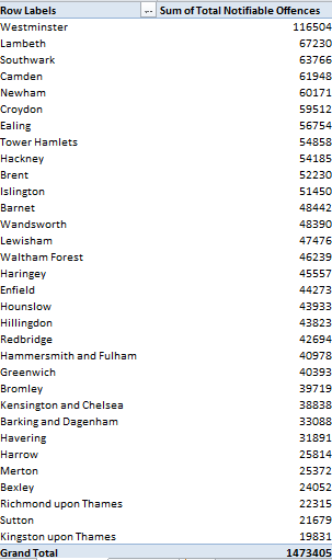
Note Westminster’s surpassing figure, a more than six-fold multiple over the bucolic and quaintly-named Kingston upon Thames in the city’s western sector. Of course you’d need to pitch these numbers to the boroughs’ respective populations, including their daytime counts, in order to fairly understand them. Westminster, after all, is the meeting ground for Parliament and a tourist cynosure, and as such likely boasts an effective demographic a couple of orders of magnitude beyond its residential cohort (see these 2011 UK census data, particularly page 8, which put Westminster somewhere in the middle of the London pack; note too the absence of the City of London here, the teeming financial district that stands in a quasi-independent relation to the rest of the boroughs).
And there’s room for an additional “of course” here. Of course, an undifferentiated total of all notifiable offenses (I’m American –excuse that first ‘s’) can’t engineer the drill-down you’d really need in order to press the analysis meaningfully. Because the pivot table assigns a value of 1 both to murders and the handling of stolen goods, for example, the incidence of each crime type need be isolated and counted discretely in order to enable the necessary perspective on borough-specific crime. Indeed – exchange Murder for Total Notifiable Offences in the pivot table, for instance, and you’ll find four other boroughs with higher homicide counts than Westminster.
What we’d want the pivot table to do, then, is agglomerate and banner all the crime types by borough across their columns, much as our source data presently do for each ward, and then subject all these to the Show Values As > % of Row Total feature, thus properly sizing each offense’s “contribution” to the borough’s crime whole.
But you can’t do that here, at least not without mounting a mega-reconstruction of the data – and that’s because each crime type tends its own field, and Show Values As will only return its percentages for data all of which occupy the same field (again, see last week’s post and its first screen shot for a fleet restatement of the field-item problem). And so by granting a false independence to its crime fields, the workbook stiffens its receptivity to important extensions of the data.
Nevertheless, other more plausible breakouts await, e.g.
Row Labels: Borough Name
Column Labels: Month-Year (D_Offences)
Values: Total Notifiable Offences
And here, you can apply Show Values As > % of Row and % of Column Total(s) – because Total Notifiable Offences comprises but one, self-containing field.
By working with Show Values As > % of Row you’ll discover a down-sloping of reported crimes; the Grand Total for Columns row pinpoints February 2013 as the first of the 24 months in which its total registers less than 4% of all crimes; and if you’re quick to discount that figure as an artifact of a 28-day month, the Grand Totals let you know that eight of the next ten months likewise duck beneath the 4% crossbar (and for a streamlined look at the totals only, you can pull Borough away from the table).
Note by the way that a redo of the above table by importing the Month, as opposed to Month-Year (D_Offences) field, won’t deliver an equivalent finding, because Month merely ticks off its data in a stream of month-denoting numbers 1 through 12, foreswearing any yearly references. And along those lines – though it may be a touch high-sounding to say so – I’d offer that the workbook could’ve done without both the Month and Year fields altogether, as these bits of chronology could be siphoned from Month-Year (D_Offences) via the pivot table’s Grouping feature (and through some as-needed formulas, too).
And there’s a concluding point to me made, this perhaps more sociological than technical. Crime statistics suffer from a storied methodological impairment – the relative willingness of victims to come forth and prefer charges against presumptive perpetrators. Change the extent of willingness, then, and ceteris paribus the crime rate rises. And the skew potential is redoubled once the agents of law enforcement get in (or out) of the act too, and perpetrate interest-driven understatements of the data. To be sure, most of the cognoscenti seem to acknowledge that some of the numbers have been cooked at least some of the time, but my point is this: even given a level of untoward statistical coyness, have these fast ones been pulled on the ground (i.e., the police station) level, or in the offices of some global assembler of the totals? If the former, then perhaps we still need to account for the relatively orderly movement across the reported rates. And if the latter, the newspapers will be happy to name names if you know them.
Try this pivot table out:
Row Labels: Borough Name
Column Labels: Year
Values: Total Notifiable Offenses (Show Values As > % of Row Total)
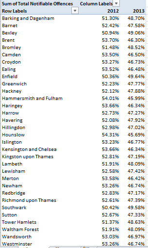
That table reckons the respective percentages of all reported crimes committed in each borough, distributed across the two reported years. In every case the 2013 data fall beneath their companion 2012 figures; and if these cross-borough contractions red-flag some conspiratorial revisionism, we’re well within our rights to request some manner of proof to that effect. Who’s doctoring the numbers, and on what level of authority, and how?
Just thought I’d ask.

Leave a comment