Transparency, it’s wonderful; but when the sun trains its rays on government data full on, sometimes the red faces you see out there aren’t sunburned, but rather embrowned with embarrassment.
Point your TomTom toward the sovereign state of Maryland somewhere in America’s Mid-Atlantic in order to see what I mean. For some time now, the state has made its employee salary data available to inquiring minds – and by employee name. And that means if your neighbor’s, or friend’s, or cousin’s check has the governor’s name on it, you know exactly how much they make. Will you ever look at them the same way again?
In any event, all that illumination, or incrimination, shines right here, on the Baltimore Sun’s site:
http://data.baltimoresun.com/salaries/state/cy2012/
(Click the “For this data in CSV form, click here.” link.)
The workbook will run roughshod over 12.8 MB of your hard drive, but that’s what 135,000 employee records will do to a file.
In any case, once there, you’ll find the data quality pretty good, but not flawless. For one thing, the first two data rows clearly aren’t fit for purpose; row 3 in particular seems to have played host to some manner of dummy data, as all its cells report some variant of the 123456789 sequence. You need then to delete these mislaid rows, though you probably didn’t need me to tell you as much. I’d also probably delete the A column (field-named orig-sheet) that appears to share sheet-identifying codes with us that can’t imaginably advance our narrative intents.
But once you get past the quotidian but necessary column auto fits, it gets a little more exciting. Interested as I was in Maryland’s salaries for its university employees, I pushed the On button for a pivot table, beginning with something like this:
Filter: organization-name (select the STATE UNIVERSITIES & COLLEGES item)
Row Labels: organization-subtitle
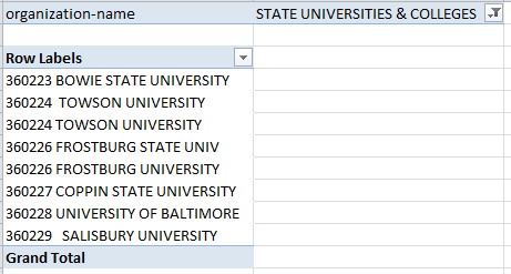
What’s wrong with this picture? Hint: We’ve seen it before, and now we’ve seen it again. But before the suspense gets intolerable, I’ll let on: it’s those two entries for Towson University – in plain, apparent violation of the pivot table dictum that field items shipped to the Row Label area can be listed only once. And in fact, the dictum holds; note the discrepant lengths of the Towsons, intimating loudly that some of the data here have been superfluously spaced. And that’s true – and for the quick fix, insert a temporary column in the data alongside the organization-subtitle field, and enter
=TRIM(G2)
(Your reference here would be F2 if you had deleted that A column.) Copy the above expression down the column, copy all these results, click G2, and aim a Paste Special > Values at the cell, thus imprinting the whole column with hard-coded space-lopped data. And then delete the temporary column, which can now be honorably discharged.
And while we’re at it, note the two entries for what is surely the same Frostburg State University both times. These several spellings can be brought into line by selecting the G column, and issuing something on the order of this Find and Replace:
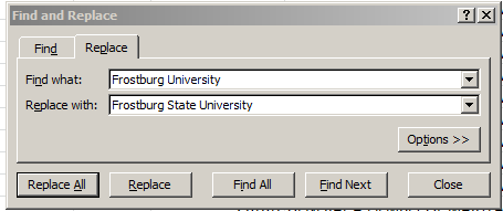
Refresh the pivot table as it stands, and the Row Labels reappear, duly rectified.
And given the workbook’s potpourri of fields there stand to be any number of interesting investigative possibilities in there. For example, why not try to associate salary with what Maryland calls eod, or entry on duty (which I take to mean employee start date; some field headings are elaborated here, though I had to do a site search for the meaning of eod. I’m also not quite sure about Samuel Esposito, eod dated April 21, 1921 – soon to celebrate his 93rd year of service to the state, along with the coterie of staffers with eods dating back to the 50s):
Row Labels: eod
Values: ytd-gross (Average)
(The site observes that “The ‘YTD’ refers to the time specified in the database query by the state, not to the current date.” (quoted from the linked location above). I for one am construing the data, perhaps mistakenly, as the effective yearly totals for calendar 2012. After all, it’s now 2014, and the yearly results should be in by now. But note as well, by the way, the small packet of 15 records bearing 2013 dates, all but one of them time-stamped January. Because some of these report overtime earnings, I’m assuming these are live, actually-compiled data, their post-2012 eod notwithstanding.)
Be that as it may, over 10,000 dates stake the Row Labels area in our table, and so some grouping might the parsimonious thing to do here. But my Group Selection button lets me know I Cannot Group that Selection. Why? Sort the dates and you’ll see why; six of the records date their eod 1900-01-00, a dummy, text placeholder that as a consequence stymies any attempt at grouping (all presumptively grouped data have to be up to the grouping task). I’d take the relatively easy way out here; click among those ersatz dates, sort A to Z (if you click an actual date instead in order to start the sort you’d sort by Oldest to Newest instead), and beam a row insertion between 135722 and 135723, thus casting the stand-in dates away from the data source. Then you can try, after resetting the operative pivot table range to $A$1:$p$135722 (via PivotTable Tools > Options > Change Data Source in the Data button group; again, the P may be lettered differently in your table if you’ve deleted some fields):
Row Labels: eod (group, say by year)
Values: ytd-gross (Average, currency format)
Ytd-gross (Count)

(That’s an excerpt, of course.) The correlation between year and average salary: -584, which is not insensible; all things being equal, the longer the tenure, that is, the “smaller” the starting year, the higher the earnings (Note: if you essay the correlation by invoking the numbers in the A and B columns of the pivot table itself, that is,
=CORREL(A4:A63,B4:63)
you’ll be slapped with a #DIV/0! message for your troubles. That’s because that even though the dates lining the Row Labels are full-fledged numeric data, they revert to a temporary label standing when they’re shunted to Row Labels. To realize the correlation you’ll have to copy the pivot data elsewhere).
But whatever you do, just remember: the next time you visit Maryland, be nice to the 135,728 red-faced citizens there trying hard to keep a low profile. Don’t let them know what you know.

Leave a comment