Slow and steady wins the race? Bromidic license aside, that can’t be true, can it? When I last looked, it was fast that was copping the money and the medals – but it’s the second adjective that might just hold up to scrutiny.
And I’m directing my scrutiny to some marathon data, the inspiration and workbook data flashing from runner/triathlete Peter Whent and his blog post on the 2012 London marathon, which placed the matter before my mind’s eye. Peter’s concern is with the problem of steadiness, denoted here as the comparative timings of a runner’s first and second halves of the 26-mile race, and with an expressed interest in the number of entrants managing a negative split – that is, a second half run more speedily than the first. His inquiry confirmed the expected – that runners overwhelmingly (about 96%) stepped through their latter 13 miles more haltingly than their former. And the data, which Peter has kindly afforded you and me, is here:
(Note, by the way, that the second-half splits in Peter’s workbook were returned via a subtractive inference, e.g., the Finish Times minus the (first) Half times.)
All of which points our sneakers toward a corollary question: do split margins covary with overall times? That is – and sight unseen I’d promote the idea – are elite runners more likely to equilibrate their halves than the long-distance hoi polloi? Superior at pacing and strategizing their course, I’d assume that occupants of the world-class stratum would endorse, and act upon, the aerobic virtues of matched halves. Or could it be that first-to-second half ratios – as opposed of course to actual times –might be found to incline toward something like a constant proportion?
Needless to say that’s an empirical question, and given the data we can make some tracks toward an answer.
First, you’ll note that a good many of the 42,000-plus runners pulled up somewhere short of the finish line; you’ll know them by their blank Finish Time cells, and because they have no splits to report we should sort the runners by Finish Time (A to Z or Smallest to Largest, depending on the cell in which you’ve clicked.), thus casting the 6,000 or so non-finishers to the data’s ground floor. Then introduce a blank row between rows 36673 and 36674, thereby striking the uninhabited cells from the active data. Remembering that we want to affiliate split disparities to aggregate time, next squeeze a new column between K (the Finish Time field) and L, name that upstart field something like Split Pct Difference and enter, in what is now L2:
=(J2-I2)/I2
Translation: by subtracting a runner’s second half time from his/her first half and dividing that difference by the first-half time, we can deliver a percent change across the two halves, and in L2 I get
0:07:43
Which is not the kind of number you were expecting. And that surprise has been sprung by a formatting disjunction.
Recall that, as with dates, time entries are nothing but numbers. Thus 12:00, or noon, is really .5, the quantity metering one-half of a day. Look again at 8:00 (am), then, and you get .333333, and so on. But because the Split Pct Difference field has inherited the Time format of the field next-door, Finish Time, we’re faced with seven minutes and 43 seconds – or what is really .54% of a 1440-minute day. And indeed, when we reformat our field into Percent Style and unpack two decimal points for the value in L2, 0.54% resolves before us.
But there’s a bit more neatening up to do. I noticed a handful of #DIV/0! gatecrashers glowering in the Split Pct cells, their scruffy appearances reflecting the absences of split times in their records. If you sort Split Pct Differences smallest to largest seven dissident records plunge to the bottom, whereupon another blank row, this one interlarded between rows 36666 and 36667, will send them packing.
Now, at last, we can attend to our question. First, we can try this pivot table out:
Row Labels: Place Overall (grouped by say, 1000)
Values: Split Pct Difference (Average, and Number Formatted as Percentage to two decimals)
In excerpt, I get:
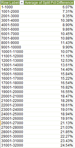
What we find is a fairly persuasive association between runners’ finish position and what could be termed their split discrepancy. The closer to the front, as a rule, the closer the timings of the two halves. Expressed in straightforward correlational terms, e.g.
=CORREL(A2:A36666,L2:L36666)
The association comes to .442 – again fairly pronounced, at least by the lights of social science.
We also need to observe that our necessary analytical confinement to runners who actually completed the marathon imposes a skew of sorts upon the data, and the absence of a forthright gender-discriminating field complicates the relationship as well, but there may be a workaround here that I hope to discuss next week.
We can now lumber toward today’s finish line by adding that the pivot table above expresses the splits/Place Overall connection in ordinal terms; that is, we’ve weighed a runner’s splits against his/her finishing place in the competition. We could alternatively measure splits against grouped actual times, and we hope to do that next week. Just be advised there’s a pivot table-specific issue that needs to be understood and confronted before the data can do what we want them to do. In the meantime, do a few more sprints and break for lunch.

Leave a comment