Our analysis of the London marathon data has proceeded apace, but the next bend in the road will slow our jaunt a trifle. We spent the latter part of last week’s post on a think about runners’ split ratios and how these comport with their race finish, and we found a comfortable if imperfect fit between finish positions with the evenness of runner splits. That is: the higher the finish, the greater the split symmetry. Now we want to try something different: to associate splits with the clocked times of the runners, rather than their finishing positions.
And this project poses a few new problems peculiar to the pivot-tabling enterprise. As with last week’s split/finish position table, we again want to group the runners, but this time by some grouped interval of the measured times. We can start here:
Row Labels: Finish Time
Values: Split Pct Difference (Average; again format Percentage to two decimals)
Enter the problem. Initiate a Group Selection for Finish Time and click off the Months grouping default. Then tap the tandem of Seconds, Mintues, and Hours (note each of these can be clicked independently of the others – don’t press the Ctrl key as you click). But now what?

That was a semi-rhetorical question, if you’re keeping score; and I’m asking it because once you ratify the above selections you get something like this:

The data have indeed been grouped, after a fashion, but not in fulfillment of the wish I’d harbored for them. Here the results have been organized and broken out by respective units of time, but have not beenbinned by any interval I might want to specify for them, e.g. ten-minute tranches:
2:00-2:10
2:11-2:20
2:21-2:30
And so on. Then note that the Grouping shot above seems to have secluded the By field that typically solicits the user’s interval call, e.g.
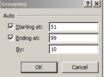
There thus seems to be something about numbers – and remember, at base that’s exactly what they are – formatted in Time terms that rebuffs traditional grouping overtures. I’ll repeat my question, then – now what?
I should add that I’ve taken this general problem up elsewhere, namely on the datadrivenjournalism site, but in any event we want to group runner times in what should assume passably time-resembling appearances. So here’s what I’d do: Type the field heading Times in the first free column (mine is Q; remember that last week we had planted that Split Pct Difference field in the midst of the existing fields) and enter, in Q2:
=ROUND(K2*24,3)
Returning 2.079 (when formatted to three decimals) – and that’s not two hours and eight minutes (We’ll get to ROUND shortly). What it is is 2.079 hours, or in the language of clock time marathon winner Wilson Kapsang’s 2:04:44, or thereabouts. What we’ve done is simply multiple race times – which again are really numbers reflecting the portion of a 24-hour day taken by any runner – and subjected these to the 24x multiple. Thus three hours – or .125 of a day – will appear here as 3:00. Considered purely numerically, then, Kapsang’s victory quantifies as .087, or 8.7% of a day, which in 24-hour-multiplier terms batches up to 2.079 – a real number, one which can be grouped with all the others. 2.079 – not 2:079.
And what about ROUND, the function that materially rewrites the real (as opposed to formatted) value of the number to which it’s applied? I want it because had the formula plunged ahead without it here, that 2.079 would have exhibited many more decimal points, all of which would in turn displayed in the pivot table (carry out the steps below without the ROUND supplement and you’ll see what I mean).
And once all the backstaging is done we can proceed to this table:
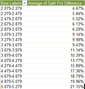
Row Labels: Times (grouped at least here for illustration purposes by .2, or 20% of an hour, or 12 minutes)
Values: Split Pct Difference (again by Average, formatted in Percentage and two decimals)
I get, in excerpt:
Here too as with last week’s finish position-split difference correlation, split difference averages match up with fleetness of foot.
Now what about that gender workaround to which I pointed last week, a restorative step that would institute a gender field in the source workbook? After a not inconsiderable time (probably more inconsiderable than it should have been) I toughed out something like this:
Custom Sort the data, first by Place Gender and then by Place Overall.
Shoot a new column between B and C, call it Gender, and in what is now C2 enter:
=IF(A2<max(a$2:A3),”M”,”W”)
And copy down the column.
What is the formula attempting to do? First, the two-field sort puts Place Gender finishers in their place, such that both 1s, 2s, etc. stand neatly atop one another. Next, the second sorted field, Place Overall, proceeds from an assumption: that, for any pair of men and women holding down an equivalent Place Gender – for example, a man and woman finishing in a respective 600th place – the man’s time should be the swifter. That isn’t sexist, just a statistical and empirical likelihood (the first 263 finishers were men), and an assumption that clearly couldn’t be mapped to other sorts of data , e.g., test scores. The absolute reference for A2 in the nested MAX function allows the range to be extended down the column, e.g., A$2:A3, A$2:A4, A$2:A5, etc., thus identifying the maximum overall finish, or slowest time, to that point in the column. And since the maximum at those successive points should – should – be keyed to a female runner, the formula should post Ms and Ws alongside the appropriate names.
I think this works, though be aware that some finish-place numbers appear to have dropped out of the listing, and that a number of runners completed the course with exactly the same time, earning them duplicated finish numbers. But I don’t think those loose ends compromise the results, which I think are pretty good and presage an interesting series of gender-driven breakouts.
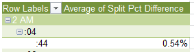
Anyway, it seems to me a Part 3 is called for in this discussion, or at least I’m calling for it. Two concluding points, here, then: This post’s second screen shot, the one portraying the pivot-tabled Hour, Minute, and Second groupings, pictures an odd chronological datum:
See that 2 AM? In fact, the London Marathon workbook’s Half and Finish Time numbers all seem to record themselves in AM terms, and that’s really and clearly not what we want. Wilson Kipsang’s 2:04:44 hardly means to be understood as a middle-of-the-night four minutes after two, even as it is formatted as such. And it turns out that ridding the numbers of their AM/PM tags is a rather sticky wicket. (See, for example, this discussion.) Just be advised.
And the other point is this: click on that 2 AM, for example, and type something – anything – else in its cell. That something else suddenly overwrites the data, a bit of pre-emption that is, if I may be so colloquial, fairly mind-blowing. Try it; whip up a pivot table flowing from any data source and type into a Row Label cell. Your text takes over – and I thought you couldn’t do that, and I can’t explain it, at least not yet.
I need to think about it. Or is this something everyone knew all along?

Leave a comment