Compare and contrast, the test-makers like to say, and that alliterative injunction packs a redoubled punch across the Research Excellence Framework (REF) data put together by Research Fortnight, the self-described “leading independent source of news, analysis, funding opportunities and jobs for the academic research community” in the United Kingdom. You can compare the estimated six-year estimated funding prospects for 154 UK universities, driven by a weighted assay of their research standings and Research Fortnight-devised power ranks, and then compare the very handling of those numbers by the data managers at two national publications, the Guardian and the Telegraph here:
and here:
(Transparency check: remember, I teach an Excel class for the Guardian.)
Ok; now do you notice any formatting curiosities in the Guardian’s data capture?

Why, for example, should the wholly-integered Fortnight Power Ranks splurge to two decimal places, a question that could be even more pointedly posed of the counts in the Number of departments field? And indeed – why Velcro a second decimal to the RF quality index data, when no meaningful values fill that space?
I’m not sure I can answer those questions, but eager to slake the acquisitive pangs of my hard drive, I clicked the petite Get the data link spaced below the Guardian table, and was taken nowhere. A pair of right clicks atop the table – one, to spark an internet-familiar menu, the other, to stab at the Export to Microsoft Excel option did what it usually does, nothing:
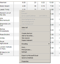
Having vainly fought the good fight, it was time for a shameless resort to Plan C – a drag across the data, and a simpering copy-and-paste of them all into a blank Excel sheet (you may be able to start the copy with a right click > Select all try). But what I saw, apart from the need to unwrap the text from their constricting cells and auto-fit the Research staff column, was nothing if not interesting.
For one thing, those Power Ranks are more than just zero-freighted. That digital exorbitance is aggrandized by still more, only-now-seen values pulling rightward from their decimal points, and if you like your bewilderment full-blown, take a hard look at those decimals. Each one mirrors the substantive value to its left, e.g., 11.0011, 81.0081, 53.0053, and this curious echo appears to sound across every number in the table in the Excel edition. I don’t presume to know what it means, but it’s there, as is the second decimal point speckling all but six of the ostensible numbers in the Power Rating and most of the other fields : 97.3097.3, 37.8037.8, and the like, an intrusive fillip which, among other things, degrades 147 aspiring Rating numbers into text.
There’s more. The 2,409 Oxford staff attributed by the Guardian site undergoes a logarithmic leap to 24,092,409 in our spreadsheet, making for an astonishingly favorable faculty-to-student ratio, one bettered only by University College London’s 25,662,566, and that’s in a city numbering a village-small 8,500,000 residents.
What happened here? Again I really don’t know, although doubtless there are folks somewhere out there who have the answer (I read my emails). The revelatory powers of a simple copy-and-paste, through which net-sourced data make their actual, lengthier, suppressed values/text known to the spreadsheet setting, is something I’ve experienced before, and must have something to do with the movement from source data to web page. But in any case, my mystification sends me back to my semi-rhetorical question: do the complications we’ve encountered here matter?
Again, for the reader qua reader they don’t. As it stands and apart from its redundant decimals, the Guardian table presents no particular challenges to legibility, making for a rather straightforward read, once you acquaint yourself with the meaning of its fields. But the problem, of course, besets the analyst, those seekers of new and arresting finds who want to saddle up atop the data and take them for a ride. You can’t do much with 97.3097.3 if you want to count or average it.
That’s not to suggest that the data are beyond repair, but the process could get messy. To bring research staff sizes back to reality, for example, you could divide them, but staff sizes above 1,000,000 require a denominator of 10,000, even as the smaller others make do with 1,000. And you could perform a Find and Replace for all the data’s decimals by replacing each point with nothing and thus requantifying these entries; but again, dividing these in order to restore their original magnitudes seems to require differently-sized divisors.
On the other hand, you could copy and paste the Telegraph’s rendition (itself a tricky business, as the table needs to be scrolled though; try keeping the left mouse button down and position it just beneath data as you continue to scroll; you may also have to hand-enter the field headers) and go to work. The numbers here are numbers (and by the way, the Power Ratings are calculated by dividing a university’s predicted share of funding by Oxford’s 6.24% percentage).
It’s clear, then, that the Telegraph thought through the data – precisely the same data – differently. You’ll have to ask them all what they thought – and “them” includes Datawrapper, credited with doing the heavy lifting for the Guardian.
Let me know what they tell you.

Leave a comment