If the subject is Ebola, you want the data to be equal to the epidemiological tasks to which they’re likely to be applied – that is, as timely and accurate as they can be. The Humanitarian Data Exchange (HDX) site, an outpost of the United Nations Office for the Coordination of Humanitarian Affairs (OCHA), has been tracking the disease’s incidence across nine countries (as of this writing) from which Ebola reports have issued, and in nearly to-the-minute fashion (my data posts records dated January 20). You can download it here (access the csv rendition; I couldn’t get the Excel offering to work).
Once inside, you’ll be able to get to work on the sheet’s 3200+ rows of time-stamped data (as of this writing), and a parameter – Indicator – that will force your attention span to… snap to attention. Indicator comprises 36 different items, a good many of them same-sounding; and if you’re program calls for a scrupulous run through the data, you’ll have to make sure you understand what each of these uniquely mean. For example, the eight discrete items headed by the phrase “Cumulative number of…” simply demand clarification, as do the 12 “Proportion of… ” rubrics. Put alternatively, each country receives 36 parameters worth of records about its Ebola status.
Moreover, keep in mind that the Proportion data are registered in whole-number terms, and as such would be more meaningfully comprehended by dividing each by 100 (and thanks to HDX’s email reply to this question). Thus a proportion of 43 is to be quantitatively read 43%, for example.
That obligation to clarify might be illustratively served by pivot-tabling Ebola cases by Indicator and one country, say Sierra Leone:
Row Labels: Indicator
Values: Value (Sum)
Slicer (or Report Filter): Sierra Leone
And here’s where I made my first mistake. I saw that the country had apparently incurred 257,286 confirmed cases of Ebola as of January 20th, but that figure isn’t remotely true-, and fortunately not. My pivot table had added each successive, as-of-the-specified date case total – a textbook case of double, triple, and quadruple counting – when in fact of course each figure tabulates the cumulative case total until just then.
And that makes for a rather cautionary item. After all, review an unassuming datset of sales recorded by say, salesperson, and Jane or Rob’s transactions are there for the summing. But adding successive cumulative totals makes for one very wrong answer. It’s as if the data have already submitted to something like Excel’s Show Values As > Running Total In… option. It’s the records that are doing the aggregating for us, as the dates proceed.
And all that means that for certain reads the data should to be lined up one date at a time. For example, the Sierra Leone data for October 8, 2014 total 2455 cumulative, confirmed cases of Ebola. The number of confirmed cases in the previous 21 days as of that date at stood at 924, which indeed yields the 38 (really 38%) in the “Proportion of confirmed Ebola cases that are from the last 21 days” cell – that is, 924/2455.
Note at the same time the empty cells that, for whatever reason, have no data to report, and doubtless data collection in affected regions has its challenges. October 3 counts no confirmed cases of Ebola, even though it precedes the 8th by only five days and even as it follows Oct 1 and its 788 cases by but two. And because the dataset’s 51 dates aren’t identically spaced in time, one needs to reflect on the mathematics of those “…last 21 days” items. As with the cumulative data above, these numbers are rolling, but here they confine their locomotion to a moving 21-day band. That means of course that days in the data set fewer than 21 days apart share many of the same cases in their respective enumerations (as another HDX e-mail acknowledged), certainly not a bad thing by itself. After all, the recency and magnitude of Ebola case distribution is a perhaps literally a vital concern for researchers. But the journalist needs to appreciate the necessary resort to a kind of double-counting in the process. Still, the variable distancing of the 51 dates from one another does ask a question about how case counts should be properly interpreted.
And there’s something else. Cumulative figures should naturally increment across time, or at the very least remain unchanged; but the cumulative death totals (for all countries) for October 29 and 31 2014 appear as 9 for both days, following a total of 2990 for October 25. And November 5 presents a figure of 1739, still notably smaller than the October 25 report. It seems that only certain countries were considered for the 29th and 31st, a undercount that seriously disrupts the accumulating total. To see what I mean, try:
Row Labels: Indicator (Filter for Cumulative number of confirmed Ebola deaths only)
Column Labels: Date
Values: Value (Sum)
This one requires follow-up, I’d allow.
And at the risk of baring my medical ignorance I’ll put one more table on the table:
Row Labels: Indicator (filtered for the four “Case Fatality rate” items
Values: Value (Average).
I get
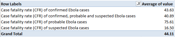
Why should probable Ebola cases exhibit so markedly higher a fatality rate? Could the differential be ascribed at least in part to post-mortem assessments of individuals whose conditions went undiagnosed or to whom medical attention was delayed? I don’t know, but the rate differentials are notable and investigation-worthy.

Leave a comment