The topical suggestions on the US www.data.gov home page flash across its master search field like a battery of rotating advertisements, and it was the Credit Card Complaints catchphrase that road-blocked my fleeting attention span, if you must know.
Ok – yours will likely resonate to a more exotic theme, but it must have been the cool alliteration that got me. Either way, if you’re looking for 22.5 megabytes and 334,000 records worth of consumer discontent about their plastic you’ve come to the right place:
http://catalog.data.gov/dataset/consumer-complaint-database
(You’ll also want to review the companion Data Dictionary in there, at its own linked destination for elucidations of and field references for the above workbook. I have a bit more to say about these later.) Click at the Comma Separated Values Download link, and when the hurly burly’s done save it all as an Excel sheet. (I’m now beginning to think that a workbook’s CSV derivation is what explains the un-fit columns that burrow their way into so many spreadsheets across the net; here too, our data call for the redoubtable autofit.)
Once you actually get to the data (which are rather current; beginning with December, 2011, my download called up complaints through January 8) you’ll be enraptured by their organization and fitness. The dates are actually dates (that is, they’re verifiably numeric), and their fields are awash in pivot-table friendliness – lots of meaningful permutations in there to be spun. Let’s start basic, with a state-by-state complaint count:
Row Labels: State
Values: State (Count, necessarily; then by Show Values As > % of Column Total)
Sort the numbers by largest to smallest and you won’t be struck by California’s petition to call itself the credit card complaint capital of the US. That soubriquet, of course, merely hooks adventitiously into the state’s largest population but still, my Wikipedia census (circa 2012) fractionates Californians into 12.1% of the country’s total – and they’re registering 15.16% of the complaints, doubtless a meaningful disparity. (And, blank identities aside, you’ve taken note of the 62 records spilled onto the pivot table, taking the data rather over and above America’s 50-state inventory. Those excess rows point to US territories, whose 2-character codes are deciphered here; and so California’s complaint quotient is in actuality a bit higher, if you filter out the territories.) They’re laid back out there, but unhappy.
And other state discrepancies break towards statistical significance, too. Florida’s second-place complaint count – 9.79% – doesn’t really square with its 6.2% of the US population, for example. Perhaps they’ve experienced an influx of Californians.
And how about the problems with Product, i.e., the kinds of credit card services most likely to put the pique in the public?
Row Labels: Product
Values: Product (again, Show As > % of Column Total). Never mind the Grand Totals.
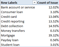
Mortgage complaints, however defined, trouble complainants most widely (though these evince considerable inter-state variation), with debt collection – presumably remonstrances against dunning tactics – running a few laps behind in the second position. (It goes without saying, however, that the numbers here need can’t be confidently understood without sizing up the respective customer base for each product, though I just said it.)s The few complaints about student and payday loans might surprise Britons accustomed to recurrent news coverage of both types of transactions.
Of course the data could also be broken out by time, e.g.
Row Labels: Date received (Grouped by Years and Months)
Values: Date received (Count, Show Values As > % of Parent Row Total)
I get (in excerpt)

That % of Parent Row Total command is new to this blog, and merits some detailing. It works something like this: Because the Years/Month grouping naturally accords priority to years, that chronological unit is vested with a Parent status, with the kindred month rows sired as a kind of progeny. The above screen shot fits subtotals within subtotals, then; 2013’s 32.36% marks that year’s slice of all consumer complaints, but its monthly percentages proportion themselves not to all months in turn, but only those contributory to 2013’s totals. Thus January’s 9.07% is 2013-specific, even as the strikingly scant 4.50% for the previous January binds itself to 2012 alone. It’s what % of Parent Row Total does.
When it’s all unrolled before you onscreen you’ll observe the very substantial uptick in complaints for 2014, though it’s difficult, though not unimaginable, to suppose that service quality faltered so badly from but one year to the next. More plausible, though again not definitively so, it’s possible that more consumers were made aware, or perhaps made themselves aware, of the complaint filing process. This one might be worth researching as a result.
Now about that Data Dictionary. Jump down to the Field reference section and see that, most, but not all, of the text fields are termed categorical, what are elsewhere called nominal – that is, fields whose items can’t be meaningfully ordered or measured, e.g., gender, race, or nationality. What’s slightly odd is that the zip (or postal) code field is likewise understood here as plain text, even as each and every available code (there are some blanks as well) is a certifiable number. What the sheet wants us to presumably understand, then, is that these numbers aren’t for adding or otherwise manipulating. They’re “text” in the way that telephone and social security numbers are text.
But ok; those are quibbles, and does the worksheet really need a 334,565th complaint?

Leave a comment