Archive | February, 2015

Re-counting the Conseil de Paris Election Data

22 Feb

With its Gallic titular panache Les Conseillers de Paris could pass as a movie title, perhaps the sequel to the Umbrellas of Cherbourg; but alas, it’s only a spreadsheet, and the big screen on which it features is probably the one glassed inside your Samsung.

OK, so it isn’t coming to a theater near you, but the sheet has its moments, nevertheless, once you decide  you want to know something about the  “deliberative body responsible for the governing of Paris” and its 163 members, all of whom throw themselves at the mercies of the city’s voters every six years, including 2014.

With members apportioned from the city’s 20 arrondissements , or districts, in numbers reflective of  arrondissement size (the 15th is the largest), the Paris Open Data site lists each and every serving conseiller from 1977 through 2014, and I’ve sent it your way here:

Les Conseillers de Paris 1977-2014

Once you’ve smoothed all that wrapped text curled inside the worksheet you can proceed to a couple of first general-interest findings for starters. Try this pivot table:

Row Labels: Mandature (or Term)

Values: Mandature

conseil1

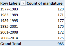
Thus we see that the 1977-1983 complement comprised only 120 conseillers, and nowhere does that defining 163 appear, even among the later mandates. The surplus figures are likely attributable to the deaths of conseillers (note the deces field in column J) and their replacements, all of whom are listed, and perhaps mid-term leavers and their successors (see the remplacement field in L). Note, on the other hand, that some deaths appear to have post-dated a conseiller’s tenure. For example, both Claude Avisse and Louis-Henri Baillot died in 2007, well after their service on the conseille had elapsed.  Moreover, because conseillers who served multiple terms (e.g., Baillot) appear in the data set for each of their mandatures, dates of death appear as many times. And I can’t explain why date-of-death entries are fashioned in text format, e.g., décédée le 25 mars 1998, when they could have been made available as actual dates – particularly when dates of birth are expressed in bona fide numeric terms.

Note as well the curiously extended seven-year mandature 2001-2008,a governmental workaround “designed to avoid an overloading of the electoral calendar in 2007“, a presumable concession to the presidential and parliamentary contests of 2007.

And if you want to learn something about the Conseil’s gender representation, try this:

Row Labels: mandature

Column Labels: conseiller

Values: conseiller (Count, and % of Row Total) (and turn off Grand Totals for Rows)

conseil2

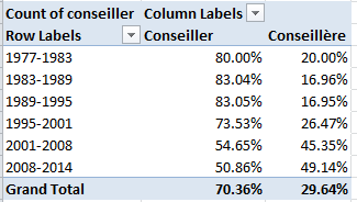
A most interesting and emphatic incline toward gender-count parity informs the table.  Remember, however, that the above accords multiple counts to the same conseillers serving across multiple mandatures; if you want to break out discrete, actual conseillers by gender, then, the process gets trickier, because if you go with:

Row Labels: Nom

Row Labels: Prenom (to disambiguate conseiller’s with the same last name)

Column Labels: conseiller

Values: conseiller (Count)

You’ll pile up multiple counts for the multiple-term servers (some conseillers in fact have served in all 6 cited mandatures), and thus do little more than restate the outcomes of the screen shot right above. There are several resolutions to this pivot-table-peculiar search for unique field constituents that appear repeatedly, and here’s but one: Return to the data set, and conduct a Data > Remove Duplicates, by ticking prenom and nom as the duplicate-bearing columns. Then pivot table the 532 prevailing, definitively unique  records (i.e., any and all conseillers now receive exactly one entry) again, precisely as per the instructions immediately above; and down by the Grand Totals role you’ll find 348 Conseillers – men – totalled along with the 184 Conseillères. Gender percentage breakdown: 65.4%-34.6%.

(Keep in mind of course that a removal of duplicates imposes would could be a permanent decrement in the dataset count, depending how you play it. You could of course save multiple versions of the data, pre and post-paring.)

You’ll also want to think about the dataset’s 57 fields, and wonder why the last six of them – out there in columns AZ through BE- aren’t merely entitled empty, but are empty.  There’s no evident reason not to delete them,  and I suspect for purely operational reasons you might well throw a good many of the other fields overboard too, as they’re only occasionally populated (and I’m still working on what their headers actually mean, truth be told. J’ai besoin a native French speaker), and the fields often have been distended to enormous column widths besides.

Still, the more self-evident data do have something to say. What if, for example, we wanted to calculate the average conseiller age of at the point of election, i.e., date of election minus date of birth? That’s a most practicable task – begin by parting the fields with a new column, say between A and B, call it Age at Election or something like it, and, in what is now B2, enter

=(J2-AT2)/365.25

That is, subtract the number of days separating a conseiller’s birthdate from the day on which he/she was elected, and divide the total by the average day-length of a year. Then head towards this pivot table:

Row Labels: mandature

Values: Age at Election (Average, round to two decimals).

I get:

conseil3

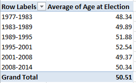
The consistency is notable, though the average age ascent – about four years, between 1977-2001 and 1995-2001 – may reflect large numbers of triumphing  incumbents, all of whom of course aged about six years between elections.

Then swing conseiller into Column Values:

conseil4

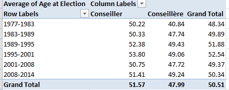
We see women members are the consistently younger, perhaps comporting with their relative, aggregated newcomer statuses.

So check it all out; vive la feuille de calcul. That’s spreadsheet to the rest of us.

Snow in the Forecast, and in the Data: Winnipeg 311 Calls

14 Feb

Call it a disciplinary tilt, or just another blurt of dime-store iconoclasm, but I’m prepared to label much of this thing we call data journalism as nothing more – or less – than a take on sociology writ digital, and with fewer  prepossessions. Ok -I’ll own up to a graduate credential or two in the field if my view needs defending or explaining, but tilt aside, the case is there to be made.

I can’t help noting that the early University of Chicago sociologist Robert Park – whose first job description actually read “journalist” before he turned into the academy  – famously made a go (with colleague Ernest Burgess) at mapping  the city’s sectors into differentiated, concentric  zones of activity, and with nary an Android in hand or satellite above.

The quest for pattern directs much of what passes for sociological exploration, but that what’s what data journalists often do, too; and their tools for aggregating and plotting the data mean to paint the big pictures affording the step-backs that let us see what’s really going on, we hope. Sounds pretty sociological.

Either way, if it’s pattern you want, albeit of a fairly obvious sort, download the 2014 311 Service call records for the Canadian city of Winnipeg here:

 311 Service Requests Winnipeg 2014

Drawn from its open data site, the resulting workbook most neatly archives the 64,000 calls put to the service that year in nine nicely laconic fields.  A few very small design carps could be placed in the record (these should sound familiar, too), namely the redundant Year field, streaming its 64,000 2014-only entries down its column, and the fact that for parsimony’s sake the Month and Day fields could have been left aside as well, because these could be coaxed from Date as needed. But that’s a very small carp indeed. A slightly larger one: if you want to do something about the latitudes and longitudes pressed together in text format in the Location 1 field  you’ll have to detach these into usable readings, via something like a Find and Replace to rid the open and closed parentheses (replaced in both cases with nothing), and followed up with a Text to Columns (the comma’s your delimiter).

In any event, it snows in Winnipeg, about 45 inches a year (including 4.2 inches last April), and as such you’ll want to find something out about the 311 dialers having something to say about that meteorological shakeout. Start with this time-sensitive pivot table:

Row Labels: Service Request

Column Labels: Date

Values: Service Request (Count)

In fact, snow-relevant requests come in two varieties, Snow Removal Roads and Snow Removal Sidewalks, the former engaging far more callers. Pattern? Clear, if pretty obvious; the calls predominate in the January-March quarter, time-stamping more than 92% of all such requests on both matters.

Note that you can group the data by quarter, provided you’re prepared for a small detour in the step-through. If you wheel Date into Column Labels to prime your quarter-grouping intention, you’ll find you can’t get there from here:

win1

While it’s true that 2014 had only 365 days, the dates here micro-refine themselves by time of call as well, and the count of unique entries top the no-go 16,384 as a result. The means for stanching the overflow is recommended in the above prompt: drag Dates into Row Labels first, click PivotTable Tools > Options > Group Selection > Quarters, and then drag the grouping back into Column Labels.

You, could, on the other hand, dust off a Plan B quarter breakout by positioning Month in Column Labels instead and grouping those thusly:

win2

Because the Month data comprises nothing but numbers landing between 1 and 12, you won’t come anywhere near the 16,384 item limit.

Quartering aside, next try showing the data as % of Column Total (we’re back to the Month breakout). Here you can click Design > Grand Totals > On for Rows Only, because the column totals all necessarily return 100% and there’s nothing to learn there. You’ll see:

win3

Pattern, or something like “systematic” variation at least, surely guides the Snow Removal calls, these cresting predictably in the January-March interval (note the December numbers, though which really poke into the following winter); but variation bobs up and down through the quarter nevertheless. OK, you may suppose that the February peak in calls probably square with a precipitation uptick in the month, but let us see.  The Winnipeg Weather Stats site throws out these respective precipitation overalls:

Jan 2014 16.30 mm

Feb 2014 8.40 mm

Mar 2014 9.00 mm

There’s perhaps something noteworthy, then, in February’s most-calls/least-precipitation disjunction. Looking for a story? There might be one there. You might want to wonder as well about September and October’s top-outs in Garbage Collection calls, another type of removal of a more perennial sort.  In fact Collection and Recycling complaints are the most likely to bend the ears of Winnipeg’s 311 responders, comprising over 45% of all calls.

And for a final gaze at pattern, try:

Row Labels: Month

Values: Service Request (Count)

Service Request (again, this time by % of Column Total)

win4

Once charted (say by Month and one of the Values fields), the curious near-linearity of months and calls describes itself:

win5

So there’s some pattern. Now try and explain it, too.

The Skinny on UK Obesity Data: Work to Do

8 Feb

The reported levelling of the rates of childhood obesity in the UK has naturally been accounted a good thing (for the article that made the news in full, consult this URL), although for dieters who like their glass half empty the news should perhaps be imbibed with slow, deliberate slips.  After all, the study’s abstract prefigures its findings with this bit of curbed enthusiasm:

“More than a third of UK children are overweight or obese, but the prevalence of overweight and obesity may have stabilized between 2004 and 2013.”

It’s possible, then, that the discovered equilibration has more to do with some saturation effect that has already visited its full-on impact upon the cohort of obesity-vulnerable youngsters, but I take no credit for the worthiness of that conjecture, only blame for the conjecture itself.

Be that as it may, the National Child Measurement Programme (NCMP) has something to say about the development as well, here for the years 2007/8 through2012/13, in the form of this workbook available for download here:

http://www.noo.org.uk/visualisation

(Click the Download link for Child Obesity and excess weight prevalence by Clinical Commissioning Group.)

The book breaks out its populations by both “excess weight” and “obesity”  measures  (the former standing as a superset of the two) for two school-year age cohorts, what the UK calls Reception (ages 4-5) and Year 6 (10-11) (look here for the BMI formulas, both for kilograms and pounds; the workbook’s NOTES tab sketches additional methodological background. This study’s sample sizes also operate within the confidence interval limits limned in the Excess weight and Obese tabs. Remember again that our spreadsheet doesn’t invoke the same data compiled in the journal piece. Remember too to review the Notes tab’s explication of data cells marked “s”).

Now to those data, about which there is a good deal to say. Or orrection: now to the data organization.  First, and perhaps most prominent, are the fields. We’ve seen this before, and the question begs reiteration: why are data which, for all analytical intents and purposes, belong to the same parameter – e.g. Reception – stationed in a plurality of columns? The resulting barrier to analysis is formidable, though not insurmountable; but surmounting requires us to cut and paste kindred data to the same field, copy and properly align the CCG (Clinical Commissioning Group) identifiers down columns A and B via a duly-diligent copy and paste, and make room for a year field in which that differentiating datum needs to be copied down, too. And you’l probablyl need to cut-and-paste the Year 6 data, too, and presumably to a worksheet all its own the better to disentangle these from the Reception figure, though that larger positional issue needs to be thought through – because in fact the workbook draws itself around two pairs of variables – the Reception/Year 6 axis, and the Excess weight/Obese binary. (It could at the same time be possible to jam all of these into a single grand sheet, by introducing, say, new School Year and Weight Category fields, thus lending themselves to additional breakouts along those lines, but I’m holding my jury out on this unifying tack.) The larger point, though: if you’re serious about doing something serious with the data, you’ll need to think about all these prior somethings, too before your analysis proceeds.

But quite apart from those necessary considerations you’ll also have to do something about the superabundance of merged cell in rows 1 through 4. These can’t coexist with your pivot-tabling intentions, and neither can the blank row

obesity1

That prohibitively separates those potential field headers from the data. The simplest rejoinder, of course: move the putative field names above down a row, but only after you’ve made sure that the now-unwelcome text entries still higher above these perch at least one blank row away from what you’re envisioning as the finalized data set (and if you’re going this far you’ll find that, once unmerged, the cell now invested with the “Number measured” header, for example, has been bumped two rows above its eventual place atop the dataset). And, for crowningly good measure, you’ll likewise have to unmerge the sheet’s title wrapped across the A1 supercell. (I also don’t see the immediate pertinence to our data of the 32,000 LSOA-CCG lookup records in that so-named tab, apart from the “The analysis uses a best-fit 2001 LSOA to 2013 CCG lookup created by PHE” declaration in the Notes tab. LSOA abbreviates lower layer super output area; for more, look here.)

To repeat – if you’re not prepared to do the reconstitutive work schematized above I don’t think you’ll be able to take the data very far; and why the analysts and/or story-seekers should be made to steel themselves for a rough ride across this obstacle course makes for one very good rhetorical question, though of course we’ve asked it before.

In fact, though, the data look pretty interesting, if now untamed. Your mission – should you choose to accept it – is to domesticize it all.

But don’t worry – the workbook won’t self-destruct.