Call it a disciplinary tilt, or just another blurt of dime-store iconoclasm, but I’m prepared to label much of this thing we call data journalism as nothing more – or less – than a take on sociology writ digital, and with fewer prepossessions. Ok -I’ll own up to a graduate credential or two in the field if my view needs defending or explaining, but tilt aside, the case is there to be made.
I can’t help noting that the early University of Chicago sociologist Robert Park – whose first job description actually read “journalist” before he turned into the academy – famously made a go (with colleague Ernest Burgess) at mapping the city’s sectors into differentiated, concentric zones of activity, and with nary an Android in hand or satellite above.
The quest for pattern directs much of what passes for sociological exploration, but that what’s what data journalists often do, too; and their tools for aggregating and plotting the data mean to paint the big pictures affording the step-backs that let us see what’s really going on, we hope. Sounds pretty sociological.
Either way, if it’s pattern you want, albeit of a fairly obvious sort, download the 2014 311 Service call records for the Canadian city of Winnipeg here:
311 Service Requests Winnipeg 2014
Drawn from its open data site, the resulting workbook most neatly archives the 64,000 calls put to the service that year in nine nicely laconic fields. A few very small design carps could be placed in the record (these should sound familiar, too), namely the redundant Year field, streaming its 64,000 2014-only entries down its column, and the fact that for parsimony’s sake the Month and Day fields could have been left aside as well, because these could be coaxed from Date as needed. But that’s a very small carp indeed. A slightly larger one: if you want to do something about the latitudes and longitudes pressed together in text format in the Location 1 field you’ll have to detach these into usable readings, via something like a Find and Replace to rid the open and closed parentheses (replaced in both cases with nothing), and followed up with a Text to Columns (the comma’s your delimiter).
In any event, it snows in Winnipeg, about 45 inches a year (including 4.2 inches last April), and as such you’ll want to find something out about the 311 dialers having something to say about that meteorological shakeout. Start with this time-sensitive pivot table:
Row Labels: Service Request
Column Labels: Date
Values: Service Request (Count)
In fact, snow-relevant requests come in two varieties, Snow Removal Roads and Snow Removal Sidewalks, the former engaging far more callers. Pattern? Clear, if pretty obvious; the calls predominate in the January-March quarter, time-stamping more than 92% of all such requests on both matters.
Note that you can group the data by quarter, provided you’re prepared for a small detour in the step-through. If you wheel Date into Column Labels to prime your quarter-grouping intention, you’ll find you can’t get there from here:

While it’s true that 2014 had only 365 days, the dates here micro-refine themselves by time of call as well, and the count of unique entries top the no-go 16,384 as a result. The means for stanching the overflow is recommended in the above prompt: drag Dates into Row Labels first, click PivotTable Tools > Options > Group Selection > Quarters, and then drag the grouping back into Column Labels.
You, could, on the other hand, dust off a Plan B quarter breakout by positioning Month in Column Labels instead and grouping those thusly:

Because the Month data comprises nothing but numbers landing between 1 and 12, you won’t come anywhere near the 16,384 item limit.
Quartering aside, next try showing the data as % of Column Total (we’re back to the Month breakout). Here you can click Design > Grand Totals > On for Rows Only, because the column totals all necessarily return 100% and there’s nothing to learn there. You’ll see:
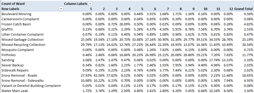
Pattern, or something like “systematic” variation at least, surely guides the Snow Removal calls, these cresting predictably in the January-March interval (note the December numbers, though which really poke into the following winter); but variation bobs up and down through the quarter nevertheless. OK, you may suppose that the February peak in calls probably square with a precipitation uptick in the month, but let us see. The Winnipeg Weather Stats site throws out these respective precipitation overalls:
Jan 2014 16.30 mm
Feb 2014 8.40 mm
Mar 2014 9.00 mm
There’s perhaps something noteworthy, then, in February’s most-calls/least-precipitation disjunction. Looking for a story? There might be one there. You might want to wonder as well about September and October’s top-outs in Garbage Collection calls, another type of removal of a more perennial sort. In fact Collection and Recycling complaints are the most likely to bend the ears of Winnipeg’s 311 responders, comprising over 45% of all calls.
And for a final gaze at pattern, try:
Row Labels: Month
Values: Service Request (Count)
Service Request (again, this time by % of Column Total)

Once charted (say by Month and one of the Values fields), the curious near-linearity of months and calls describes itself:
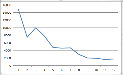
So there’s some pattern. Now try and explain it, too.

Leave a comment