When Big Data gets too big, crack the manual and page furiously to Plan B; and if someone’s put the scissors to Plan B, then hold your head high and beat a dignified retreat. What’s that song about knowing when to fold ’em?
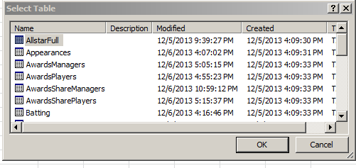
For spreadsheet operatives, too big arrives at record number 1,048,576 (there’s that header row, after all), where the retreat begins its pullout, and the white flag starts waving. Plan B, then, might consist of keeping the data at arm’s length – in an Access table, for example, and querying it from afar. That task is certainly practicable: click Data > From Access, identify the database, and click its desired table e.g, this shot from Sean Lahman’s must-have baseball stats repository:
Decide in the dialog box that follows how you want the data to present themselves; if the record count overruns the sheet, click the Pivot Table Report radio button in answer to the Select how you want to view the data in your workbook prompt. You’ll get your pivot table and its Field List, all right, but it’ll be flying on automatic pilot; you won’t see the actual data, because you can’t.
This works; but when I read about data visualizer Joe Lieder’s charted considerations of the 5,700,000-record dataset of crimes perpetrated in Chicago between 2001 and 2015 I began to search for the data, along with the nearest white flag. I guessed right, and found the former in the city’s Data Portal. But what now?
With its familiar American open-data interface, the Portal does open a number of possible download routes (start exploring by clicking the blue Export button in the far right of the screen) including the ones taking us through Excel territory:

But 5,700,000 records just can’t be squeezed through those channels above. There’s also that OData possibility, up there, a data mode likewise affording at-a-distance access to Excel, provided you can download the free Power Query engine add-in; but it appears that my plebeian version of Excel doesn’t qualify for the utility (but don’t worry; I bought my copy).
In the interests of dignified retreat then, I asked the Chicago Data Portal to filter but two years’ worth of data, 2013 and 2014 instead – but at 577,000 records and nearly 100 MB, no small excerpt. Have your laptop take a deep breath before it attempts to force-feed it to your screen.
Now allow me to ask: what can a pure, un-charted spreadsheet bring to the analysis? How about, for starters, learning something about crime by hour of the day? Among other things, Lieder charts monthly crime fluctuations, but goes no farther. An hourly breakout, then, could be engendered by throwing the Date field data into a pivot table Row Labels area (but not into Column Labels; with around 228,000 unique date-times, they won’t fit in there); but a preliminary Oldest-to-Newest sort of the field turns up nearly 350,000 non-date – that is, text-formatted – entries, an apparent casualty of the AM/PM suffixes clinging to these.
I don’t know why some, and only some, entries should be so embellished (and note I’m asking after truly labelled AMs and PMs. Those time-of-day qualifiers can also associate themselves with certain actual, numeric date formats). After a good deal of dithering over the matter, I pried open a new column between C and D, called it Hour, formatted its cells to zero decimal points, and entered, in what was now D2:
=HOUR(C2)
And copy down the column, of course.
This works, but I don’t entirely know why. Again, there’s a whole lot of (apparent) labels in C, and yet HOUR manages to secure the number it’s seeking from each and every cell in the column format notwithstanding. Requires additional scrutiny, I think.
Then I’d step through this pivot table:
Row Labels: Primary Type (of crime, that is. I than continued with a Filter > Top 10, in view of the 33 types)
Column Labels: Hour
Values: Primary Type (Count; turn Grand Totals off)
And because the outcome reads densely, I went ahead and grouped the hours in bundles of four hours each:
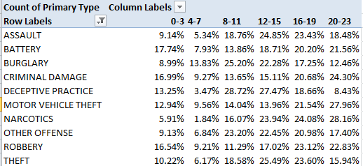
(Deceptive Practice appears to denote crimes of business deception, by way. Look here, for example. And note that the grouped hours above are merely numbers, and not derivates from certified time-formatted values. Note in addition that HOUR retrieves just that – an hourly reading only – and as such will treat 7:58 as 7:00; and that means that the 8-11 really sections off 8:00 through 11:59, for example).
Among other things, the breakout totals almost exactly 40% of all narcotics offenses in the broad-daylight hours of 8:00 AM through3:00 PM (in effect), outnumbering the 35% it counts between 8:00 PM and 3:00 AM, when one might have stereotypically anticipated a spike in this kind of activity. Of course the greater daytime population and its widened customer base may offset the facilitating, clandestine ecologies of nocturnal settings.
No less surprising, perhaps is the 50% fraction of motor vehicle thefts reported between 8:00 AM and 7:00 PM, when cover of darkness would likewise have been expected to abet the illicit repossessions.
But of course it’s dark at 7:00 AM some of the year, so let’s try this: insert another column, this to the right of Hour, call it Month, and post in what is now E2:
=MONTH(C2)
And copy down. Next, engineer this pivot table:
Row Labels: Hour (in the interests of precision, group by bins of two hours each)
Column Labels: Month
Report Filter: Primary Type (select Motor Vehicle Theft)
Values: Primary Type (Count, necessarily; the data are textual. Select % of Column Total; turn of Grand Totals)
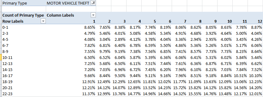
Do auto thefts mount in early morning and evening winter hours? Not decisively, but the percentages for the 16-17 (4:00 to 6:00 PM) tranche are slightly supportive. The winter month percentages (remember that we’ve called for intra-month hour/crime percentages, not proportions across the months for a given hourly frame). In fact the three highest theft rates for the 16-17 bin do emerge in November, December and January. Indeed, the 6-7 (6:00 to 8:00 AM) reading for January, when’s it’s still dark, stands notably higher than for any other month, but April and May discernibly top October and November here, and so the results aren’t emphatic.
And for a presentational talking point, it could be asked of this chart by Mr. Lieder:
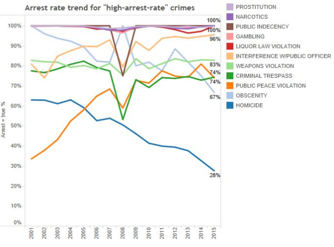
In which in effect, three-variable are charted – Year, arrest percentage, and primary crime type – might be better captured by
Row Labels: Primary Type
Column Labels: Arrest (coded either True or False for an arrest or the failure to effectuate it)
Values: Arrest (% of Row Totals; Grand Totals turned off).
It’s just a thought.
And one more thought: the pivot table above turns up these labels:
![]()
And that means the same crime has been recorded with a pair of spellings, a classic no-no. While the absolute total of the two – 33 – isn’t enormous, you’d want to select just one of these entries for the authorized spelling and put the others through a Find and Replace.
Then refresh the pivot table.
—
And by the way, I have vacation next week. That’s the advantage of self-employment – you get to make your own hours.

Leave a comment