Money-management issues, you say? Can’t stem that outflow, fettered debtor? I hear you, but you sure didn’t put your good name to 140,179 checks last year, the number of payments flowing from the pock-marked bank account of the city of Boston in 2014 alone. That’s 384 autographs a day, even more than David Beckham signs on his milk runs to his bodega; and you can read all about it here, and test your auditing smarts against the 556,104 checks disbursed by the city from July 1 2011 to April 28 of this year, all saved to the city’s Checkbook Explorer sheet.
Sorry, folks; you’ll need to actually go there in order to download the 556,000; click the Checkbook Explorer link, follow with a subsequent click of the Export button, get the download going with a click on the CSV or CSV for Excel download option).
As with most US Open Data governmental sites the data are pretty good, albeit with a few curiosities. Rows 426220 through 426226 (at least in my download) restate redundant header data, as do a few other rows farther down, even as columns B through F and H and I remain unpopulated in those records. The quick fix is to sort the data by one of the blank cell columns (via A to Z), thus forcing these discrepancies to the bottom of the data set, after which the good old blank-row insert will send them into oblivion.
Note in addition the Year and Fiscal Year fields. The latter begins every July 1, and so July 17, 2013 belongs to fiscal 2014, for example. The conventional Year field could, in the interests of slimming down the file for the analyst, be deleted, because years can be derived as needed from the dates staking the Enter field, via the pivot table’s Grouping feature; and the same could be said about, and done with, the months in Months (Number), and Month, the latter supplying their names. Savings: about 1.5 million cells. And while you’re at it you could probably disengage Voucher and Voucher Line as well as Dept, those latter numeric IDs receiving their user-friendlier names in Department Name. And that greater total economy of 3 million cells would doubtless please the Boston accountants.
Once those sweeps have been conducted the data read and work pretty straightforwardly. It occurred to me, then, that a monthly aggregate breakout of expenditures might prove of interest, given June’s end-of-fiscal year status. Might that month bear more than its share of outlays, with unspent budgetary remainders burning a hole in departmental coffers? Not a bad investigatory question, and answerable by this pivot table awaits:
Row Labels: Entered
Values: Monetary Amount (grouped by Month and formatted in currency mode):

In fact the results stand my question on its head. We see a remarkable downturn in July spending, remarkable because the months flanking it – in different fiscal years, at that – register far higher numbers. It seems that the bean counters in Beantown are happy to spend their due allotments with time to spare, and their creditors aren’t complaining either.
But the above table also imparts a real-world pertinence to a point to which I call students’ attention in my Excel classes. Note the data span at least parts of four years, and because they do, a grouping by month alone quite overlooks the plurality of Januarys and the eleven other 30-or-so-day units the year comprises. Our table sums spending activity for all the Januarys, then, a level of abstraction normally too high for most data-analytical intents. But because we want to understand the role of months qua months in the spending calendar, the table makes sense. Indeed, if you retool the above numbers via % of Column Totals:

You’ll see just how understated the June expenses are, though at the same time I’m not sure what to make of April’s lion’s share.
And if you next substitute Department Name for Entered, turn off the % of Columns Total calculation, run a Top 10 filter for Departments (start by right-clicking somewhere in Row Labels, not the Values), and sort the numbers Largest to Smallest you’ll see

Boston’s schools rise to the top of the expenditures class, and note $3.6 billion grand total. If you turn off the Top 10 and thus expose all the departments figuring in the dataset, you’ll count 76 of these, along with their $4.1 billion grand total. And that means the top 10 departments account for about 87% of all spending. The most frugal department? The Office of Women’s Advancement, whose one and only $92.00 payment earmarked itself for printing expenses at a local Sir Speedy. The office is connected to the Boston Women’s Commission, whose none-too-profligate $6,145.34 places it in the austere 74th position. Conclusion, then: we need more women in the Boston Public School Department.
And as for the receiving end, switch Vendor for Department and run another Top 10/sort:
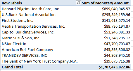
The health insurance provider Harvard Pilgrim Health Care accounts by itself for more than 21% of all of Boston’s outgoings. Indeed – the top 10 takes in 41%, and that’s out of 12,643 vendors.
And among other things that means Boston has a whole lot of potholes, Mario Susi & Son, you see, sell asphalt.

Leave a comment