What makes a dataset interesting? A slightly dangerous question, to be sure, exposing as it does the respondent to charges of extreme geekiness and other personality shortcomings likely to result in relegation to the B party list. But enough about me; let us rise above the ad hominems and endeavor to actually answer the question.
Apart from data that is (eventually) ready to use, of course, an interesting set would likely comprise enough records to make pivot tabling and other pattern-seeking enterprises worth one’s while, and enough redundant field items to justify some manner of grouping (although remember that even unique time data can be grouped, too). What might not be required, however, is some compelling topical theme to which the analyst might be drawn. Rather, it may be that the very fact of the set’s manipulability and the prospects for novella it is poised to deliver, that’s interesting sui generis. In other words, play with any data that lends itself to the playing, and something of interest could well follow.
For an instructive see-what-I-mean, consider the Canadian city of Edmonton’s open data site and its stirringly-named Pet Licenses by Neighbourhood dataset (it’s there for the downloading via its blue export link; and at 8 megabytes it’s nothing you can’t handle. And the “u” in neighbourhood is where the Canadian part comes in). I’m not a pet lover, and that is part of the point – because a few step-throughs across the data should uncork some odd, interesting sociological truths nevertheless – even to an undomesticated type like me.
At least it should after the preliminaries are battened down. For openers, we don’t need the COUNT field and its unrelieved, undifferentiating spate of 101,472 1’s. We also could do without the LOCATION field, which unaccountably concatenates the adjoining Latitude and Longitude data into a redundant and conspicuously less serviceable set of text labels. And again (we’ve seen this before), the time-bearing format of the LICENSE_DATE items puts every time in every cell at 12:00:00 AM, and that means we don’t need any of those midnights, either.
I’m also not sure what interpretive gain is to be realized by the YEAR, MONTH, and MONTH_NUMBER fields, when all that information is effectively and already bundled into LICENSE_DATE; and if you charge me with hyper-criticizing the dataset, keep in mind that with 101,000 records no one is going scan, and then go on to mentally pivot table or filter, the data. If any aggregate sense is to be imparted to these records then some Excel mechanism will have to be brought to bear upon them; and if so – that is, if you’re pivot tabling and grouping years and months anyway – then the above fields can’t really add anything more to the analysis (it’s true that a pivot table grouping of LICENSE_DATE months will yield a 1, and not a January – but month names could be referenced by a simple VLOOKUP table). Strike off COUNT, YEAR, MONTH, MONTH_NUMBER, and LOCATION, then, and you’ve lightened the workbook by 500,000 cells . (I also don’t know why the data for 2014 is so scant (280 records), in view of the fact they report licenses for all 12 of the year’s months.)
But we haven’t gotten to the interesting part yet, and I didn’t come this far just to disappoint you. Try setting this pivot table for starters:
Row Labels: NEIGHBOURHOOD
Column Labels: PET_LABELS
Values: PET_LABELS (% of Row Total; turn of Grand Totals)
(Note that three records don’t identify a pet type.) Apart from the fact that according to Edmonton’s estimation it has 321 neighborhoods (excuse the contrarian spelling – I’m American), and that more than two-thirds of the licenses overall were issued to dog owners, it’s the variation by neighborhood that puzzles and intrigues. Why should 50.62% of Strathcona’s 815 pet licenses go to cats, even as that species accounts for but 25.1% of the 1210 certificates handed out in Summerside? Why, after all, should pet preference align with location? That, it seems to me, qualifies as an odd sociological truth – not necessarily an unexplainable one, but an odd one just the same.
Then try this simple but provocative table:
Row Labels: LICENSE_DATE (Group for months and years and filter for 2015, the year that contains the lion’s share of the data – pun slightly intended)
Values: LICENSE_DATE (Count, % of Column Total)
I get:
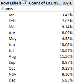
Some pretty broad disparities in there, and most notably for some monthly pairs. Is the spike in licences from May to June a concession to vacationing children clamouring for a Fido to call their own? What about the leap from January to Februrary, or the April-May slump? Remember that we’re considering 100,000 licenses, so the monthly breakouts seem reliable.
And for all your budding sociologists out there, know that according to this site Edmonton comprises 316,000 households – of which 93,000 garnered a pet license in 2015. That’s nearly 30% of all residential groupings in the city barking for a pet in one year (though the licenses have to be renewed annually)– and that’s a number to compare to other cities.
And in keeping with the spirit of all this creaturely activity, I’d also recommend that you position your pivot tables starting in cell K9.
Pun definitely intended.

Leave a comment