Archive | November, 2016

The Vote, 2016: A Fait Accompli in Progress

29 Nov

When is an election over – when the winner is declared, or after the votes have been counted? The alternatives are neither mutually exclusive nor mutually determinative; while the declared winner readies his regime change, the ballot count proceeds, eerily distanced from an outcome that has already been affirmed and conceded. Mr. Trump plunges ahead toward his office, while the shadows umbrate some other figure on the wall.

Such is election 2016. Both presidential candidates seem to have won – something – but only one gets to hold a party on January 20th, courtesy of the misshapen, superstructural interposition we call the Electoral College (note that Donald’s Trump’s popular vote percentage falls beneath that of both George W. Bush – himself a minority-vote winner, and Mitt Romney, who outpolled Trump but lost. Of course a large third and fourth vote this time has something to do with that disparity).

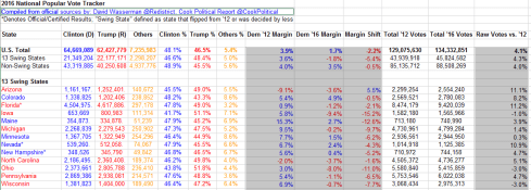
But the vote continues to be tallied, and a most useful, near-real time spreadsheet of the numbers as they stand right now is yours to download, this time the courtesy of David Wasserman of the Cook Political Report site. Indeed – on a couple of occasions I’ve clicked its on-site refresh button and watched the number change right then and there. To get the sheet, look here (note the sheet inhabits its space in Google Spreadsheet form, and sometimes its File command – the one you’d click in order to download the data in Excel mode – isn’t always there. It may take a couple of accesses before you see it. That’s been my experience).

Spreadsheets of this kind and organization again ask again question I’ve posed here more than once– namely, the one about the intentions you bring the data. If they’re purely self-educational – i.e. you simply want to learn what the sheet has to say about the current count – then it’s perfectly fine as is, and by definition there appears to be nothing more to do. Read, then, and be edified.

But if you want to act upon the data – that is, try your analytical hand at learning something more than what you’re seeing – you’ll need to decide if the worksheet calls for some manner of restructuring. If for example you decide you want to treat the numbers to a round of pivot tabling, than restructure you must: You must, for example, strip away blank rows 6, 10, and 25, along with the textual captions slid into 11 and 26. You’ll also need to vacate rows 7 through 9 as well; leaving them alone will unleash a triple count of the vote totals upon any pivot table, as the U.S. Total in 7 doubles the individual state vote count, and the Swing/Non-Swing State data in 8 and 9 duplicate the count yet again.

But even if one opts against the pivot table strategy there’s still work that could and perhaps should be done, and things to be learned from the sheet. First, I’d restore all the numbers in the data set to their default right alignment; centering New York’s 4,153,119 votes for Clinton (as of this writing) immediately atop North Dakota’s 93,758 imposes a false presentational symmetry for the values, and the formulas in columns E, F, and G, e.g. in E7:

=B7/(D7+B7+C7)

could have submitted to the more parsimonious

=B7/L7

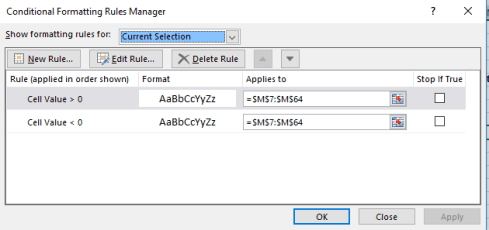
OK, that one’s a small point, and here’s another: the parentheses bracketing the formulas in the I column could be lopped off. But the sheet’s color-scheming raises another, weightier issue, begging the question if the collection of tints before us embody a set of conditional formats, or rather and merely a pastiche of fixed-color design decisions. The answer is all of the above; conditional formats range across some of the data cells, while the latter motif dyes others.

To discover exactly which cells have been subjected to which treatment, we can make our way back again to the agile F5, Go to > Special > Conditional Formats option (we’ve done this before):

blog-vote1

Ticking the option button above instructs Excel to go to, or select, all the cells in the sheet that in fact bear some conditional format, and following through here I get, in excerpt:

blog-vote2

Note therefore that a good many cells – e.g. those populating the first seven columns – sport static, manually-colored hues that represent party associations – blue for the Democratic, red for Republican, yellow for the generic Others. The “margin” columns of H:J, however, were conditionally formatted, for example:

blog-vote3

That is, the numbers in the above cells exceeding zero revert to Democratic blue, bespeaking a win for that party; the less-than-zero values turn those cells Republican red.

But note that the M column has been likewise conditionally formatted, even as none of its values seem to have undergone any change of appearance. Click any cell in M, click Conditional Formatting > Manage Rules, and you’ll understand why:

blog-vote4

While the greater/less than zero conditions have been entered here as well, the worksheet designer neglected to assign any formatting consequences to the M cells. (Cell A2, disclosing nothing but identifying information about the sheet, has been conditionally formatted as well – but I’m assuming that treatment is a simple, inadvertent mistake.)

But consider the state-name enumerations in the A column. Their respective colors reflect a win for the appropriate party, and these could have and should have been given over to conditional formats (in this case formulas) – and they weren’t. Absent that device, the spreadsheet designer apparently needs to inspect the present vote totals for each state and manually apply the relevant color, again state-by-state. The recommended formulas look something like this (after first selecting the state names in A12:A64):

blog-vote5

That is, if the vote in the C (Republican column) exceeds that in the associated B column, color the cell red. Let B exceed C, and the cell reverts to blue. Of course if we had reason to suspect or anticipate a state win for Others, a third condition would have to be introduced.

Now there’s another non-pivot-table-driven finding of interest that the data, in their present incarnation, grant us. Note that states whose vote count has been officially finalized are asterisked, and so we might want to tally that count in turn. In effect, then, we want to look for the appearance of an asterisk in any given state’s name, a task amenable to the same sort of COUNTIF with which we developed key word searches in our Trump tweet anthology. But here you need to be careful. If I enter

=COUNTIF(“*”&”*”&”*”)

We’ll realize a count of 52, because the formula ascribes an equivalent functionality to all three asterisks – that is, a wild-card property, even though the center asterisk is the precisely character for which we’re searching. To overthrow that trammel, you need to enter:

=COUNTIF(“*”&”~*”&”*”)

The tilde signals the formula to regard the middle asterisk as the search item (see a discussion of the tilde here; I had to check it out myself). My current total of 17 (one of which is the District of Columbia) tells us that 34 states have yet to complete their presidential vote count, and this three weeks after Election Day.

It looks as if Mr. Wasserman still has a lot of work to do.

The President-Elect’s Tweets

21 Nov

Donald Trump’s Twitter account describes its holder as President-elect of the United States; so the reports, then, must be true. The deed has been done, the unthinkable has been thought, the reality checks have been written and distributed to the disbelieving. Or is it all another case of fake news?

Call me the naïf – but on the assumption that it really did happen, it next occurred to me that a reeling nation might be restored to equilibrium by taking yet another look at the latest tweets streaming from the curious mind of the chief-executive-in-waiting.

And so it was back to the web site of record, twdocs.com and its burgeoning trove of planetary tweets, for yet another audit of Mr. Trump’s now-presidential ruminations. My spreadsheet haul comprises the victor’s last 3019 tweets as of the afternoon of November 21, dating back to February 19 and moving me to build a first pivot table breaking out his tweet total by month (note that those 3019 exclude replies and retweets, possibly a procedural error on my part). I get:

elect1

We’ll note the quicksilver wax-wane of the October and November tweet totals (remembering that the latter sum counts about two-thirds of the month’s transmissions), both numbers perhaps a correlate of both pre-election frenzy and Mr. Trump’s current preoccupation with other things. Since (and including) the November 8 election day, 51 tweets (appear to) have issued from the @realDonaldTrump signature, these continuing to exhibit the curious, perhaps even trademark ebullience of its eponymous subscriber. There shall be no Marlowe-Shakespeare authorial controversies here; the prose is surely Trump’s – even as his book’s contents may have other claimants. (And by the way – if you can’t get enough of our fearless leader’s literary output, visit the compendious Trump Twitter Archive, a repository of just about every tweet ever fired off by the commander in chief.)

So what is there to be learned about November’s 127? I once again ran these tweets through a battery of key-word searches as per previous Trump posts and via the same COUNTIF routine (sorting the tweets in latest-to-oldest order rows 7 through 133 will offer up the relevant range to be counted, and will spare you from all array formula concerns). I then subjected the 597 October 1-and-beyond tweets to the same searches, with these joint results, sorted in order of the November tweet key-word appearances:

elect2

I did say something about ebullience; and with nearly two-thirds of the November tweets studded with decisive exclamations I think I’m on to something there. And with his flurry of thank yous the ever-courteous Mr. Trump is nothing if not grateful to his minority of supporters. You’ll also note the references to crooked Hillary holding steady, though to be fair the incidence of that sobriquet for all 3019 stands at 6.82%. The man is clearly mellowing, exclamation points notwithstanding. (A technical aside here: the search term @nytimes need be preceded by a text-format-bestowing apostrophe. Overlook that punctuation, and Excel will read the @ sign as a vestigial Lotus 1-2-3 formula code.) The slightly odd downturn in Pence-bearing tweets and the slightly-odder-still dip in references to Trump probably reflects the fact that the gentlemen have since gotten their jobs, and no longer need to tug your sleeve as insistently.

If you’re doing your own downloading (that’ll be $7.80, tax included) you’ll doubtless find the tweets make for some interesting, and entertaining, reading. The November 20 encomium for General James “Mad Dog” Mattis forces one to wonder why Trump wanted you to know his nickname; and his view, voiced likewise on the 20th, of the post-production preachment aimed by some of the cast of the show Hamilton at playgoer Mike Pence – “The cast and producers of Hamilton, which I hear is highly overrated, should immediately apologize to Mike Pence for their terrible behavior” – looks past Pence’s own recommendation that people see the musical. And Trump’s November 15 ascription of “genius” to the Electoral College won’t square with his 2012 tweet to the effect that the institution is a “disaster” (that allusion to the College, by the way, is the one and only among the 3019 tweets in my dataset.) And for what it’s worth, this pivot table:

Rows: Source

Values: Source

Drums up this distribution:

elect3

And it tells me that Mr. Trump’s phones are a lot smarter than mine, and apparently more numerous.

And if you are in fact downloading and analyzing, there’s one other spreadsheet-specific matter about which you’ll want to know: In past posts I made something of an issue about the uncertain time zones which the data in the Created At field record. I had speculated that the times keyed themselves to the zone in which the downloader resided, but a helpful note from Joel of twdocs set me straight. The tweets are in reality French-timed; that is, set to the time in that country (in which twdocs’ server is stationed) – or generally six hours later than Trump’s native New York. And indeed – my question to Joel about my hourly puzzlements spurred him to rename the Created At field to Created At (UTC+1hr).

And if – if – we assume that Trump’s 51 Nov 8-and-beyond tweets sprung from New York, a halfway plausible proposition, as the commander-in-chief likes to hunker down in his namesake towers – we could insert a column to the immediate right of Created At, call it NY Time, and enter, in what is now B7:

=A7-.25

.25 is Excel’s way of expressing six hours – that is, one-quarter of a 24-day. Copy that little formulation down B and you’ve established New York-zoned tweet times.

And what that does among other things is trim the number of November 8-plus dates to 46, because the our six-hour recalibration has dragged five erstwhile November 8 times back into November 7.

If we then tread the path of least resistance and muscle in a blank row beneath 52, we can pivot table for the hours during which Trump’s most recent tweets were blurted to his 15.6 million followers, by corralling the A6:Z52 range:

Rows: NY Time (grouped for hours only)

Values: NY Time (Count)

I get:

elect4

The president-elect seems to like his tweets in the morning, or at least he does now. But again, an hour-driven scrutiny of all 3019 tweets can’t reckon as confidently with his whereabouts across the last nine months – he was campaigning, after all – and the corollary uncertainty about exactly when he dispatched his tweets.

But hasn’t Mr. Trump said he wants to be unpredictable?

Greensboro’s Fire Alarm Data – Time Sensitive

13 Nov

It’s Greensboro North Carolina’s turn to admit itself to the open-data fold, and it’s been stocking its shelves with a range of reports on the city’s efforts at civic betterment, all spread behind the familiar aegis of the Socrata interface.

One such report – a large one at 67-or-so megabytes and 211,000 records – posts call-response information from Greensboro’s fire department, dating the communications back to July 1, 2010, and made available here:

https://data.greensboro-nc.gov/browse?q=fire

If you encounter the “Datasets have a new look!” text box click OK, click the Download button, and proceed to CSV for Excel.

And as with all such weighty data sets one might first want to adjudge its 58 fields for parameters that one could properly deem analytically dispensable, e.g., fields not likely to contribute to your understanding of the call activity. But here I’d err on the side of inclusiveness; save the first two incident id and number fields and perhaps the incident address data at the set’s outer reaches (and the very last, incontrovertibly pointless Location field, whose information already features in the Latitude and Longitude columns), most of the fields appear to hold some reportorial potential, provided one learns how to interpret what they mean to say, and at the same time comes to terms with the fact that a great many of their cells are vacant. (By hovering over a field’s i icon you’ll learn something more about its informational remit.) In addition, several fields – Month, Day, and Week, for example – could have been formulaically derived as needed, but Greensboro has kindly brought those data to you without having been asked.

In any case, it’s the date/time data that bulk particularly large among the records and that could stand a bit of introductory elucidation. First, the CallProcessingTime data realize themselves via a simple subtraction of the corresponding 911CenterReceived time from the AlarmDate (and don’t be misled by that header; there’s time data in there, too)- Thus the call processing time of 15 seconds in K2 (its original columnar location, one preceding any field deletions you may have effected), simply derives from a taking of O2 from P2. That is, call processing paces off the interval spanning the receipt of a 911 call and the dispatching of an alarm. Subtract 7/2/2010 11:38:17 AM from 7/2/2010 11:38:32 AM, and you get 15 seconds.

Well, that’s obvious, but peer beneath the 00:15 result atop K2 and you’ll be met with a less-than-evident 12:00:15 AM. You’ve thereby exposed yourself to the dual identity of time data.

Subtract one time datum from another and you will indeed have calculated the desired duration, but that duration also counts itself against a midnight baseline. Thus Excel regards 15 seconds as both the elapsing of that period of time – as well as a 15-second passage from the day’s inception point of midnight (which could be alternatively expressed as 00:00). Examine the format of K2 and you’ll see:

green1

And that’s how Excel defaults this kind of data entry, even as an inspection of the Formula Bar’s turns up 12:00:15.

That feature, proceeds by Excel’s standard scheme of things, however ; a more problematic field concern besets AlarmHour, which presumably plucks its information from AlarmDate (an equivocally named field to be sure, as it formats its data in time terms as well). Hours can of course be returned via a standard recourse to the HOUR function, so that =HOUR(P2) would yield the 11 we see hard-coded in N2. But many of the hour references here are simply wrong, starting with the value in N3. An alarm time of 3:51 AM should naturally evaluate to an hour of 3, not the 12-hour-later 15 actually borne by the cell. Somehow the hourly “equivalents” of 3:00 AM and 3:00 PM, for example, underwent some manner of substitution, and often; and that’s where you come in. Commandeer the first unfilled column and enter in row 2:

=HOUR(P2)

Copy all the way down, drop a Copy > Paste Values on the AlarmDate column, and then delete the formula data.

And once in place a number of obvious but meaningful pivot tables commend themselves, leading off with a breakout of the number of alarms by hour of the day:

Rows: AlarmHour

Values: AlarmHour (count)

I get:

green2

Note the striking, even curiously, flat distribution of calls.

Next we could substitute day of week for hour, both for Rows and Values:

green3

(Truth to be told, leaving AlarmHour in Values would have occasioned precisely the same results; because we’re counting call instances here, in effect any field fit into Values, provided all its rows are populated, would perform identically.)

Again, the inter-day totals exhibit an almost unnerving sameness. Could it really be that alarm soundings distribute themselves so evenly across the week? That’s a downright journalistic question, and could be put to the Greensboro data compilers.

We could do the same for year (remember that the data for both 2010 and 2016 are incomplete, the numbers for the former year amounting to exactly half a year’s worth):

green4

My data for this year take the calls through November 7; thus a linear projection for 2016 ups its sum to a new recorded high of 37,744.

We could of course do much the same for month, understanding that those data transcend year boundaries, and as such promulgate a kind of measure of seasonality. We could back Month Name into the Values area twice, earmarking the second shipment for a Show Values As > % of Column Total:

green5

The fall-off in calls during the winter months is indisputable, but note the peak in October, when a pull-back in temperatures there is underway. There’s a research question somewhere in there.

Of course more permutations avail, but in the interests of drawing a line somewhere, how about associating TotalResponseTime (a composite of the CallProcessingTime and ResponseTime in K and L, respectively) with year?

Return Year to Rows and push TotalResponseTime into Values (by Average) and you get:

green6

That’s not what you were looking for, but the pivot table defaults to the times’ actual numeric value, in which minutes are expressed as a decimalized portion of an 86,400-minute day. Right-click the averages, click Number format, and revisit the Custom h:mm:ss (or mm:ss, if you’re certain no response average exceeds an hour). I get

green7

What we see is a general slowing of response times, though in fact the times have held remarkably constant across the last four years. But overall alarm responses now take 30 seconds longer than they did in 2012, and more than a minute from 2010. Does that matter? Probably, at least some of the time.

Note, on the other hand, the 1500 call processing times entered at 0 seconds and the 933 total response times set to the same zero figure. Those numbers await a journalist’s response.

U.S. Voter Turnout: A Sometime Thing

4 Nov

Looking for a vivid trademark of democracy? How about the right not to vote? Overturn the hard-won prerogative to stay at home, and a defining attribute of democracy gets overturned with it.

But Americans have long been accused of abusing the privilege. Election Day absenteeism is a veritable national folkway in the States, turnouts there comparing rather unfavorably with voter activity rates for other industrialized countries (though the matter isn’t quite that straightforward; see this cross-national survey for some comparative clarification). Per the above link, merely 53.6% of the American voter-age population made its way to the polls for the 2012 presidential election; and that means about 112 million citizens who could have failed to do the same.

The political implications of so massive a truancy are massive, apart from the civics-lesson remonstrances that could be aimed at the apathetic or disillusioned. If it could be demonstrated that the political gestalt of recalcitrant voters assumes a different shape from those who do make an appearance, some candidates are aren’t getting the most out of their constituency, e.g. this New York Times piece on an apparent shortfall of black voters in this year’s presidential contest.

For more detail on the problem we can turn to a raft of Census Bureau data on the turnout phenomenon, an assortment of spreadsheets that consider the demographics of voters in the 2008 presidential election (I can’t find equivalent numbers for 2012; note that the files are dated February of this year). This book plots turnout by state:

table-04a

But when politics come to spreadsheets the latter need be squared away before we can learn anything new about the former, and the latter is slightly messy. First, the Registered and Total Voted headers in row 5 occupy merged cells, and merged cells have no place in the pivot tabling enterprise. But moreover, a set of supplementary headers banner row 6, and two header rows have no more of an analytical place in the process than merged cells:

turnout1

By selecting A5:M6 and subjecting the range to the Unmerge Cells command we’ve made a start; then delete the Registered and Total Voted entries (that excision is both necessary and harmless; the headers in row 6 continue to distinguish registration from vote data in any case). But the unmerge has also floated the headers in columns A:C to row 5; and as such they need to be pulled down to 6 if they’re to share header that row with all the other field identifiers. You’ve also likely concluded that the header for column A doesn’t really mean what it says: the data beneath it bears state names only (along with that of the nation’s capital, the District of Columbia), and as such the field should probably be renamed.

And if you’re planning to do anything more with the worksheet than read it, you’ll eventually need to delete the United States entry in row 7. That summative record behaves as a grand total, and as such will inflict a double-count of the values upon any pivot table. But before you send that record on its way you may want to think about the data it aggregates. Understand first that the sheet’s numbers are expressed in thousands, i.e. the Total Population of 225,499 in B7 shorthands an estimated 225,499,000; remember that the data report survey results, and as such are subject to the margins of error conveyed in the H and K columns that correlate negatively with state population; the larger the state, the slimmer the error margin. (Let the record also show that the state totals don’t precisely equate with those aggregate US figures in row 7, presumably a bit of fallout from the rounding activity imposed upon what are, after all, survey estimates.)

And do consider the denominators; that is, atop which demographic baseline is turnout data to be mounted? It seems to me that Total Citizen Population – apparently counting those Americans eligible to vote – serves as one, but only one such floor, along with an important alternative, Total Registered. Thus the Percent registered (Citizen +18) for the country in its entirety divides D7 by C7, or the number of estimated registrants by the entire voter-eligible population; and by extension the Percent voted (Citizen 18+) proportion of 63.6 derives from I7/C7. I will confess a laymen’s ignorance about the utility of the Total Population numbers, because they subsume residents who are presumably barred from voting in the first place.

Once those understandings are put in place another metric – which I’ll call Pct of registrants voting – offers itself, via a dividing of the Total Voted figures by Total Registered. To be sure, the measure is curiously subsidiary and self-selected, calculating as it does a subset of voters from among the subset of all potential voters who’ve actually registered. Nevertheless, I’d allow the parameter is worth plumbing, and I’d title column N the aforementioned Pct of registrants voting, and enter in N7, while formatting the field in percentage terms to two decimals:

=I7/D7

(Remember that these percentages possess a different order of magnitude than the native percent figures accompanying the worksheet. The latter are communicated in integer terms e.g. 60.8, not 60.8%.) After copying the formula down N, you’ll note that a very substantial segment of the registered population voted in 2008, a finding not quite as truistic as it sounds. On the one hand, of course, a citizen bothering to register could at the same time be expected to bother to vote, and no state has a Pct of registrants voting falling beneath 80%. Indeed – 22 states (including Washington DC) boast a percent of registrants topping 90%. On the other hand – and here I allude back to the Pew Research link referenced above – relative to other countries the US overall registration percentage vs. voter turnout disparity is high, suggesting a peculiar bifurcated enthusiasm among the electorate. Those taking the pains to register will overwhelmingly go on to vote (at least for presidential contests), but millions of their countrypersons simply don’t take those pains to begin with.

Now about pivot tabling…well, what is there to pivot table? We’ve encountered this mild puzzlement before; because the textual data – here state names – don’t recur, there’s nothing in the State field to aggregate. If we impose a set of coarse, recurring categories upon a new field, e.g. we assign each state a geographical region name, you will have contrived something to pivot, and I’m not sure that’s such a bad idea. An alternative could be to group the values of a selected numeric field, for example Total Population, and have it break out Pct of registrants voting, by way of additional example:

Rows: Total Population (grouped into bins of 1000, which again signify millions)

Values: Pct of registrants voting (formatted in percentages to two decimals)

turnout2

But one doesn’t discover much variation therein. On the other hand, isn’t the absence of variation a finding?