Huge organizations, huge budgets, huge pressures, huge controversy. That chain of indissoluble links clenches around the latest pronouncement of the UK’s National Health Service (NHS), heralding a cutback on “low priority” items that are otherwise available, and affordable, at local pharmacies – e.g. gluten-free products and hay-fever drugs.
Of course that is wherein the controversy lies, and if you’re interested in deeper contextual information about NHS prescription practices you’ll find it among a set of NHS data sources, including this one. That site provides what it terms Commissioning Group Prescribing Data across four quarterly spreadsheets for 2016, and for England (but not Northern Ireland, Scotland, and Wales); and by opening each of the four and copying and pasting it into a solitary workbook, the year’s prescription activity is consolidated, in 154,000 rows worth of data.
A large data set, but perhaps not optimally so. Each record is summative, after a fashion, totalling the number of prescriptions – or really, the number of products or items prescribed – for a medical speciality (Chapter Name), by a particular UK area team, e.g. (note the Items field):

Thus the first record counts 36 product-item prescriptions for gastro-intestinal treatments; and as such one might want to see that entry drilled down into 36 rows of information, resolving to prescription/product-level granularity. The analytical advantage there: a date-stamping of each and every item and a corollary enabling of useful time breakouts, e.g., items by week and/or month. (In fact some of that data are here, but for 2015, apparently; its billion or so records would overwhelm a spreadsheet, of course. and while these could be routed into Power Pivot – an add-in we haven’t explored here – the process might also exact a prohibitive download time, and so perhaps could be considered at another point.)
Note as a consequence that the 154,000 rows don’t total the numbers of items; that figure emerges only after a simple summing data in the Items field, returning 1,091,518,463 items (or again, prescribed products) for the year. Note in addition that because the quarterly demarcations in the A column are geared to the UK fiscal year – April to March – and not to calendar 2016 – what positions itself here as 4th Quarter data in fact recalls prescription activity for the actual first quarter of 2016, with 3rd Quarter numbers keyed to October through December of the year. In the interests of clarification, then, I’d run a series of Find and Replaces at the field data, something like this:
 h
h
And so on, so as to map the data fitly to calendar 2016.
Once that bit of administration is concluded a number of substantive breakouts suggest themselves. You may want to inaugurate the analysis, for example, by breaking out item totals by the broad Chapter Names in G:
Rows: Chapter Names
Values: Items
Items (again, % of Column Totals)
I get:
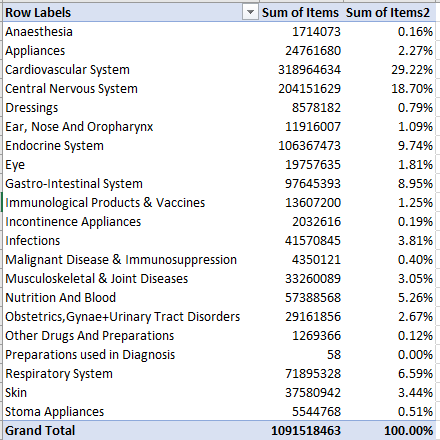
You may want to comma-format the values, but the percentages convey the message in any case. We see that Cardiovascular and Central Nervous System account for nearly 42% of all product items. By means of follow-up we could refer Chapter Names to a Slicer and roll Section Names – categorical subsets of each Chapter Name – into Rows. If I tick the Slicer for Cardiovascular System I get:
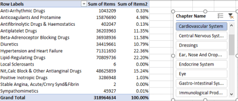
Not surprisingly Hypertension and Heart Failure product head the list, though only very slightly ahead of Lipid-Regulating Drugs, which include statins.
Slicing for Central Nervous System products I get:
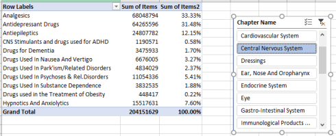
Analgesics (pain killers) and antidepressants contribute about 65% of the product total; the paucity of Obesity-treatment items is perhaps striking, however, given the incidence of the condition across the UK.
For another instructive measure, albeit a crude one, we could distribute item totals by England Area Teams. First, I’d tick the Slicer’s Clear Filter button:
And then delete the Slicer. Because I may want to return Chapter Name to the pivot table, clearing the Slicer’s filter selection sees to it that all the Chapter Name items will reappear in the table when requested. Otherwise, the Slicer’s filter will remain in force.
Then we can move assemble this pivot table:
Rows: Area Team Name
Values: Items (Sum, % of Column Total, sorted Highest to Lowest)
I get:
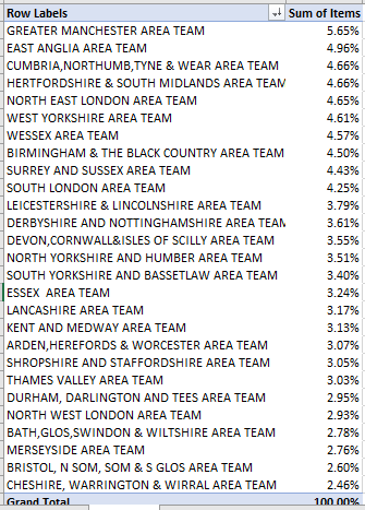
The percentages are clear but crude, in view of missing population data that would serve as a necessary corrective. Drag Chapter Name into Columns and, in part, you’ll see:

You’d doubtless need to take a series of long hard looks at the percentages, which don’t always reflect the overall proportions throughout.
And as for a simple, slightly coarse assessment of item totals by quarter:
Rows: Quarter
Values: Items
Items (again, by % of column totals)
I get:
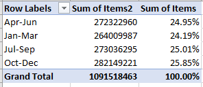
The numbers are notably constant, and hence just a little provocative. Are these comparable aggregates an expectable consequence of the outlier-smoothing might of very large numbers, or are doctors somehow phasing prescriptions evenly across the year? I suspect the former, but there’s an investigative tack for you.
And yes, the Row Labels haven’t filed themselves into chronological order, have they? They’ve rather assumed a purely alphabetical progression, simply because they’re labels. Excel can’t construe Apr-Jun as a unit of time, and so resorts instead to the standard sort protocol. If you want the entries to adopt a faux chronology you’ll need to right-click the Jan-Mar label (and take pains to click only that cell) and click Move > “Jan-Mar” Up.
And what of the item costs? That, after all, is what’s impelling the NHS to rethink its prescription allowances. As long as we’ve installed the quarterly labels we can substitute Actual Cost for Items in the Values area, formatting the results into British pound currency:
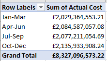
(Note the distinction in the dataset between Actual Cost and NIC, or Net Ingredient Cost. For a definitional clarification look here. Actual Costs nearly always tend to fall a bit below NICs.)
Again, the totals evince a remarkable sameness, no less provocatively. In any event, that’s 8 billions pounds worth of prescribed items.
Next we could substitute Chapter Name for Quarter, and drag Actual Cost into Values a second time and recondition via % of Column Total:

The totals are lucidly apparent, but of course don’t break down into the kind of items the NHS wants to exclude from their reimbursements. If you again cast Chapter Name into a Slicer and filter for the largest Central Nervous System category, we’ll get:

More detail needed, perhaps. But for cost accountants, it’s a start.

Leave a comment