Are boys better at math than girls? The question is hard-wired for controversy of course, but stammer a first response by trotting out SAT (Scholastic Aptitude Test) scores and the answer is yes. Boys consistently outscore girls by roughly 30 points a year on the nationally-administered exam (national in the US, that is), an extraordinarily dogged interval that bucks the ebb and flows of SAT score aggregates:

(Screen shot source: the above-linked web site, reproducing the chart in turn from the College Board that conducts the SAT.)
And, as the linked site above continues, the advantage enforces itself even as high school girls outperform boys academically overall. (None of this suggests that conclusions are necessary or unitary; see this demurral, for example.)
Is that the last word on the subject? Of course it isn’t, and for additional testimony we can swing our protractors over to the New York City Open Data site and its compilation of New York State Math Test results by gender for city schools, reported for the years 2013-17 (the test is described here). Click the Data Dictionary link to call up a workbook offering the data and supplementary worksheet tabs clarifying their fields.
Next click the Master tab and 47,000 rows worth of score data are yours for the analyzing, including at least three parameters just begging for your attention: student grade, year of exam, and gender, which the sheet curiously entitles Category. The test scores themselves – scaled to enable cross-grade comparisons – fill column G, a normalization that would thus appear to support some rather global aggregations, e.g. average score for all students by year or gender, or even borough (that parameter is in fact concealed in the DBN field in A and must be dredged from the school code entries, a chore we’ve performed in a previous post).
You’ll note, however, that 485 records, a touch more than 1% of them all, substitute an “s” code in lieu of actual test scores, a replacement impelled by privacy considerations (see the discussion in cell B12 of the DatasetInfo tab). In fact, we’ve encountered this stricture before in a different demographic context; see this post, for example. But in any case, those alpha proxies will simply be ignored by any computation, thus freeing the 99% of the number-bearing entries for any closer, quantifying look.
But there’s another perturbation roiling the data that the formulas won’t automatically overlook: the All Grades posts in the Grade field that, in effect, subtotal schools’ math averages by year and gender, e.g., the scores for all girls at P.S. 015 in 2013 across all grades. There are more than 11,000 such records among the data and I’d allow they could, and probably should, be deleted, because they perpetrate the old double-count snag that must be cleared. Again, any and all aggregating tasks performed upon the score data could be made to emerge from a pivot table, and the promise of eliminating 187,000 cells from the worksheet should prove irresistibly appealing.
But I am mustering a show of resistance, or ambivalence, to any plan for expurgating some of the Level fields in columns H through Q. These count the number of students per school per year and per class, whose testing outcomes position them atop one of four levels of accomplishment defined by New York State, and as detailed in the ColumnInfo sheet (the higher the number the greater the proficiency). The Level % fields – for example, could have, under other spreadsheet-organizational circumstances, been easily derived from the N-field data via a standard pivot-table sited % of Column/Row Total – had all the level scores been assigned their own record beneath the same, circumscribing field. But the data don’t behave that way, and so perhaps the sheet is doing us a favor by folding the % fields into the data set (in fact, had all the Level_N numbers been assembled beneath a single field heading, the Number Tested field could have likewise been bid a farewell, because a pivot table would return numbers tested as a sub or grand total). So in light of the prevailing realities, leaving all those fields alone might be a prudent thing.
But I think the time has come for us to actually do something with the data. For a broad-stroked inaugural look, we could average all test scores by gender and year, via this pivot table:
Rows: Year
Columns: Category
Values: Mean Scale Score (Average, figured to two decimal points)
I get:

No female shortfall here. On the contrary, girls’ average scores top boys for each of the available years, by more than a point each year. (On the other hand, we also need to inspect a nuance dotting the large student numbers here: the obvious fact that many of the scores issue from the same students. After all, a third-grade student in school A in 2013 likely reappeared as a fourth-grade student in school A in 2014.)
But is there any evidence of a progressive slimming of the girls’ edge with age? SAT scores, after all, chart a significantly older demographic: the cohort of university-eligible students, the one that affirms that insistent 30-point male differential. Our data, on the other hand, emanate from test-takers hailing from grades three through eight, bidding us to wonder: Does a male margin begin to pull away any time within our data? An answer calls for an introduction of the Grade parameter to the table, but because a three-variable output (Year, Category, and Grade) will begin to clutter the table, I’d opt to cast Grade into a Slicer and successively tick the six grades for which the numbers are available:

Click through the grades and the girl score superiority prevails throughout, indeed broadening unevenly across the older grades and cresting with a 3.07-point average excess in grade 6.
We could also examine borough-wide variation in the numbers, by extracting the respective borough codes from the DBN data in column A. The codes occupy the third position in each code entry, and so if we wend our way to the-next-free-column R and name it Borough, we can enter in R2:
=MID(A2,3,1)
Copy down R, and the borough indicators are isolated:
K- Brooklyn (for Kings County)
M-Manhattan
Q-Queens
R-Richmond (Staten Island)
X-The Bronx
Then draw up this pivot table:
Rows: Borough
Columns: Category
Values: Mean Scale Score (Average, to two decimals)
I get:
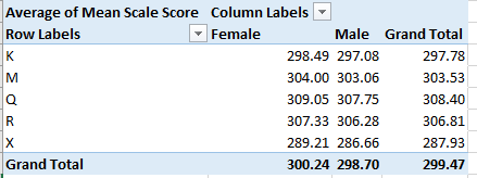
Here both gender and borough disparities mark the data, the former most conspicuous in the Bronx. Among the boroughs Queens rises to the top, its average score separating itself from fifth-place the Bronx by more than 20 points. Indeed, the Queens boy average exceeds every other girl’s mean, save that of Queens, of course.
These findings contribute but a sprinkling of pixels to the larger picture, but contributory they are. Accounting for the relative male math predominance at later phases of the educational process serves up a famous analytical challenge; winners of the near-impossible William Lowell Putnam Mathematical Competition, for example – 120-point university-level exam on which the median score is often 0 – are nearly all male, but I don’t know what that means, either.
All of which begs the next question: I’m a guy – so why is it when I divide my number of socks by 2 I always get a remainder of 1?

Leave a comment