Would you rent your apartment to me? I have references from real people, don’t smoke, clean up after myself (is my nose growing?), and probably can be counted on not to trash your living room and adjoining vicinities.
Still don’t want to take my scratch for your pad? See if I care; there are plenty of other flats out there where yours came from.
Too many, in fact, according to Murray Cox, the self-identified “data activist” whose researches into Airbnb’s rental listings opened the door on a warehouse of dodgy practices, in numerous localities, e.g. property owners who market multiple dwellings, a clear and present violation of New York state law. Cox maintains that, among other things, the outsized scale of Airbnb offerings can worrisomely constrict a city’s available rental stock, and has published a city-by-city inventory (brought to my attention by a student) of Airbnb listings that you and I can download in most convenient spreadsheet form (look for the Summary Information and metrics for listings in… link attaching to each city).
It occurred to me that, among other potential takeaways, an intercity comparison of Airbnb activity might advance the journalistic cause a mite. I thus downloaded the data for New York, London, and Paris, all nicely exhibiting the same fields. With the intention of copying and pasting the data to a single workbook I cleared out a new column to the left of A, called it City, and entered and copied down the respective names of the three locations, properly lined up with their data once pasted, culminating in 162,701 rows of data, its 20 megabytes just itching to tell me what Airbandb has been up to.
Of course, the three-city amalgamation means to prime the data for a range of comparisons, but some comparisons don’t avail. I’m thinking in the first instance about the price field in what is now column K. These entries presumably cite daily rental rates, but express themselves in disparate currencies – dollars, pounds, and euros. One supposes an exceedingly determined investigator could mobilize and apply a round of currency equivalences to the records, a prospect that would require a vast compiling of date-specific rate fixes in short, a challenge likely to a real-world, deadline-mindful journo. I’ve thus elected to leave the numbers as they stand, and if that touch of laissez-faire works against the analysis I have no one to blame but myself. The buck stops here – and maybe the euro, too.
In any case, before we get fancy, we can think about this self-effacing pivot table:
Rows: City
Values: City (Count, by definition for a textual field)
I get:
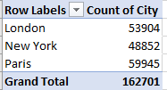
We see that Paris – by far the smallest of the three cities – nevertheless advertises the largest number of Airbnbs. An accounting for that disjuncture would probably justify a deeper look. Might tourist cachet or friendlier legalities spur the Paris margin? I don’t know. But consider that, juxtaposed to Paris’ population of around 2.25 million and its average household size of approximately 2.3 persons, the city’s Airbnb stock could house around 6% of its residents – with the point, of course, that the inventory is apparently being withheld from the permanent-residence rental market.
Other incomparables have their place among the data, too. There’s little comparing to do as such among the three cities’ neighborhoods, and indeed – the neighbourhood group (UK spelling) field for Paris and London is utterly empty (the field for New York comprises the city’s five boroughs).
But of course other workable comparisons are available. What, for example, about average minimum stay requirements by city and type of rental? We could try this:
Rows: City
Columns: room_type
Values: minimum_nights (Average, formatted to two decimals)
I get:

We see that diffident London Airbnbers expect notably briefer stays at their places on average, with those uppity Parisians insisting that you agree to set down your knapsack – and debit card – more than a day-and-a-half longer before they let you in. At the same time, New York’s shared-room minimum is disruptively anomalous.
And for more evidence of cross-cultural heterogeneity – if that’s what it is – flip the values into Count mode and hand them over to the Show Values As > % of Row Total, ratcheting the decimals down to zero and switching the Grand Totals off (because the rows must invariably figure to 100%). I get:

The overwhelming Paris proportion devoted to the Entire home/apt offering is not, I would submit, proof positive of yet one more Gallic quirk, but rather a simple function of the Paris housing stock, in which apartments predominate.
For additional, if glancing, corroboration, try this pivot table:
Rows: neighbourhood_group
Columns: room_type
Slicer: City (tick New York)
Values: neighborhood_group (Count, % of Row Total)
I get:
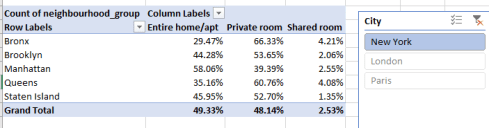
Recall that New York is the only city among our trio whose neighborhood group field is actually occupied with data – the names of its five boroughs. Note the relative Manhattan tilt towards Entire home/apt, even as the other boroughs, whose housing range features far more private homes, incline towards Private room – that is, presumably one private room among the several bedrooms in a home.
And what of daily price by city, keyed as it doubtless is to room type? It looks something like this:
Rows: City
Columns: room_type
Values: price (Average, to two decimals)
I get:

Again, that imperative qualification – namely, that the prices reflect evaluations per their indigenous currencies – need be kept in mind. As such, the New York tariffs verge much closer to the London figures when the appropriate, albeit variable, pound-to-dollar conversion is applied. With those understandings in place, the Paris Entire home/apt average seems strikingly low – because the Euro consistently exhibits a “weaker” relation to the pound, the former as of today equaling .88 of the latter. Yet at the same time, Paris’ private room charge would appear to be effectively higher.
Now again, because the data are there, we could compare average prices for New York’s boroughs:
Rows: neighbourhood_group
Columns: room_type
Slicer: City (New York)
Values: price (Average)
I get:
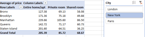
No astonishments there, not if you’re a New Yorker. Manhattan expectably heads the rate table, though Staten Island’s second-place Entire home/apt standing may issue a momentary pause-giver, along with its basement-dwelling (pun intended) shared room rate.
That’s $7,300 a month for an entire place in Manhattan. And wait until you see the interest on the mortgage.

Leave a comment