Archive | July, 2018

World Cup Data: Goal Seeking- and Finding

31 Jul

Like American presidential elections, the World Cup doesn’t seem to end; the four-year interregnum separating those two events seems ever more ostensible; and because some prognosticators have instated Brazil as winners of the 2022 Cup it may already be time to wonder if the tournament should be held at all.

But my latest information is that it’s all systems go, and anyway, Qatar is lovely in November; so in the interests of limning some helpful deep backgrounding of the picture, you may want to download and kick around the data set of all World Cup match outcomes extending through the 2014 go-round, niched here in Kaggle’s repository of holdings.

The set then records all 836 matches contested from the Cup’s inception in 1930 through the immediately previous competition, in relatively self-evident fields, with the exceptions of the Round and Match IDs in columns Q and R. Kaggle maintains that the identifiers are unique, but the Round IDs exhibit a qualified uniqueness, i.e., they appear to signify a certain stage in the tournament (e.g. semi-final) that by definition would have been reached by multiple teams bearing the same id. And the match ids display curiously variable lengths, suggesting a mid-data shift in their coding protocol. The 2014 matches, for example, sport nine-digit identifiers; in 1998 their lengths have shrunk to four characters.

More troublesome is the small but measurable number of redundant game records, signaled by shared match ids. A Remove Duplicates routine earmarking MatchID as the offending field discovered 16 doubled records, which were promptly shown a red card.

Once you’ve stretched all the columns via the requisite auto fit, you can begin to think about what’s interesting in here. What, for example, about putative home field advantage? That vaunted residential edge is something of a legal fiction here; the first record, for example, names France as the home team and Mexico as the visitors, in a 1930 game set in host country Uruguay. But that only nominal imputation spices the question; might even a desultory home team standing impact game outcomes?

Let’s see. Any formula presuming to calculate win percentages needs to reckon with a common soccer/football eventuality – the fact that many games culminate in a draw. As such, we can take over next-available column U, title it Home Win Pct., and enter in U2:

=IF(G2>H2,1,IF(G2=H2,0.5,0))

That simple expression means to ask: if the goal entry in G exceeds the figure in H – that is, if the home team wins, then enter 1 the appropriate U cell. If, however, the values in G and H are identical – signifying a draw – then assign .5 to the cell, the standard evaluation of an outcome in which each team in effect arrogates half a win. Once we copy the formula down U, we can simply add all the numbers and divide the total by 836, the number of records in the data set (remember we deleted 16 of them). The result: a home-team win percentage of 68.42, a disproportion that piques the question as to exactly how home teams are nominated.

For example: in the 1930 debut Cup, Argentina received home-team standing for four of its five matches, its sole “away” status assigned to its role in the final, which it lost to the authentic home team, Uruguay. Mexico, on the other hand, competed under the away rubric for all three of its games that year. And the home team in 1930 – however denoted – won all 18 matches during the tournament.

Explanations notwithstanding – though they do need to be pursued – we can calculate Cup-by-Cup home-team winning percentages via a rather neat deployment of the AVERAGEIFS function.

First, enter a bare section of the spreadsheet and list the years in which the Cup was held, starting with 1930 and coming to a stop at 2014 (I’m commencing in Y3). Once you type 1934, of course, you can drag the remaining years down their column by autofilling their four-year interval, remembering, however, that the Cup was suspended in 1942 and 1946. Then name the Year field in A yr, the winner field in U win, and enter in Y3:

=AVERAGEIFS(win,yr,Y3)

And copy down the Y column.

How does simply averaging the win data – which after all, comprise either a 1, a .5, or a 0 – forward our objective? Contemplate this example: a team winning two games and losing one receives 1, 1, and 0 points for its exertions. Average the three values and the resulting .6667 returns the winning percentage for two wins and one loss.

If we’re happy with that understanding and then proceed to format the results in percentage terms, I get:

Cup1

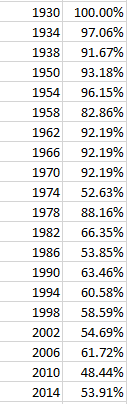
It is clear that somewhere, perhaps in the 70s, the idea of a home team underwent a rethink; I’m not sure what drove the apparent definitional overhaul, but it seems to have been put into place (for a possible partial accounting see this discussion). We even see an away-team edge gained in the 2010 Cup. I’m happy to entertain surmises about these disparities.

In any case, what about goals – e.g., have their outputs ebbed or surged across the Cups? If we want to figure a winning-to-losing team metric, say the average winning and losing goal total – or really, the average score  – by game by Cup, we’ll have to improvise, because those data aren’t expressed in existing fields. A couple of simple formulas should be able to answer our question, however. I’ve moved into column V, called it Win Goals, and jotted in V2:

=IF(G2>H2,G2,H2)

That expression simply declares that if the goal total in G exceeds the one in the corresponding H cell, then return the value in G; otherwise report the number in H. If a game was drawn the logical test will not have been met, of course, but no matter; since in such a case the G and H figures are identical it matters not which one the formula returns.

I next head into to column W, label it Lose Goals, and write what is in effect the flip side of the above formula in W2:

=IF(G2<H2,G2,H2)

Both formulas are copied down their respective columns, of course, and conduce toward this pivot table:

Rows: Year

Values: Win Goals (average, formatted to two decimals)

Lose Goals (same treatment as above)

I get:

Cup2

The marked downturn in goal scoring is associated with the recency of the Cups; indeed, the overall winning-game average of 2.18 goals was last attained in the 1970 tournament, and the average victory margin of three goals in the 1954 contests exceeds the average per-game combined goal total for the last 14 Cups. Average winning margin for all games: 1.51 goals.

And let’s see VAR verify that .51 goal.

Hacks of Stacks of Wax: Billboard Top 100 Data, Part 2

16 Jul

The hits keep coming on the Billboard 100 dataset, and its mighty chorus of voces populi (it’s the plural; I checked) sounds an arpeggio of questions our spreadsheet is prepared to answer. Topping the survey, perhaps, is one that is both obvious and most compelling: who’s the most prodigious hit maker? The answer, again, should emerge from the trenchant Data Model Distinct Count query we described last week. It informs a pivot table that should look something like this:

Rows: Performer

Values: Song (Distinct Count)

Sort the results Highest to Lowest.

The listings, at least to this way-behind-the-curve listener, were cause for surprise:

top1001

Pulling away from the pack, and by a couple of orders of magnitude, is the vast vocal catalogue of ditties crooning your way from the Glee television show, its cover versions of other person’s hits splattering all over the charts, but with a curious aggregate brevity. Its 183 unique hits resounded through the rankings for a total of but 223 weeks, if I’ve gotten my filter right; not one-hit wonders, then, but one-week.

But those counts call for a measure of refinements. In addition to the generic Glee Cast appellation, a filtered scan of the data for the artists bearing the name Glee somewhere in their handle reports:

top1002

Filter-confining our pivot table to that expanded Glee complement, I get

top1003

Apart from the fact that I haven’t heard of half of the above collaborators, we’ve boosted the Glee count to 206 unique tracks that some time, somehow, succeeded in booking their place in the top 100.

And of course, the multi-name problem is no idiosyncrasy of the Glee phenomenon. You’ll note a Mr. Presley, whose 53 chart visits essayed in conjunction with his antiquarian colleagues the Jordanaires combine with his 49 solo efforts (we’re apparently not counting his backup singers here). That’s 102 appearances for the troubadour from Tupelo, but we’re not finished. Filter for Elvis Presley, and

top1004

I’m all shook up. (And like you, I have no idea who the Carol Lombard Trio/Quartet was. The movie star was spelled Carole, but so is one of the listings up there.) And by the way, remember that the Billboard 100 data tracks back to August, 1958; but Elvis’ debut hit, “Heartbreak Hotel”, bears a time stamp of February 1956, and so won’t be found here (though four renditions of a song with the same name by others will).

Aim a like filter at the Beatles – that is, the words Beatles, and –

top1--5

Or take James Brown. Soul brother number 1 has 47 entries per his name in stand-alone mode, but filter for all instances of the original disco man and we see:

top1006

You’ll appreciate the problem; a proper census of each and every artist’s top 100 total would appear to require a filter of the sort we’ve applied above, a necessity that, if plied, can’t be directly pivot tabled, in part because a great many songs would need to be counted more than once. You’d need to allot an entry, after all, to each artist enumerated in a tandem hit, e.g. you’d be bidden to assign one hit each to the Beatles and Billy Preston for “Don’t Let Me Down” and “Get Back”. Remember them?

Now the route to another need-to-know metric, the total number of weeks an artist’s offerings have informed the top 100, offers a smoother ride, particularly if you simply need the total:

Rows: Performer

Values: Songs (Count)

Each appearance of a song in the data set amounts to a 1, after all, or one week’s visit to the top 100. Sort the outcomes by Highest to Lowest, and I get, in excerpt:

top1007

Your cultural weltanschauung will dictate your adjective, i.e., the results are interesting, surprising, confirmatory, or dismaying. I am in addition either embarrassed or proud to say I’ve never heard of Kenny Chesney, Keith Urban, and Brad Paisley; that these titans are country and western singers explains my arrant illiteracy in this character-defining matter.

But the complication we uncovered earlier reappears here. If you’re asking after the missing Elvis Presley in the above screen shot, for example, run the Performer filter for the generic Elvis Presley – again, filter for all instances of his name:

top1008

And you’ll see:

top1009

That’s 19 years’ worth of time spent in the top 100. Next filter for all mentions of Elton John:


top10010

A remarkably comparable durability, but again, we haven’t accredited Presley’s pre-August 1958 incursions into the chart.

And just for the record, here’s some other all-mentions-of-an-artist/top-100 week tenures:

The Beatles: 608

Michael Jackson: 726 (none of which factor in the Jackson Five’s 212 weeks, however)

James Brown: 682

U2: 397

Kelly Clarkson: 542

Diana Ross: 626 (but the Supremes qua Supremes, sans any official allusion to Ross, contribute another 299)

Barry White: 175

The erstwhile Beatles in solo-act capacity:

Paul McCartney: 344 (but Wings brings another 201 weeks to the count)

John Lennon: 161

George Harrison: 161

Ringo Starr: 129

But just don’t ask me what any of it means.

And still another need-to-know follow-on takes our analysis to its interrogative crescendo: Which tracks have enjoyed the longest stays (welcome or not) on the Billboard 100?

That question seems to admit of a pretty straightforward answer:

Rows: SongID

Values: SongID (count, of necessity; the field is text)

(Remember that SongID, and not Song, need be applied to the pivot table. SongID imparts a unique identifier to each song, in order to disambiguate multiple versions of the same song.)

I get, in excerpt:

top10011

Remember that SongID concatenates title and artist; and so oblivious am I to all these next big things that I wasn’t sure if the week leader above is entitled Radioactive Imagine by the Dragons, or Radioactive by the Imagine Dragons. I have since learned the latter formulation properly parses song and group; described by Wikipedia as a sleeper hit, Radioactive nevertheless somnambulated across the charts for 87 weeks (a figure Wikipedia corroborates), or about  1 2/3 years. That’s a long snooze; but don’t overlook their Demons, chart-resident for another 61 weeks. In fact, a scan down the list counts 55 songs that persisted somewhere in the top 100 for at least a year.

And I think the only one I know is Unchained Melody, by the Righteous Brothers. Are you amused?

Hacks of Stacks of Wax: Billboard 100 Data, Part 1

2 Jul

You don’t read big data, you analyze it. No one unrolls themselves into their hammock, reaches for their mint julep, and thrills to that page-turner of a 300,000-row data set they’ve been craving to get at all winter. Big data is meant to revel in its bigness, favoring the curious with its possibilities for aggregated, patterned and macro-leveled largesse, and largeness.

But sometimes the revel is in the details. Now and then a big data set comprises a gigantic compound of molecular bits whose very protons might be of sufficient interest to make you put your julep on hold – and I’m thinking about the 59-years of variously memorable hits filling 309,000 rows of the Billboard top 100 workbook, playing its enormous medley here on the data.world site.

As indicated, the Billboard set recollects its chart-toppers all the way back to August, 1958, and if you’re just bursting to know for exactly how many weeks “She Loves You” oooed its way into the listings – and you probably are – or precisely when the epochal “Rapper’s Delight” first hip-hopped onto the rankings and your consciousness (15, and the week of November 10, 1979, respectively; but remember that the Beatles’ own German cover version “Sie Liebt Dich” also checked in for a week at 97 in June, 1964), you’ve assuredly come to the right place.

I don’t know about you, but I think the Billboard data – all 21.6 megabytes of it (i.e., you’ll have to download it yourself) – makes for a cracking good read – but it’s a spreadsheet, after all, and so some intriguing global findings should be in there, too. But as usual, the data need some inspecting before the work gets underway.

Note, for example, that the Peak Position and Weeks on Chart fields installed in columns I and J are, at least in theory, dispensable; one could derive both findings from a pivot tabling of the songs, subjecting Peak Position to a Min in Values, and then applying the song titles themselves to Values, realizing a count that would deliver a Weeks on Chart equivalent. That sparer approach would relieve the data of a slew of redundant entries, e.g. a song’s peak position appears identically for each week in which it appears.

If you’re wondering about the Instance field and what it means, you’re not alone. I originally supposed that it counts the number of times the same chart-bound song was performed by different artists (I use the term loosely), but that conjecture proved a false take. Rather, Instance seems to number a given version’s non-contiguous revisits to the charts. For example, Nicky Jam’s El Amante – a performer and song whose identities draw a pair of blanks in my uncomprehending mind – exhibits six instances; its debut at position 99 in the week of February 18, 2017 was succeeded by its disappearance the following week, only for the tenacious ditty to stage a three-week comeback dating from the week of March 4. Continuing to loll in the high 90s, El Amante submerged once again, before clambering back into 98 on April 4, etc. It last held its place in the rankings until the week of September 2, 2017, concluding its sixth instance – before it fell back into the oblivion it likely deserved.

Note in addition the SongID field, a unique identifier crafted by a concatenation of the entries in Song and Performer. Slightly curious is the retention of the formulas in their cells; their work has been completed, and could be paved over with a Paste > Values routine, an austerity move that serves to reduce the file’s size to 19.5 MB.

And if you’re wondering what purpose a song id might fulfill – that is, what analytical need would spur the assignment of an id to each song – I can think of at least one, one that returns us to an exigency with which I’ve contended before, and not optimally, as it turns out.

If we want to learn how many discrete songs clambered into the top 100 for any particular year we need – again – to do something about the recurring weekly appearances of the same songs, songs we want to count exactly once. I had expressed a similar wish, for example, in my posts on the Supreme Court Voting data, in which I wanted to count unique cases heard by the Court per year. I developed the count by embedding case data into the Rows area, where of course they’re enumerated but one time each. I then moved to analyze that satellite table instead.

But I’ve since learned that the above exertion is unnecessary, thanks to Excel frontliner Chandoo. He inclined my attention to an unassailably more elegant maneuver, that works like this:

But before I demonstrate, recall what I’m aiming to do: I want to pivot table a tabulation of the number of unique songs crashing the charts by year, and as such a prior step need be enacted upon the data before I set the table – I need to release year information from the WeekID field in B. That intention can be effected in several ways, but in the interest of simplicity I’ll scamper to next-available column K, call it Year, and enter in K2:

=LEFT(B2,4)

And copy down the column. That simple device releases the first four characters from each week id, which in every case offers up the year of the song’s chart entry (WeekId is text-formatted, by the way).

When the venerable Create Pivot Table dialog box opens, tick the Add this data to the Data Model box at its lower left (and someone tell the folks in Redmond it should be these data):

bill1

That tick activates Excel’s Data Model (which first made itself freely available in the 2013 release), an add-in that enables a number of data-querying enhancements, including the potential for building relational pivot tables. But our interest here is in those unique song titles, and so once you’ve executed the tick and the Data Model loads, advance to the pivot table (notice the slightly modified field list drawn up by the Data Model) and earmark Year for the Rows area. Next show SongID into Values, right-click into Summarize Values by, click More Options… scroll down and…

bill2

Wow – Distinct Count; what a concept. Click it, click OK, and I get (in excerpt):

bill3

(Note that the 1958 data are partial, encompassing only the last five months of that year. The 2017 listings extend to the end of October.) Subjected to a rudimentary line chart, the slope looks like this:

bill4

I’m not sure what sociological conclusions beg our attention, but the peak in song numbers in the 60s is marked, as is the decided slump in the ensuing years.

Put it this way: There’s something happening here/What it is ain’t exactly clear.

“For What It’s Worth”; hit the charts the week of January 28, 1967, and stayed there for 15 weeks. Peak position: 7.