I try to keep this close to the vest but the firewalls have ears, and in any event, I seem to have leaked this datum into my About link elsewhere on this page in a moment of inexplicable indiscretion, and it’s even true, besides – yes, I have a doctorate in sociology.
There – I’ve manned up and told the truth, and I haven’t even been nominated for the Supreme Court. Mea culpa. But there’s more than head-bowed contrition to the confession; it also explains why I was moved to have a look at the spreadsheet devoted to the section choices plied by members of the American Sociological Association (ASA) nestled into the Scatterplot blog. You can devote yourself to it here:
Copy of 2017_section_membership_by_race
In fact, the workbook cross-references the items of two parameters – the sub-disciplinary section enrollment preferences of ASA sectarians, aligned by what Scatterplot calls race. ASA members were asked to supply the latter information here:

You’ll note the liberty granted members to self-identify by up to two backgrounds, which “ASA translates…into 8 mutually exclusive categories: Black or African American, Asian or Asian American, Hispanic/Latino(a), Native, White, Other, Multiple, Missing.” (Note that the Asian designation denotes Orientals and not denizens of the Indian Peninsula, as that category is understood in the United Kingdom.) The Multiple (or Multiple Selected) rubric thus conceals the paired backgrounds self-imputed by some members, and as such it’s impossible here to know which two were selected in any instance and how often, though we do know the total multi-identity cohort contributes 4.97% of all ASA members. We also don’t know who populates the Other affiliation, a status characterizing another 3.38% of respondents.
Moreover, blog-post author Dan Hirschman of Brown University adds in a comment that “…the Other/Multiple/Missing categories are non-trivial for most sections (ranging from about 7-20%)”, an important, but not incapacitating, constraint on the data. In this connection, the legend on row 56 (which you may eventually want to delete; it’s a little too close to the actual data for comfort) observes that any cell value falling below five has been reassigned to the Missing field (we’ve seen the five limit before in a similar connection, e.g. this post); thus the 27-member Native American contingent totalled in cell I2 reports only 19 section enrollments, all of which do exceed five. And while of course an N of 27 may beat back all claims to statistical significance in any case, the far more considerable Other, Multiple, and Missing cohorts leave us to yet ask exactly who is being counted there.
But notwithstanding those cautions material findings do await, emerging from the worksheet even as it stands. The sheet has been curiously but methodically designed; and we could pointedly aim both of those adverbs at the de facto header, installed in row 2. Its contents are not typically the stuff of which headers are made; the entry 11551 doesn’t smack of grade-A header material, after all.
But it appears row 2 holds down its header status because the sheet designers wanted its numeric, aggregating entries to remain atop the sheet when the remaining data are sorted, and because row 1 merges its cells in order to center its race designations over two columns each – one conveying absolute membership totals, the other, each category’s percentage of the whole. But I’ve been unable to determine how the sort invariably staves off and excludes header 1. Suggestions are welcome.
But before we propose any revisionisms for the sheet we can learn a number of insights right now. First, and perhaps most obviously, the aggregate section totals in the B column can be sorted highest to lowest (remember that B2 heads the field), after which you’ll learn that the Sex & Gender section is the best-attended, attracting 1099, or 9.5%, of the ASA fold. The least popular? The Ethnomethodology and Conversational Analysis unit (honk if you like indexical expressions), whose name length stands in elegantly inverse proportion to its following.
But don’t get unduly confused by the numbers. Add the section enrollments and you get 26,628, per the members’ prerogative to enlist in multiple sections (probably no more than three). Divide 26,628 by the ASA actual membership of 11,551 and we see that the typical constituent has signed into 2.27 sections.
Proceeding with that understanding, we can simply (somewhere) compute the average number of member section enrollments by race, e.g. for African-American members:
=SUM(C3:C54)/C2
(It’s C2 in which the ASA African-American membership in toto – 748 – is recorded.) That fraction comes to 1.95 section affiliations per member, and after conducting parallel calculations for the other races this comparison resolves:
| African-American | 1.95 |
| Asian/Asian American | 2.35 |
| Hispanic/Latino(a) | 2.48 |
| Native American | .70 |
| White | 2.28 |
| Other | 2.17 |
| Multiple Selected | 2.52 |
| Missing | 2.11 |
(Again, the data for Native Americans are obstructively small.) I’m not sure what the above variation, and variation there is, suggests; that question is better put to a…sociologist, e.g. why black disciplinarians opt for fewer section associations than the bearers of other identities.
The section data lend themselves to a number of other looks, including Dan Hirschman’s charted assays of races and their enrollment percentages by ASA section, e.g.:

(Note that each chart sorts the X-axis data items – the section names – highest to lowest, that is, by a race’s extent of participation; and as such, the items are variably situated on the axes.)
It occurred to me at the same time that a spreadsheet-specific, conditionally-formatted framing of the data could add appreciable value to the analysis. For example, we could color any section enrollment figure exceeding a race’s overall ASA membership percentage.
We can naturally and alphabetically enough begin with the African American data. Select the percentages in D3:D54 (note the formulas within that multiply the authentic percentages by 100, souping up the results by a couple of orders of magnitude. 5.27, after all, isn’t .0527.) With that selection in place, plug into Conditional Formatting and enter the following formula:

Note I’ve nominated orange as the if-true cell fill color. and you need the dollar sign in order to properly compare all the African-American enrollments with the aggregate 6.48 in D2. And because we’ve already selected D3:D54, all those cells will receive the format.
You can next leave the D3:D54 selection in place and apply the range’s format to the other percentage fields across the data set via a Format Painter reproduction. If you double-click Format Painter you’ll be able to instill the format immediately by clicking F2, H2, J2, L2, N2, P2, and R2.
When the clicking stops I get, in excerpt:
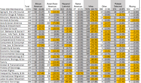
Here of course, and unlike the Scatterplot charts, the section names remain in place; and I would submit there’s lots there to think about.
Cool. Now does anyone have Max Weber’s email address? I’d like to show this to him.

Leave a comment