Curious but methodical, did I quotably describe the American Sociological Association’s section membership data’s spreadsheet, calling attention first of all to the sheet’s functional header row in 2 that manages to ignore the data resting atop it in 1; and in that connection I owned up to my own curiosity about row 1’s resistance to any sort applied to the data set beneath it. It turns out that curiosity was apparently misplaced. If, for example, you proceed to sort this data set:

Its numbers will sort properly – for whatever reason – even if you click among the data in the top row. even as that attainment seems at least slightly curious too, at least to me (for a resume of some of the vagaries of sorting see this post by Excel ace Allan Wyatt).
And while I’m mid-course correcting, you’ll recall the supposition I entered in the previous post – namely, that ASA members are confined to a maximum of three selection enrollments, a deduction I prised from the enrollment averages springing from the race data workbook. It turns out, however, that I was wrong again; my misunderstanding was righted by ASA Director of Academic and Professional Affairs Teresa Ciabattari, who tipped me to the fact that no enrollment limitations are imposed on members. But that very open-endedness rouses the question why per-member enrollments thus hover around the 2 mark. Academics are busy people, of course, and their collective professional experience may have centered the normal curve around that number. What isn’t here is a frequency distribution of sorts, one that would count the numbers of members who affiliated with this or that many sections.
And I learned something else not entirely extraneous to the above: that section memberships must be paid for, the costs of which are interestingly variable. I was thus bidden to wonder if the dues might be negatively, or even positively, associated with section enrollment numbers (the most expensive: $52, for the Community and Urban Sociology section, a fee that at the same time grants members a subscription to the City & Community quarterly).
They aren’t, apparently. The correlation between section dues and their numbers comes to .127, a value that surely won’t quicken the heart of a sociologist, but at least tells us that money isn’t everything.
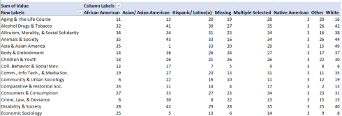
But back to the curious/methodical theme. Consider the organization of the membership-by-race worksheet as it was conceived by the ASA:

Now suppose you’re been entrusted with the raw membership data in their primeval, pre-spreadsheet form, along with a remit to put the numbers to some good analytical use. As such, you need to bang together a sheet that serves your purposes and only yours, and not the interests of a general readership who intends nothing more than a breezy scan of the numbers. What, then, would your sheet look like?
Here’s the form that functional recreation might assume: First, I’d efface the gray banding that could discolor a piquant conditional formatting of the cells. Next, I’d decouple all those merged cells in row 1 and see to it that each and every column/field was properly headed, e.g. in excerpt:

And by extension, I’d instate Row 1 as the data set’s header.
But these steps toward a remake of the worksheet conceal a false start – because If I’m shaping the sheet for myself and not for the general reader, I’ll thus decide that I don’t need the section % fields in the data set at all, headers notwithstanding. Once I’ve subjected the set to a proper restructuring on my terms, I can tap into the Show Values As > % of Row Total option and derive section percentages by race when needed; and if I don’t need to know those percentages, then I don’t need the section percentage fields either.
So on behalf of a prudent minimalism I’d delete all the section % columns, and by the same token I’d delete the Membership field; its aggregates can likewise be derived in a pivot table from the individual race section numbers.
But a question needs to be asked about row 2, the sheet’s erstwhile header. That row records ASA membership totals by racial category, and those data are not of a piece with the holdings in the following 52 rows. Row 2 enumerates the actual totals of ASA members by claimed racial identity, but they do not inflict a double-count upon the sheet’s fields just the same. Because members can enlist in as many sections as they wish, the totals for the eight race fields won’t add up to the figures in 2. Thus, the enrollment numbers in row 2 possess a discrete, non-duplicating character, but at the same time they don’t belong with their companion rows. On balance, then, I’d say the row has to go.
And for something like the coup de gras –remember, I’m earmarking this data set chiefly for myself – I’d run the records through the Get & Transform routine described here, thereby unpivoting (blame Microsoft for that word; I take no responsibility) the columns into this most pivot-table-friendly arrangement, in excerpt:

And of course I can rename the Attribute field Race, or whatever suits me (but if I’m working in the privacy of my own room and left to my own analytical devices, I may not even bother to rename the field).
And once I’ve gotten this far, my three fields can do almost all of the work of the original sheet design, and some more besides, for example:
That is, here I rank section enrollment preferences by race (the ranks read down the column), and thus learn that Sex & Gender proves the most popular section for White sociologists, while Racial & Ethnic Minorities stands in the first position for both African American and Multiple Selected ASA members. And for the 1162 members who, far whatever statistical or preferential reason slip into the Missing category, Political Sociology tops the enrollments. And again, the Get & Transform rendition of the data set enables the user to tee up a Slicer, though which race or section-specific data – whose items are all now domiciled in a single field – can be neatly filtered.
But the larger point is that even if my revamp does nothing more than emulate the potential functionality of the sheet I download from the ASA site, I’ve achieved in three fields what it took the original 18. That’s prudently minimalist, isn’t it?

Leave a comment