Among the metrics figured and plotted by the Medium look at NBA shot-making (and missing) is a two-way-player analysis, a comparison of the points scored by a given player to the points surrendered in his defensive capacity. As the study authors allow, the measure’s validity need be qualified by several cautions, e.g. the fact that an offensive dynamo might be assigned to guard a scorer of lesser prowess, thus padding his points differential. In any case, we can ask how a spreadsheet might applied to the task.
And that task is encouraged by the data’s CLOSEST_DEFENDER field, which identifies the player nearest a shooter at the point when he launched the shot. Thus by totalling a player’s points and subtracting the sum scored “against” him in his closest-defender role, the metric is realized. (Remember that the data issue from three-quarters of the games comprising the 2014-15 season.) But in view of the way in which the data present themselves, calculating that difference is far from straightforward.
It’s simple enough to drop this pivot table into the equation:
Rows: player_id
player_name
Values: PTS
That resultant – indubitably straightforward – apprises us of the number of points (scored via field goals, but not foul shots) credited to each player, and we’ve earmarked player_id here for inclusion in the table in order to play the standard defense against the prospect of multiple players with identical names. (Subsidiary point, one that’s been confronting my uncomprehending gaze for quite some time: fashioning a pivot table in tabular layout mode substitutes the actual data source field names in the header for those dull “Row Label” defaults. Thanks to Barbara and her How to Excel at Excel newsletter.)
But it turns out that an another, data-set-specific requirement for player_id imposes itself on the process. In fact, the player names in CLOSEST_DEFENDER are ordered last name first, surname distanced from the first by a comma, Yet the entries in player_name hew to the conventional first name/surname protocol, daubing a viscous blob between the two fields. Excuse the pun, but properly comparing the fields would call for a round of hoop-jumping that won’t propel me off my couch – not when I can make a far simpler resort to both player_id and CLOSEST_DEFENDER_PLAYER_ID, which should encourage a more useful match-up (but I can’t account for the mixed caps/lower-case usages spread across the field headings).
That understanding in tow, we can plot a second pivot table, one I’ve positioned on the same sheet as its predecessor, set down in the same row:
Rows: CLOSEST_DEFENDER_PLAYER_ID
Values: PTS
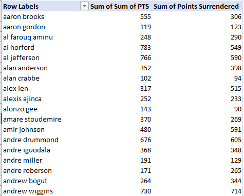
The paired tables should look something like this, in excerpt:

Once you’ve gotten this far you may be lightly jarred by an additional curiosity scattered across the data: namely, that the closest defender outcomes comprise far more players, a few more hundred, in actuality. I looked at the stats for two of the players who appear in CLOSEST_DEFENDER_PLAYER_ID only – ids 1737 and 1882, i.e. Nazr Mohammed and Elton Brand, and learned that their offensive stats for 2014-15 were rather sparse (check out www.basketball-reference.com for the data); Mohammed averaged 1.3 shots per game that years, with Brand checking in at 2.6. It may be, then, that the data compilers decided to omit field goal stats for players falling beneath an operationalized threshold, but that conjecture is precisely that.
You may also wonder why two pivot tables need to be impressed into service, when both train their aggregating gaze at the same PTS field. It’s because we’re directed different parameters to the respective Row Label areas – one identifying the scorers, the other naming what are in effect the same players but in their capacity of defender, there lined up with someone else’s points, so to speak.
In any case, once we’ve established the tables, we can dash off a column of relatively simple lookup formulas alongside the first pivot table, one that searches for the equivalent player id in the second. I’ve named the data range in the second table defense, and can enter, assuming the first receiving cell is stationed in A4 (I’ve named the budding field Points Surrendered in A3. Remember of course that the field is external to the actual pivot table):
=VLOOKUP(A4,defense,2,FALSE)
And copy down the column.
(The FALSE argument is probably unnecessary, as the ids in both pivot tables should have been sorted as a matter of course.)
The lookups track down the ids of the players listed in the first pivot table, and grab their points surrendered totals, culminating in a joint scenario resembling this shot in excerpt:

And once engineered you can, among other things, subject the lookup results to a simple subtractive relation with the sum of pts to develop the offense/defense differential on which the Medium piece reports. You could also divide players’ points by points surrendered instead, developing a ratio that would look past absolute point totals.
Remember, however, that Point Surrendered “field” and the suggested follow-on formulas are grafts alongside, but not concomitant to, the pivot table, and as such you could unify all the fields’ status by selecting the first pivot table and running a Copy > Paste Values upon the results, thereby sieving the pivot data into a simple data set now of a piece with Points Surrendered and kindred formulas.
If we go ahead and divide pts by points surrendered and sort the results highest to lowest we see, in excerpt:
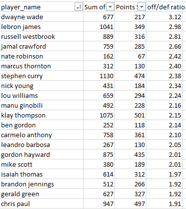
The findings are both interesting and cautionary. Dwayne Wade’s and Lebron James’ enormous differentials may have more to do with their offensive puissance than their preventive talents, offset by the understanding, on the other hand, that a good offense may well be the best defense. What’s really needed, however, is a finer scrutiny of the players to which they’ve been assigned – and the same could be said about those who cede far more points than they score on the other end of the sort.
Of course, with all those parameters there’s no shortage of looks you can cast at the data. For example, try this pivot table:
Rows: CLOSEST_DEFENDER
CLOSEST_DEFENDER_PLAYER_ID
Values: PTS
ShotPct (the calculated field we hammered together in the previous post).
I get in excerpt:
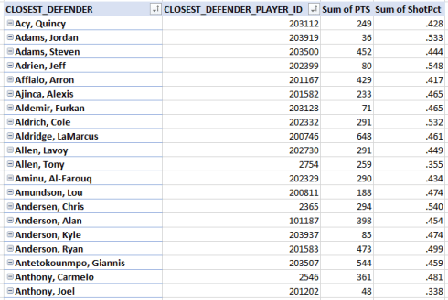
The intent here is to compare players’ points surrendered – an absolute measure – and the shooting percentages of the players they’ve guarded. Scan the list and you’ll see that Lebron James “held” his shooters to a middling .442 percentage, but Dwayne Wade restricted his opponents to a .394 mark, suggesting his defensive goods are for real. But again – the numbers need to be checked against the overall percentages of shooters. It may be that Mr. Wade has been issued a light workload.
And for a concluding, graphical touch, the Medium piece offers a scatter plot pairing players’ points scored by and against:
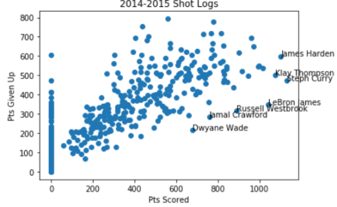
I don’t know with what tool the authors plied the chart, but I very much doubt it was Excel. In any case I managed to achieve something very similar with that application:
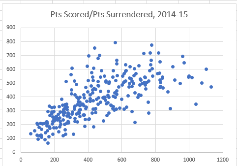
How? Well first, recognize that Excel simply can’t put together a scatter plot from a pivot table. If you try, you’ll be told “Please select a different chart type, or copy the data outside the Pivot Table.”
Opted for the latter counsel, I copied these data, for example:
And pasted them into a blank sheet area via Copy > Paste Values. I then selected the two columns of data, and headed toward Insert > Insert Scatter (X, Y) or Bubble Chart (to add data labels, see this You Tube video).
I did all this stuff without a programming language in sight. Does that make me a philistine?

Leave a comment