Thinking of a change of scenery? No; I’m not talking about that fetching screen saver you just downloaded. I’m talking a real move, of the bricks and mortar kind – apocryphal floor plans, burly guys manhandling your Wedgwood and your pet, change of address forms, having two keys for three locks – in short, big fun.
But if you’re still planning on going ahead, take a look at and a download of Ben Jones’ Data World-sited ranking of what he terms 125 of the Best US Cities, a reworking of the listing assembled by US News and World Report.
It’s all a judgement call, of course, but US News has marshalled a set of parameters, which when judiciously factored, yield their rankings. City number 1, and for the third year in a row: Austin, Texas, the state’s capital and a college town, leading the pack for its “value for the money, strong job market, high quality of life and being a desirable place to live.”
OK – that last plaudit seems a touch tautological, but Austin it is. And if you’re wondering, New York City pulls in at 90, Los Angeles at 107, and San Juan, Puerto Rico, – the latter situated in a not-quite-a-state – floors the list at 125. But the larger point, of course, is to make some aggregate sense of the ranking criteria dropped across the sheet’s columns. I see no master formula into which the criteria contribute their evidence and output the rankings, so we’ll have to make do with some homemade reads on the data.
To start with, we could draw up a series of correlations pairing the rankings with the numerically-driven parameters in columns D-Q, e.g., correlate ranking with Median Month Rent. Enough of those might deliver a crude but sharpened sense of city stature.
But you’ll respectfully demur. You’ll submit that the ranking data in column A is ordinal, that is, expressive of a position in a sequence without delineating the relative space between any two positions. Thus, for example, the grade average of a school valedictorian isn’t twice as high as the student holding down the second position, even as their respective class standings are quantified 1 and 2. On the other hand, a median monthly rent comprises interval data, whereby a rent of $2,000 is indeed twice as high as a charge of $1,000.
You’re right, and as such the correlation between city ranking and rents, for example, is assailable, but not, in my view meaningless. In spite of the gainsaying, I’d allow that higher-ranking cities should in the main associate more favorably with the variables the sheet reports. But let’s see.
We can figure the correlations easily enough by aiming Excel’s CORREL function at the fields. For example, to correlate city ranking and Median Home Price in H:
=CORREL(A2:A126,H2:H126)
I get -.191, or a small negative association with home prices and ranking. With higher city rankings (denoted by the lower the number) then, comes a small but not overwhelming uptick in home prices, befitting those cities’ desirability. But again, the connection is small. (Note that if one of the paired values in a row features an NA the CORREL simply ignores the row.)
We can than apply the correlations to some of the other parameters:
With Metro Population: .426
Average Annual Salary: -.382
Median Age: -.105
Unemployment Rate: .679
Median Monthly Rent: -.211
Percent Single: .515
Violent Crime: .329 (By the way – I’m assuming the crime rates are superimposed atop a per-100,000 denominator, which appears to serve as the standard.)
Property Crime: .251
You’ll note the emphatic, not terribly surprising correlation between ranking and unemployment rate (here both dimensions reward a lower score). A city’s plenteous job market should naturally magnetize people through its perimeters; and note in turn the trenchant, but less decisive, association with ranking and average salary. The fairly high correlation with Metro Population suggests that a city’s appeal heightens somewhat with its relative smallness.
More curious and decidedly less obvious is the impressive correlation of ranking and percent single. Here loftiness of a city’s standing comports with a smaller rate of unmarried residents (but no, I don’t know if live-in partners are identified as single). (Again, don’t get confused; a “smaller” ranking of course denotes the more desirable city.) That finding could stand a round of analysis or two; after all, city quality is stereotypically paired with young, hip, unattached urban types. And by the way – though there’s nothing revelatory here – the correlations between annual salary and median home price, and median monthly rent: .658 and .756.
But of course, it’s a trio of fields, e.g. Avg High/Low Temps, AVG Annual Rainfall and Avg Commute Time – we haven’t correlated that begs the next questions: namely, why not? The answer – and we’ve encountered this complication before – is that the values staking this collection of averages have been consigned to textual status. Austin’s average commute time of 26.8 minutes, expressed precisely in those terms, is hard to quantify, because it isn’t a quantity. But couldn’t the field have been headed Avg Commute Time in Minutes instead, with authentic values posted down the column?
But the field is what it is, and so in order to restore the commute times to numerical good standing we could select the Avg Commute Time cells and point this Find and Replace at the range:
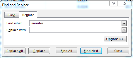
That’s a space fronting the word “minutes”, a necessary detail that obviates results of the 26.8(space) kind, which would remain textual.
Now with the textual contaminants purged the correlation can proceed, evaluating to a most indifferent .012.
But while we’re at it, this array formula can correlate average commute times and city ranking without removing the minutes term:
{=CORREL(A2:A126,VALUE(LEFT(L2:L126,4)))}
The formula extracts the four leftmost characters from each Avg Commute Time cell (all of whose first four characters are numerics), convert them into values, and gets on with the correlation. (But note, on the other hand, that the array option doesn’t appear to comport with the AVG Annual Rainfall data in I, because the NAs obstruct the array calculation. The Find and Replace alternative will work, however).
And by the same token, analytical ease would have been served by allotting a field each to the average high and low temperatures, and without the degree symbol. Here you might have to make room for a couple of blank columns and enter something like
=IFERROR(VALUE(LEFT(F2,4)),”N/A”)
Fo the average high temperature, and copy down. You need all that because a straight-ahead VALUE(LEFT ) will turn up a good many VALUE errors, which will stymie the correlation. If you go ahead you’ll realize an association between city ranking and high average temperature of .1975 – something, but not much.
And for low temperatures, don’t ask. But if you do, try:
=IFERROR(VALUE(MID(F2, 9,4)),”N/A”)
Correlation, if you’re still with me: .2159.
Maybe not worth the effort.

Leave a comment