If a spreadsheet is here, can a chart be far behind?
Apart from giving new meaning to the phrase “poetic license”, it’s a question nevertheless worth asking, one which piqued me anew when I came across Alyssa Fowers’ Points of Light: Protest in America site, a chart-driven catalogue of the mighty spate of political demonstrations flooding the country across the 2017-19 span, dating more specifically from January 16, 2017, or four days prior to the inauguration of the current president, whose name escapes me. But in addition to the columns, bars, and bubbles she’s , the native data in their own, primordial columns offer themselves for download here (click the “download a full export…” link beneath the Can I use your protest data for…? paragraph head).
More than 22,000 protests are there for the counting, or about 20 a day if you’re averaging, and the data are remarkably current. My download records demonstrations mounted as recently as December 21, including last week’s the pro-impeachment rallies speaking their collective piece about the aforementioned chief executive. Fowers has broken out and represented the data by protest theme, state of incidence, month of staging, and the like, and touches off my question in turn: are these data best studied via the chart/datz viz medium, relegating alternative spreadsheet scrutiny to the hopelessly character based?
A fair question, though one that perhaps slopes the argument toward a reductio ad absurdum: given the choice between communicating data by chart or spreadsheet, is the former modality always to be preferred? Absurd indeed, or disconcertingly plausible?
After all, it seems people tend to think about data visually, and the charted portrayal of quantitative information with its language of proportion – e.g. this bar protrudes farther than that one, or a plotted line negotiates time in its leaps and troughs. What, then, can a spreadsheet bring to the picture – so to speak? If the answer is nothing, we will have flung the question beyond the vanishing point, and that sounds a little…absurd.
Perhaps I should have addressed so elementary – and unnervingly pertinent – a question in my very first blog post, but it probably hadn’t occurred to me then – an elephant in the room, perhaps, that must’ve been crouching behind my laptop.
So here are about three answers. First, spreadsheets afford the virtue of precision. The value signified by a jutting bar, or column, or flitting line point, or crescent of a pie slice (the latter is particular disesteemed, even by data-viz wizzes), may not tell you exactly and unambiguously want you want to know. Indeed – the very fact that so many charts garnish their outputs with data labels tells you as much. Reportage is not well served by revelations that Donald Trump received about 300 electoral votes in 2016. You want 304, not a good guess of a column’s height.
Second, a multi-parameter look at the data might – might – profit from the hard-edged clarity of a spreadsheet. For example, a distribution of demonstration themes by state committed to a more-or-less conventional chart must reserve one axis for the demonstration counts and the other to say, the themes. The state identities, then, are necessarily assigned to the legend, where things can get a touch messy. But a pivot table can align demonstration with row labels and states along the columnar orientation, nestling the counts in the interior values terrain. Dense, but clear.
And of course charts in effect need spreadsheets, are hinged upon them. Yet-to-be-aggregated data resist charting; thus if you want to learn about Civil Rights demonstrations in California you need to bring them all together first before they pull across a bar.
In any case, we could contrast the data-capturing virtues of charts and pivot tables by culling screen shots of a few of Fowers’ charts, companioning them with a pivot-tabled take of the same data, and letting you decide.
But before those chart/table tandems set forth the data need to be sharpened, to wit: the Location field bears the state names that figure in a number of the charts – but these are joined in their cells to the cities in which the demonstrations were held. Because the two-character state names (probably their postal codes) appear in each cells’ endpoint, by marking out a new State field in column I and entering in the first data cell
=RIGHT(B2,2)
we can isolate the respective state codes – with three exceptions, as it turns out. In 19 instances the formula culled the two-character “am”, delivering not a state abbreviation but rather the last two letters of the US territory Guam, which appears in its cells in full. In fact Guam has been assigned its own two-character postal code, GU; and so by running this Find and Replace:
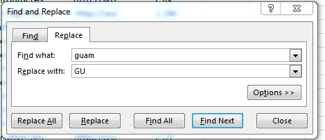
We could refit Guam with the prevailing nomenclature.
Another two formula outcomes yielded a #VALUE error, because neither sported a delimiting comma and corresponding state reference. One, location, Fredon Township, apparently maps somewhere in New Jersey (so saith Google; the entry Fredon, NJ appears in other records), and so I merely added a restorative, “, NJ” to the offending cell. The second discrepancy, recalling a demonstration held in Space, denotes the April 12, 2017 anti-Trump weather balloon floated by the Autonomous Space Agency Network, a decidedly non-governmental confederation of hackers, scientists, and artists. My cell rewrite, then: “Space, SP”.
And another field likewise begged our attention before the pivot tables could be commissioned: the Tags parameter in E classifying demonstration by theme, but fine-tunes each with a sub-theme of sorts set off by a semi-colon, e.g. Civil Rights; For racial justice; Martin Luther King, Jr. Because the Civil Rights rubric has in particular constellated so many of these modifiers, any pivot table invoking the Tags field would teem with granularity. I thus extracted the superordinate demonstration motifs by heading column J Theme and entering this formula in J2 and copying down:
=LEFT(E2,FIND(“;”,E2)-1)
(Note that the Civil Rights example above features two semi-colons, but FIND will pinpoint only the first instance of the entry to be found).
Now we can think about those chart/pivot table comparisons. Just don’t ask me to map that anti-Trump balloon. I think in 2-D.

Leave a comment