Our compare-and-contrast tête-à-tête with a sampling of Alyssa Fowers’ protest-demonstration charts is ready to convene, now that we’ve put the sandpaper to the rough edges on the protest source data.
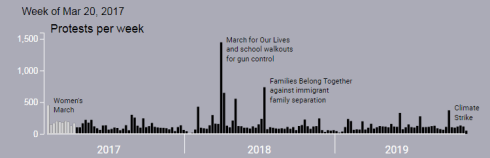
For our first look we can consider this chart, a timelining of protests per week. (A play/pause button whitens the data successively across each week in the timeline. Thus, the March 20, 2017 date below keys itself to the last whitened bar.)
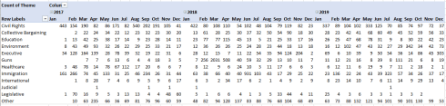
For the pivot table rendition:
Columns: Date, grouped by days in 7-day intervals:
Values: Date (count)
I get, in excerpt:

(A Wrap Text instruction stacks the dates as we see them.) While the table is not visually stirring, it sports the virtue of a heightened precision, and that could matter. We can now identify the modal week in the above chart – March 11-17, 2018, the one in which 1447 demonstrations were conducted; and while in theory all that chronology could likewise have been tacked onto the chart, the resulting textual flurry loosed upon the columns would have run roughshod over the viz. And the pivot table data could of course also be subjected to a round of conditional formats – a visual enhancement, to be sure, but not of the charting variety.
Another Fowers chart breaks out demonstrations by time and theme in stacked waves:
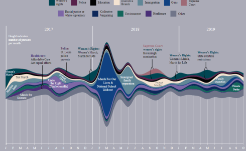
You’ll note that the Y axis is value-free, as it were, leaving us to guess at the demonstration numbers and the axis minimum, which may or may not bottom out at zero. Moreover, the identifying labels pinned to the data points appear selectively, and in addition, I’m not sure what the legend posted in the chart’s far left – “Height indicates number of protests per month” – means to suggest, given the two-dimensionality of the data points. What then do their depths signify?
In any event, how would a pivot table capture the data? We could try this:
Rows: Theme (per the previous post)
Columns: Date (grouped by Months and Years)
Values: Theme (Count, necessarily)
I get:
Not a thing of beauty, to be sure, but again I would submit the actual numbers deepen the larger story. Now we know that the conspicuous blue wave at March, 2018 – the one marking a spate of gun-control advocacies – reports 2031 protests for the month on the theme. And the table in effect identifies every theme’s totals each month, without the selective clarifications issued by the chart. Of course, the themes could likewise be inlaid into a Slicer:

Indeed – Fowers’ “When Americans protested about…”, a chart that asks readers to tick a theme from its own drop-down:
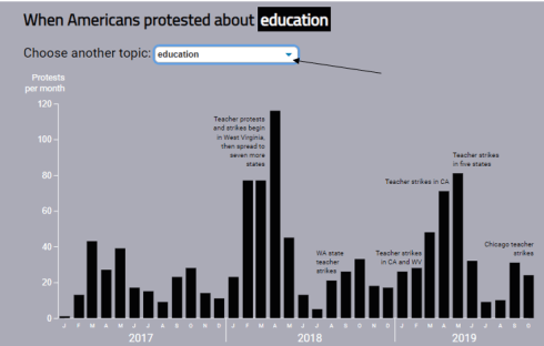
Does something comparable, and most legibly. Again, note the occasional fastening of data labels to the columns, along with the variability among the Y-axis maximums by theme, a standard chart feedback. However, here the minimum steadfastly and unambiguously holds to zero across the themes.
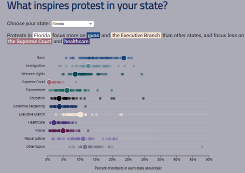
Another drop-down menu features in the above chart, asking the user to tick a state, although interpreting what happens next is slightly tricky. Nominate a state, and its demonstration themes are calculated as a percentage of all demonstrations for that state – but ranked at the same time among the other states’ percentage. Got that? We thus see that Florida, represented by the enlarged circles, is heavily sited by protests against guns and the Executive Branch (that sounds like Donald Trump to me). But relative to such activity in other states, its Supreme Court-themed demonstrators are few, however.
But the ratios call for both an intra and inter-state understanding. If, for example, gun control demonstrations were the modal protest in Florida – say accounting for 30% of all demonstrations in the state – that share could nevertheless position Florida in the rear of the state gun-control count, if other states were to experience still higher gun-control totals. Thus, it seems to me that a number-driven exposition of the intra/inter relation could add a few watts of illumination here, something like:
Rows: State
Columns: Theme
Values: Theme (Count, Rank Largest to Smallest, % of Row Total)
In excerpt, the table presents itself thusly:
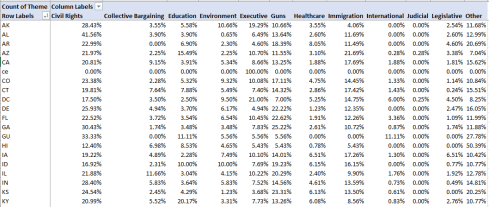
Here we want to learn the extent of each theme’s contribution to the demonstration total of each state. The percentages, then could be compared to the proportion among other states down the same theme column. We see, for example, that Florida’s percentage of gun-themed and executive-branch demonstrations does exceed that of most, but by no means all, states. But a proper substantive emulation of Fowers’ viz would have us order the state percentages by each theme, and I’m not sure how that can be carried off here.
We can’t, for example, apply the Rank Largest to Smallest tweak to the above percentages, because Largest to Smallest only ranks the raw numeric values from which the percentages derive; and because Florida’s actual population is among America’s largest its Guns-demonstration rank may skew toward the far side of the curve. In fact, only California has accommodated more actual Guns demonstrations.
Moreover, even if the percentages we see were amenable to sorting, one can’t arrange to sort every theme highest to lowest simultaneously in the pivot table; that project would require a discrete dataset set aside for each theme – and perhaps that is how Fowers poised her chart.
But Fowers’ charts aside, another, assuredly character-based question put itself before me. Wikipedia recalls a Washington Post finding that “since Trump was inaugurated there has been a protest every day somewhere in the United States”, presumably shouting out at our fearless leader. That Post conclusion tracks back to January, 2018, but the Count Love protest data (through January 6) should facilitate a follow-up corroboration now, two years later.
First, we can calculate the number of days that the data span. Since the protests are sorted chronologically and my data drop down to row 22318, this simple formula:
=A22318-A2+1
yields 1087 (the +1 adds a day that would otherwise be ignored; 4-1=3, but you want all four days to be counted). We then need to count the dates on which at least one demonstration was conducted, and that sounds like a job for the pivot table’s nifty Distinct Count operation (available from Excel 2013 on).
Once you’ve saved the download as an Excel workbook (upgrading its native CSV character) and ticked the Add this Data to the Data Model box on Create Pivot Table window, you need only try
Values: Date (Summarize Values As > Show More Options… > Distinct Count
I realize a distinct count of 1076. That is, eleven days in the January 15, 2017 – January 6, 2020 interval went demonstration-free.
And that’s only right, after all; if the President can go golfing all the time, the least he could do is give his loyal opposition a few days off.

Leave a comment