Archive | November, 2013

Tickets to Ride: New York Parking Violations

28 Nov

If you will agree that the polar vehicular opposite of last week’s lithe, green, bipedal, needs-are-few bicycle is nothing but the lumbering, profligate, fume-shrugging car, then deciding to point that contraption at Manhattan’s viscous streets must stand in turn as the quintessence of the automotive idea gone wrong.  Driving and spewing through that storied island is just another way of saying you can’t get there from here, and one wrong move – i.e,. damming an intersection, or executing a pull-over into any one of the island’s uncountable slew of forbidden territories can cost you big time – up to $115, and know, for example, that a New York-perpetrated “Failure of an intercity bus to properly display the operator’s name, address and telephone number” (to quote the city’s rule book; see this compendium of no-nos and their budgetary consequences) will  rifle $515 from some company’s petty cash drawer.  Hope they remembered to ask for a receipt.

It thus seemed to me that a log of actual New York parking delicts committed to spreadsheet form might bare a sociological insight or two; and by hailing a cab to the New York open data site (we’ve been there before, on April 18 and 25) and its ledger of violations, I found the data to be had.

Of which there is no shortage. It appears that because the violation summaries are released monthly as a the November data as of now are few, with the actual shortfall pushing back to October 29, the point in time from which the available data become atomically small. I thus placed an order for violation data bracketed by the two-week endpoints of October 15 and 28, seeing to it that each day of the week would be represented twice.

And yes, they’re a lot of data. If you’re downloading along with me, that sound you hear is your hard drive crying Ouch. 107 megabytes if you’re counting, but if you want to line up October 15 through the 28th click the small dark blue Filter button in the view’s upper right and click the eventuating Add a New Filter Condition button until you reach Issue Date is. Next click the second small down arrow, click “is between”

park1

and then identify October 15 and 28 in the contiguous date fields.  Then click away from the dates to enable them to process, and next click the lighter blue Export button and CSV beneath the Download As heading. The data should head into a spreadsheet, but you can do some household chores while you wait. (Of course you could ask for fewer days.)

Fourteen days, 346,687 violations – close to 25,000 tickets a day. Do the math and the bucks start to get get pretty big. As a percentage of all drivers the ratio of apparent malfeasance is perhaps low (about 250,000 people drive to work into Manhattan daily, and the city’s George Washington Bridge puts its macadam under the wheels of about 275,000 vehicles each weekday; and four other bridges support over 100,000 cars, these numbers drawn from this Robert Wagner Graduate School (New York University) review of the Manhattan daytime population), and it is difficult to know from here how many citations are disputed, but the absolute numbers are large either way. This simple pivot table, then, breaks out violations by each of the 14 days:

Row labels: Issue Date

Values: Issue Date (again, by Count)

I get

park2

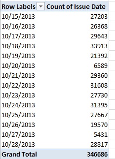
The 20th and 27th were Sundays, and note the pronounced decrement in Saturday infractions (the 19th and 26th) as well. For a more straightforward by-day aggregation, delete all the data in column A (summons number, a field you’re not likely to use), title the fledging field Day, write in A2

=WEEKDAY(E2)

and copy all the way down. This pivot table, then

Row Labels: Day

Values: Issue Date (Count)

Issue Date (PivotTable Tools > Options > Show Values As > % of Column Total)

yields:

park3

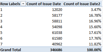
The 1, of course, proxies Sunday.  No, I can’t tell you why day 4, Wednesday, seems to fall significantly below its weekday fellows, but it does. There’s a story line for you.

Now if you’re wondering about Manhattan’s violation share – a crude but indicative index of that borough’s slice of New York’s traffic whole, try

Row Labels: Violation County

Values: Violation County (Count, of necessity; the data are textual)

Violation County (again by % of Column Total):

park4

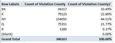
The County legend, for you out-of-towners:

Bx – Bronx

K – Kings, or Brooklyn

NY – Manhattan

Q – Queens

R – Richmond, or Staten Island.

Those surprise-fee results must yet be thought through nevertheless. People use their cars all across the city without necessarily aiming them toward a workplace, of course, and so in order to make greater sense of the totals an understanding of all traffic accumulations would have to put in place. Indeed – utterly motionless cars get nailed, too.

And what about the kind of cars likely to magnetize tickets to their windshield, operationalized here by the Plate Type field? The table is easy:

Row Labels: Plate Type

Values: Plate Type (Count)

You’ll learn that 244,471 citations, about 70.5% of the (allegedly) offending cars, were fired off to the PAS type, clearly passenger vehicles, with 76,557 more, about 22.8%, leveled at COMs, doubtless commercial vehicles (and if I’ve read these clarifications with all due understanding it appears as if both private cars and taxis qualify as PAS).

Those expectable figures  account for about 93% of the ticket writers’ literary output, but the remaining 7 or so percent comprise all sorts of abbreviations about which I’m clueless, e.g,

park5

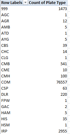
While we can assume the 999s serve as stand-ins for some data entry snarl, I remain unenlightened about the other codes, and that’s an issue of sorts. Absent some sort of clarifying directory, we’re left to guess about the meanings of the abridgements above. In any case, the data pull up short of comparative certainty, because as with last week’s bicycle data we need to know how the ticket data squares with the ratios of passenger, commercial, etc., cars actually rolling atop the city’s roads. In short, we need denominators before the next our analytical step treads across the data.

The same caution stakes the Registration State breakout:

Row Labels: Registration State

Values: Registration State (Count)

Of course New York license registrants dominate the count – exactly 264,300, or 76% of the accused multitude, with New Jersey contributing a predictably second-place 36,987. But apart from the data-empty 99s, I see 62 rows worth of registrations – and when I last looked I counted but 50 united states. While it’s clear that PR means Puerto Rico, I’m not about the other eleven entries, some of which probably represent Canadian domains, e.g., BC/British Columbia). Again, we need more background information, as we do for the Vehicle Color field, in which we need to disentangle WHITE and WH, for example (although you’re asking why it’s worth associating vehicle color with ticket vulnerability, that’s a fair question. But who knows what correlations await?).

Lots of fields and violations, and lots of possibilities. And unlike so many of New York’s parking spaces, you can hold your spot in the data from 10:00 to 3:00.

UK Bicycle Accidents: Safety First?

21 Nov

For all the wrong reasons, news about London bicycling has lately and repeatedly boldfaced the city’s headlines. A spate of fatalities on the city’s roads – six in the past two weeks – has compelled a re-ask of questions about rider safety and a gathered to it a clutch of variously satisfactory answers, including London’s Mayor Boris Johnson’s own question: if cyclist carelessness might in some way be contributory.

In fact the tragic toll urges a need for perspective upon the investigator. London’s 14 cycle deaths matches the 2013 total, but interpretations hinge on both an appreciation of the statistics of small numbers, however dreadful, and rider volume, one review of which is posted here.

Those background understandings need be imported into the equation and kept there before any analysis of the UK-wide incident data for 2012, compiled by the country’s Department of Transportation and delivered by and interactively mapped in the Guardian, can move ahead. Its Excel equivalent is here:

 UK cycling incidents

The data are hearteningly fit for manipulation (all the dates are dates, for example), if imperfectly so. Some here-and-there sprucing would appear to be in order, including

  • A turning off of the global Wrap Text effect that seems to have fanned through each and every cell in the workbook
  • A columnar autofit on behalf of field-header visibility
  • An recommended delete of the Casualty Type field, each cell of which billets the word Cyclist, and hence affords no differentiation
  • Another discretionary dismissal of the redundant Long lat field, whose values have been practicably broken out in the two columns to its left
  • As the Casualty No. field codes the Casualty Severity data to its immediate left (1 for Slight, 2 for Serious, and 3 for Fatal), it too could be deemed redundant, and likewise dispensable. Averaging the codes into a severity index of sorts would deputize the numbers with an authority of the most arguable kind. What would a severity average of 2.5 mean?
  • The field reference to Northing, “The difference in latitude between two positions as a result of movement to the north” (to quote thefreedictionary.com), could probably could be ignored, if not exiled from the sheet, along with its perpendicular companion Easting. Latitudes and longitudes would better serve any data mapping enterprise.

Once these bumps have been smoothed, you should be able to undam an outpouring of pivot tables, again provided these submit themselves to the necessary qualifications, i.e., information about the numbers of riders of any and all vehicles on the road at the pertinent times and places. And as such, these tables can only travel the first leg of the investigative journey.

Let’s start in any case with a gender breakout across the UK:

Row Labels: Sex of Casuality

Column Labels: Casuality Severity

Values:  Casuality Severity (by Count, of necessity; these are textual data). With a bit of formatting, I get

cy1

 Then shift to PivotTable Tools > Options > Show Values As > % of Column Total (and add PivotTables Tools > Design > Grand Totals (Layout button group) > On for Rows Only here. We don’t need horizontal 100%s here):

cy2

The hugely dilated gender incident divide – plainly redolent of a far greater male bicycle ridership – yet widens with accident severity.  Even granting a congenital disparity, women comprise a notably smaller proportion of fatal incidents, cueing a deeper look as a consequence. Do women ride fewer aggregate miles per trip, or navigate safer roads, or ride with greater care?

What about gender crosstabbed with time of day? Because the gender categories are binary and readability is sharpened by running times down a column and not across, where the fields could bleed off the screen, drag Sex of Casualty to Column Labels and drag off Casualty Severity.  Slip Time into Row Labels, and group its data by Hours (and only Hours). Maintain % of Column Total as well. I get

cy3

Note the disproportion of women populating both the 8AM and 9AM tranches (keep in mind the percentages above are reading downwards; the 11.68% stands as the percent of all female incidents), the likely rush-hour peak. Again, the table fires questions it can’t answer by itself. Are women riders relatively more likely to take to the roads for work destinations than at other times? Are they somehow more vulnerable to High Goods Vehicles (HGVs), implicated in numerous incidents?

But that last interrogative is a something of a London question. To see how the data present themselves for that city alone, drag Police Force into Report Filter, click its filter down arrow, tick Select Multiple Items, and check both City of London (that financial center/city-within-the-city indeed  maintains its own law enforcers) and Metropolitan Police, the London constabulary:

cy4

Both genders exhibit higher incident proportions at the 8AM mark than the UK as a whole, but again the female percentages skew the 8 and 9AM slots.

How about day of the week? Start over again, and start simply:

Row Labels: Day of the Week

Values:  Casualty Severity (again, Count):

cy5

Remember these are UK-wide data. Not surprisingly, weekend days record far fewer incidents, an expectable consequence of a presumed tail-off of car/truck (or lorry) traffic during that phase of the daily round. On the other hand, we can’t tell from the above how many recreational riders predominate on Saturdays and Sundays, and how their numbers impact the cycle-car/truck ratio. And in any case the numbers are very similar for London only.

And what of prevailing speed limits at the point of incident, a hotly controverted issue (see www.20splentyforus.org.uk  )? Considered nation-wide:

Row Labels:  Speed limit

Values: Casualty Severity (Count)

cy6

Again, of course, the data need to be reconciled to the numbers of streets upholding the respective limits, and the extent to which these are pedaled through.  In fact, recalculate the above by % of Row Total and:

cy7

The percent of fatal incidents of all 30-mph events actually falls beneath the figure for accidents at 20mph (though of course the numbers are fortunately small).

Lots to think about. We need more deep background, to be sure – but if you’re looking for Square 1, here’s a good place to start.

Notes From the wunderground, Part 3: Matters of Degree

14 Nov

Having homespun the spin button that’ll pump sequenced values to cell O1, we now need to consider that map – really a picture, and as such nothing like the organically-bred images we detailed in our  October 25, November 1 (both 2012) and July 11, 2013 posts.   We want in some way to plot the daily temperature readings for calendar 2012 for New York, Chicago, Dallas, and Los Angeles on the map, each according with every click of the spin button that moves us through that 366-day span. Our final installment in the wunderground trilogy, then, endeavors to follow through.

The first thing we need to do then, is  stake four VLOOKUP formulas on the Map sheet (I’ve recruited cells O11 through O14 toward that end, simply in the interests of choosing somewhere; it goes without saying you can stake your cellular territories wherever you wish). Each formula should return that day’s mean temperature, per the city it looks up. In this connection I’ve range-named that pivot table we nailed together (see the previous posts) Temps (by clicking PivotTable Tools > Option tab > Select > Select Entire PivotTable in the Actions button group you can indeed select the entire table for naming) and I’ve dubbed O1 Date (remember that it’s perfectly legal and patriotic to assign a range name to one cell). Thus in O11 I can write

=VLOOKUP(Date,Temps,2)

thereby looking up the temperature for Chicago for whatever date presently populates Date/O1 (it’s the Chicago data that happens to line column 2 in the pivot-table that’s serving as our lookup table). Copy that expression down three more rows and edit the primordial 2 to read 3, 4, and 5, respectively in order to capture the temp data for the four cities. And in the service of clarity enter Chicago, Dallas, Los Angeles, and New York in N11:N14. Then click the spin button up arrow and observe the daily movement in temperature flitting across the cities, exactly what we want. (Important note: if you wish, you can always supersede the current entry in O1 – our Cell Link – by simply typing a value into that cell; but that override won’t annul the operation of the spin button, whose normal operation can be kick-started anew at any time by simply clicking the button again.)

If that’s all working we can now tug the city data to their respective positions on the map, by picturing the cells with the camera tool, which I first pulled out of the box and screwed into my Quick Access Toolbar  in my December 6, 2012 post.:

                       blog31

For the sake of the example, let’s snap composite shots of the city temps and their trailing names. Select N11:O11, click the camera tool, and sail that slender black cursor over where you believe Chicago to be on the map and click:

blog32

That’s Lake Michigan pointing down at Chicago.

Now it seems to me that Chicago in the photo (look – if we’re using the camera tool, let’s keep the metaphor going) is distanced unappealingly from the 6, and so the imperatives of space management call for a right alignment of the city names in N11:N14 and a mirrored left orientation to the temperatures in O11:14. You could also narrow the O column to further tighten the temperature half of the shot, remembering that the camera tool replicates the appearance of the captured cells in all their regards; trim a column width, for example, and the column remains trimmed in the camera output. (And that the contents of the Cell link in O1 and the formula in O2 may suffer a loss of visibility as a result isn’t calamitous. We’re not principally interested in displaying them in their host cells.) Then point your camera at N12:O12, N13:O13, and N14:O14 and snap away.

Next grab the nearest atlas (it probably has a URL these days), match the city locations to our map, and drag each pic to its terrestrial niche, e.g.

blog33

And now let’s wend our way back to something resembling square one. Our greater intent again is to click through 2012, so to speak, with the spin button, and so nest each day’s temperature in its camera shot – and to orient ourselves in time you could, for example, insert a shape on the map or its environs, select it and then enter =O2, format O2 as a Long Date and center it in the shape (making sure the shape has been selected), thus captioning the map:

blog34

And if you want you can conditionally format the temperature values in O11:O14, too. They’ll show up in the camera shots. And don’t get scared by those 13 degrees in LA – remember, that’s centigrade.

—————–

Another postrscript, keeping with the above sentence. If you want to translate Centigrade readings into all-American Farenheit, try the little-used but worthy CONVERT function, which mediates all sorts of competing measures of the same sort of phenomenon, e.g. temperature. Check it out – it’s rather easy.

Notes From the wunderground, Part 2: Taking a Spin Through the Data

7 Nov

As we have begun to see, the broad, deep data from wunderground.com can be whip up both intra and inter-city takes on their numbers. We could, for example, download weather information from multiple locales, mash them into a unitary spreadsheet, and go on to write a comparative, day-by-day history of temperatures and other parameters.

For example, and as per last week’s go-round, I filched the 2012 data for New York, Los Angeles, Chicago, and Dallas, and heaped them into one consolidated sheet, while remembering to pack an additional column named City stamping the respective city names alongside each record. It’s all there for you, with a map about which more needs to be said, right here:

 four city temps

I then shook the mix into a pivot table:

Row Labels: EST (really, the date field)

Column Labels: City

Values: Mean TemperatureC  (C for Centigrade)

All of which begins to look something like this:

            wu21

(Note: there appear to be no New York temperature data for January 29 and 30).

All rather workmanlike and unspectacular, but we can nevertheless point the table in a new direction – aiming it toward a makeshift mapping of the temperatures, spiced with a pinch of interactivity seasoned by a bracing condiment called the spin box.

The resizable spin box:

wu22

sits on a branch of the family tree sprouting in the Controls button group, itself planted in the Developer tab – a band of buttons you may or may not presently be bowed neatly on your ribbon. If Developer is in fact among the missing, and it very well might, you can give it its screen debut by clicking File tab > Options > Customize Ribbon and ticking the Developer box and OK:

wu23

Once that work is done you can click Insert > Control button group > Spin Button (Form Control), and size the object as you wish.

But aesthetics aside, what does the spin button do? Here’s what: clicking the button rings up a value in a specified cell (called the cell link); each subsequent click boosts or depresses that value (depending on the directional arrow clicked) by a user-defined increment/decrement).

If that’s sounding irritatingly abstract, bear with me and picture this simple example. Imagine a roster of test scores, each test-taker referenced by an ID number:

wu24

Clicking a spin button repeatedly will install a number from 1 to 4 in a chosen cell (the cell link), any value of which can be funneled into a lookup formula, for example, that can return a student’s name and/or test score (e.g., the 2 could be looked up to yield either Ted or 81, depending on how the formula is written). The larger definitional point is that successive clicks of the button spin-cycle through a span of sequenced numbers, each one of which can be put to some formulaic or other use somewhere else on the spreadsheet. Our intention here: to have our button spin through all 366 days of 2012, enabling us to flash each day’s city-specific mean temperature in each of four designated cells, one per city. And once that manner of data capture is realized, we want to properly locate and pin each of the city temps on that map via a “camera shot” of the cells (see the December 6 and 13 posts).

So what do we do first? Let’s introduce, and review the mechanics, of the spin button. Click somewhere in the Map sheet and as per the preliminaries above click Developer tab > Insert in the Controls button group > Spin Button (Form Control). Drag the slender black indicator to a desired button size. Next, right-click the button and select Format Control. You’ll see

wu25

Five fields beg our attention (note that Page Change, an option peculiar to the spin button’s first cousin the scroll bar, is deactivated here). Current value identifies a user-elected number designated to appear by default in the cell link, that is, the cell in which the cycled-through values will register; and so while we’re at it, then, I’ll enter (or click on) O1 in the Cell link field. Again, what we want to eventually see in there is a serial, clicked-through numeric representation of the dates January 1, 2012 through December 31, 2012, each one of which is to be plowed into a VLOOKUP in order to deliver that day’s temperature for each of the four cities – and here’s where it gets interesting.  I’ve said it before, and I’m saying it again – dates are numbers, and as the numeric value of January 1, 2012 is 40909, we might as well start the spin sequence right there, and so think about entering 40909 in the Current Value field. But there’s a problem – as intimated in the above shot, the spin button will not entertain values beyond 30000. In other words, you can’t enter 40909 in Current Value – it simply won’t compute.

So I’m going to enter 909 in the Current Value field instead (and again, that value will seat itself into cell O1, the Cell Link) – and why? Because 909 is precisely 40000 less than 40909; and because it is, I’m going to enter

=O1+40000

in O2. That cell of course yields 40909, the numeric twin of January 1, 2012 (intelligibility might be aided by imposing a Date format on O2); and it’s O2 that’s going to supply us with usable date values, the values with which we really want to work – trust me.

But we’re still in the spin button dialog box. For Minimum value again enter 909, and for Maximum value try 1274 – or 909+365, which, when merged with 40000, gives us nothing but December 31, 2012, the final date in our chronology. And leave Incremental change at 1.

And what this all means is this, once you click OK: Each click of the spin button up arrow will plug an increment of 1 into the default 909 in cell O1. O2 will in turn plump each and every increment up by 40000, thus realizing a date value between January 1, 2012 and the end of that year in that cell. Start clicking and you should see what I mean.

Got that? But don’t worry – it’s all downhill from here. And we haven’t gotten to that map yet.

 ————————————————–

An addendum to last week’s post, in which I noted that the precipitation data for Manchester seemed to have been stuck on zero:  A contact from wunderground.com, a gentleman named William, offered that the reporting weather station whence the numbers came “might not be recording precipitation events”, going on to say that entering Manchester at wunderground.com’s home page and clicking Select Station in the following page might blip an alternative local station onto the radar in which precipitation was measured.   There was such a station, in nearby Urmston, which marked precipitation for all of 2012 but for but the last two weeks of 2011. Total output, so to speak, for 2012: 158.13 centimeters.