The first rule of data entry: No blank rows. The second: A field without a header is terra incognito. Rule two gets violated here, in the UK-government’s count of the nation’s (that is, England and Wales) property transactions for the first quarter this year (click the 2014 Price Paid Data sheet on the page when you get there).
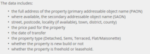
Exactly why the headers went missing is one of those questions I can’t answer, other than to channel some data-designer’s sense that the names just weren’t necessary, even though they are, and even though field explications are out there, on the web site:
(And for additional enlightenment look here; thanks to the Land Registry’s Roger Petty for the tip.)
Duly enlightened, I beamed another row atop the data and minted these names:
Column
A – Transaction No.
B – Price
C- Transfer Date
D – Postal Code
E – Property Type
F – Old/New (I would have coded these data O,N, not the slightly oblique N,Y)
G – Duration (i.e, purchase or a rental)
H – Address
I – Secondary Address
J – Street
K – Locality
L – Town/City
M – District
N – County
The Duration codes abbreviate Freeholder or Leaseholder, the former a permanent mode of ownership, the latter fixed-term (for additional enlightenment here, see this review).
Column O – Record Status – comprises an endless skein of As, and as such should be deleted. In fact, I’d delete H, I, and J as a practical operational tack (street names won’t add much to the narrative), but I’m leaving them be simply for exposition’s sake. (I should add that it seems to me that Column N really names cities and towns, and not the purported County, but I’m holding (here, at least) to the web site’s field-naming sequence).
Now we can proceed, at least after adding that the date data in C are over-formatted, interjecting as they do a constant 12:00:00 AM into every record, to no particular informational purpose. The Short Date format here should say bonne nuit to all those midnights.
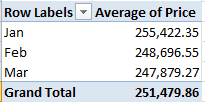
Peculiarities aside, the data are nothing if not informative. What about, for starters, a basic price-by-month breakout?
Row Labels – Transfer Date (grouped by Month)
Values – Price (with suitable formatting, including the 1,000s separator, or comma)
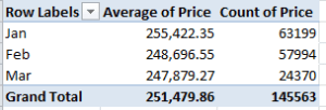
Remember that we’re looking at 145,000 transactions, and so that small pushback in price could be trend-worthy – though that is hardly the last word on the finding. Reintroduce Price to the Values area, this time via Count:
That one’s a head-scratcher. Might the precipitous retraction in March activity owe more to a lag in the data gathering than any real buyer hesitancy? That’s a question for the data gatherers.
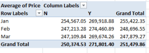
And what about price and a property’s old/new standing?
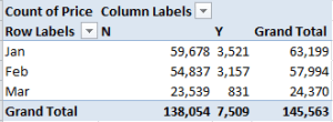
Row Labels: Transfer Date (grouped by Months)
Column Labels: Old/New
Values: Price
Newer properties (that is, those coded Y; I told you I’d would have alphabetized these differently) are expectably dearer; but the February spike is not as easily foretold. And if you think the February new-property sales totals are statistically scant, re-present the Price data in Count mode (scotching the decimals in the process):
Thus something real is at work, I think.
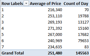
Now this one might be one part learned speculation, nine parts non sequitur, but here goes: What about average sales price by transfer day? Granted, I see no salient reason why transactions should so vary along such lines, but let’s throw caution to the winds. Take over column O (remember I’d deleted its original data inhabitants), name the field Day, and enter in O2
=WEEKDAY(D2)
and as usual, copy down the column (1 is Sunday, by the way). You could then run a Paste > Special > Values through the numbers. Then try
Row Labels: Day
Values: Price (Average)
Price again (Count)
I get
No, I can’t explain Fridays – day number 6. It’s possible some institution-wide protocol stays the processing of files until the work week’s end, but that’s one outsider’s supposition. Nor can I account for the Friday downswing in average price, which is notable and likely not driven by the probabilities. Looking for a story line, anyone?
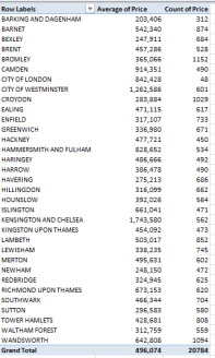
And for some local color, I thought I’d take a look at London prices alone, lining them up thusly:
Report Filter: County (click Greater London)
Row Labels: District
Values: Price (Average)
Price (Count)
It’s the borough of Kensington and Chelsea – redoubt of oligarchs and other ruling-class sectaries – that leads the pricing parade, but that’s a dog-bites-man truism. No more revelatory is London’s average £496,074 transaction figure, nearly double the overall average. What is interesting, however, is the city’s 20,784 sales during the quarter – 14.3% of the month’s total – when held up to London’s proportion of the England/Wales population – about 14.8%. In other words, the housing market in the capital appears to be no more frenetic, though considerably more pricey, than it is anywhere else – in spite of London’s vaunted economic hegemony.
So what does it mean? This: sell your house in Chelsea, and buy one in Bexley.
Leave a comment